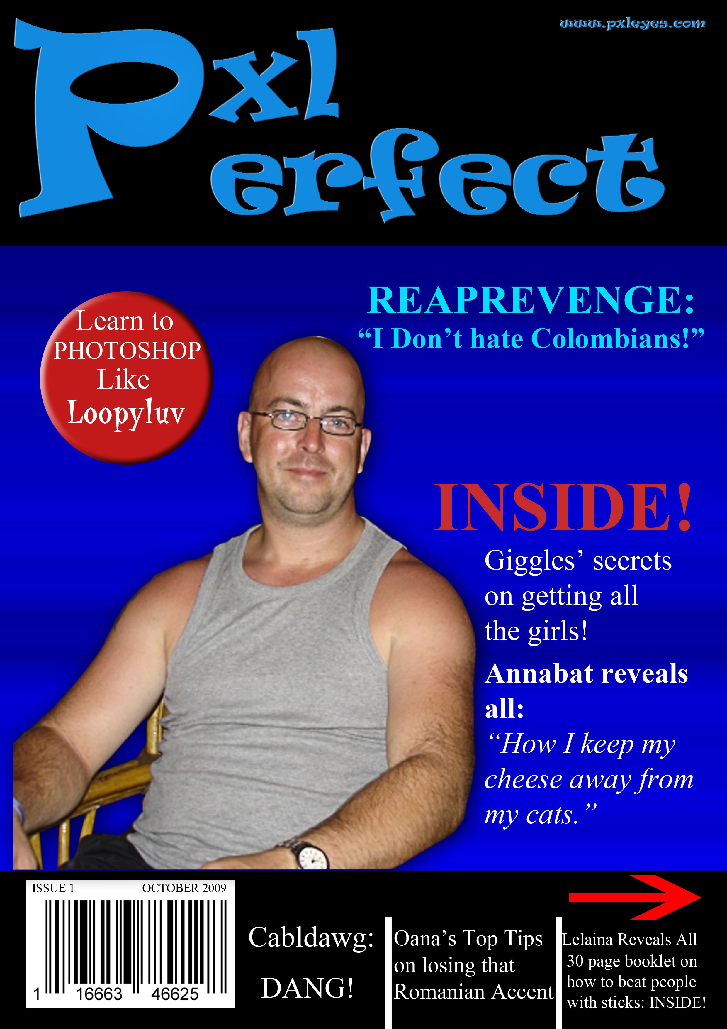
It's mainly a bunch of private jokes, but i hope you all enjoy. Thanks to ReapRevenge for the picture. (5 years and 3813 days ago)
2 Sources:
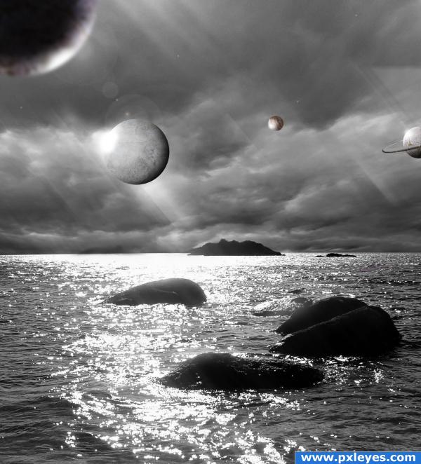
coincedence. mainly sourced from sxc (5 years and 3872 days ago)
no big whoop, but the rings on Saturn have issues.. but a very nice image over all
This is really nice
if those are some sort of hovering balls it's ok. but if those supposed to be planets they sholdn't be under the clouds.
I think the planets under the clouds is great, it gives a surreal feel to the image. Don't stop being creative like that. The blurry planet on the left is something else, keep it sharp like the rest of the image.
I disagree Inanis, Pst should be about being able to convey ideas and stimulate the viewer's imagination, take your own interpretation of what could be happening in the scene...etc..tnks guys suggestions taken, Sander it didn't seem right..tnx 4 the suggestion bro.nd Golem tnx will try...done tnx...
as i said, if those are not real planets or if you didn't aim for reality it is ok. but if you tried to do something realistic this isn't right.
Its a {surreal} scene... but cool no prob man, tnx for the suggestion.
Cool!
I'm really surprised that no one else pointed this out. Maybe you see something that I don't. But the light sorce and the lights on the planets to the left don't seem to match up at all. It seems that there are rays of light coming from the top left corner but the planet on the left has a light reflecting on its bottom right. And the planet to its right has light reflecting on its left side just under the angle that the beams should be hitting it. The atmospheric perspective is driving me crazy, too. The closest planet is the darkest planet, the small planet seems far but just as lit.
That being said, I really do like the image a lot. I think that over all you've done a nice job and I can see that you worked hard on it.
yeah its not the easiest tryna reconstruct an images whole light- especially this image where the reflexion is obvious, yet I don't hink the lighting is completely off, and for the close object the light is hitting the other side therefore the back is in shade.. tnx advice anyway bro..
Hey! It's Chick, not Bro!!
I like the surrealism. It's a theme that is difficult for some to grasp with all the different types of entries in these contests. This is visually interesting. 
Howdie stranger!
If you want to rate this picture or participate in this contest, just:
LOGIN HERE or REGISTER FOR FREE
An image anyone would love to see in real i guess :P
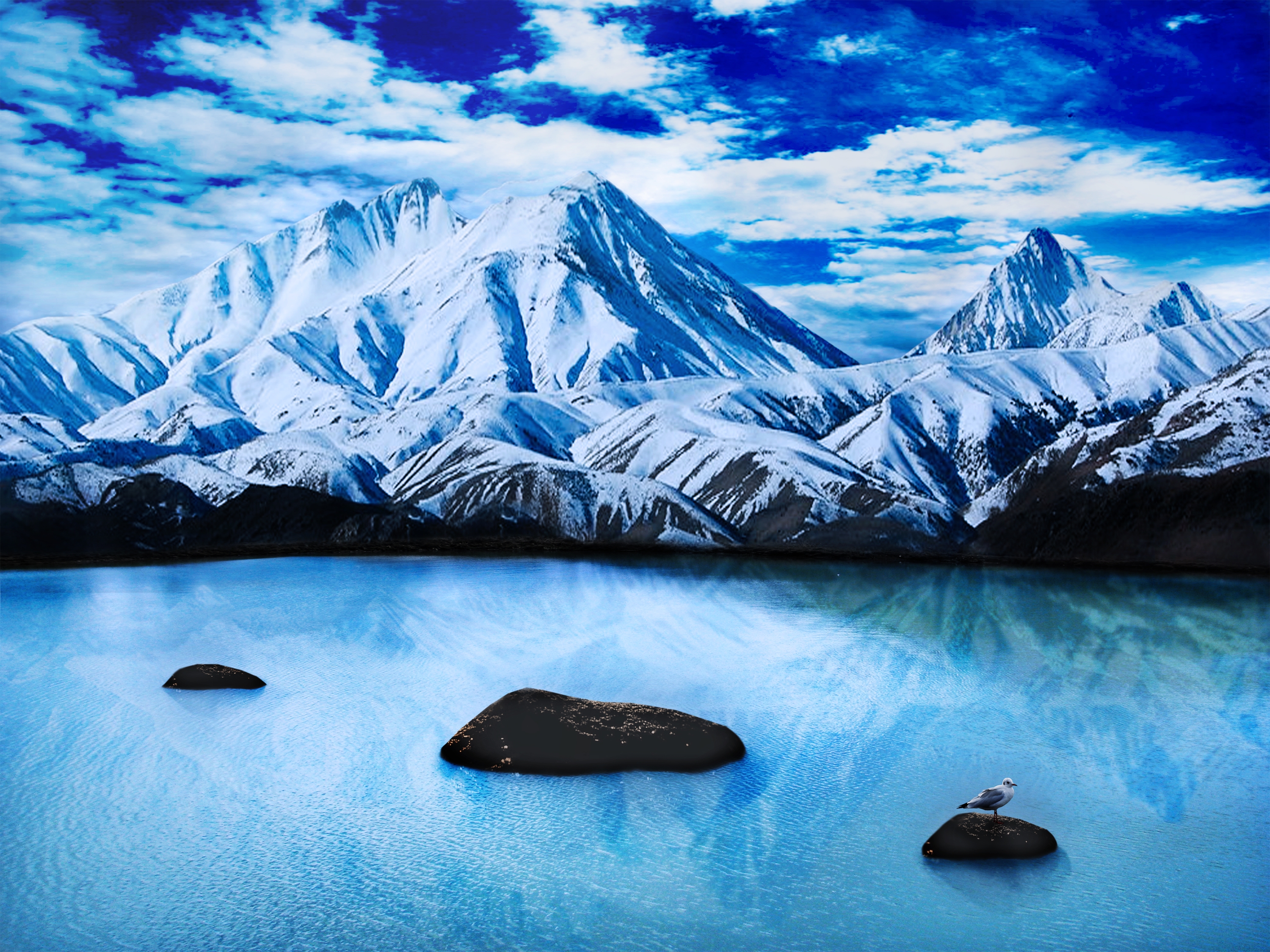
Credits to:
- agent-kstock (http://agent-kstock.deviantart.com) for the mountain stock.
- night-fate-stock (http://night-fate-stock.deviantart.com) for the lovely sky.
- momotte2stocks (http://momotte2stocks.deviantart.com) for the perfect and calm lake.
- gsso-stock (http://gsso-stock.deviantart.com) for the pretty seagul. (5 years and 3875 days ago)
BRRRRRRRRRRRRRRRRRRRRRRRRRRRRRRRRRRRRR
hehehehehehe good Job
nice!!
I think the reflections are too sharp from the mountain in the water...
The reflection of the mountains is shifted to the left...
Isn't that a giant bird ?....nice place.
Alright gonna remake the shadows (more blur and to the right) and make the bird smaller.
the bird is a little big
Howdie stranger!
If you want to rate this picture or participate in this contest, just:
LOGIN HERE or REGISTER FOR FREE
very quick so u wont forget me.....hehehehehehe
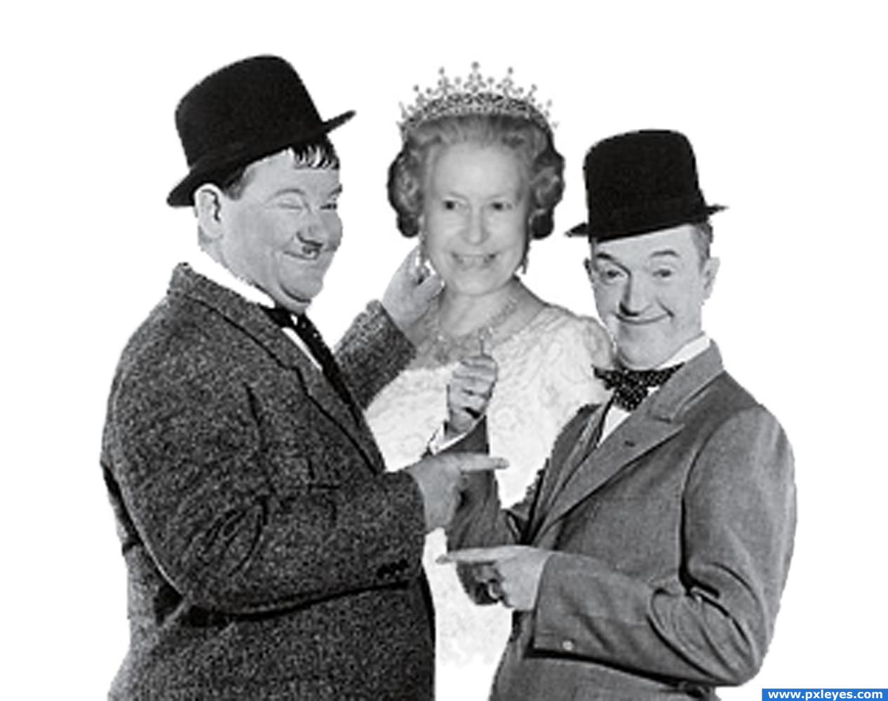
just made it b&w and merged them 2gether (5 years and 3894 days ago)
Interesting  Good luck!
quite cute... good luck
very cool
Try to find pics with better resolution...
the THREE SOME luck... 
even though the image quality is low, they look very funny together
ummmmmmmm.....no!
Howdie stranger!
If you want to rate this picture or participate in this contest, just:
LOGIN HERE or REGISTER FOR FREE
Imagine if we could take pictures as beautiful and colorful as that!
Thanks to svenic and asifthebes. (5 years and 3922 days ago)
very nice
very good! gl
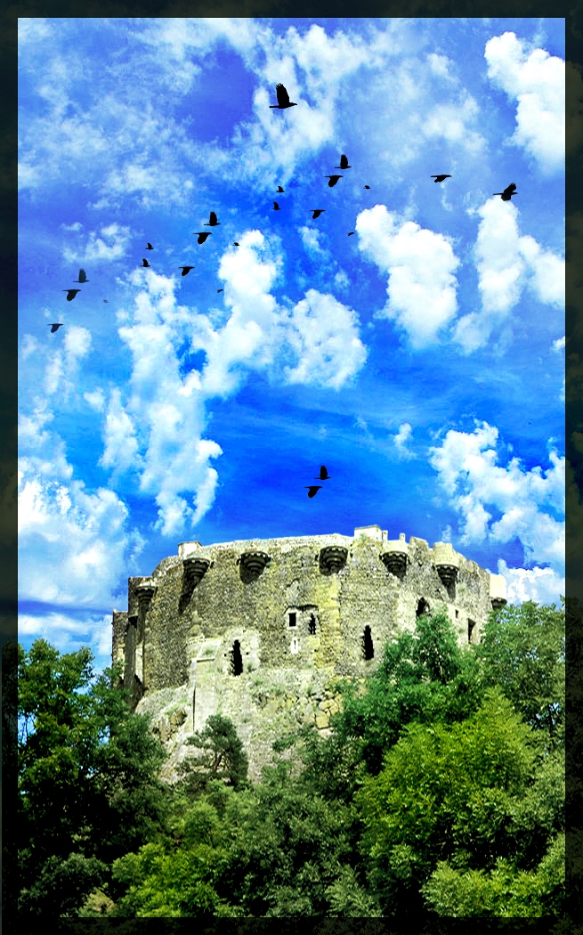
good, but too much contrast
good
Decreased the contrast and color a little.
alfred hitchcock eat your heart out...
i agree with the description but it's a bit too much for me personally (the color) so if you have the vibrance option (not sure when it was introduced in ps), lower it a little bit. if not, contrast or even reduce the saturation by a few points.
Highly decreased the vibrance and saturation in some parts like the castle.
cool
Howdie stranger!
If you want to rate this picture or participate in this contest, just:
LOGIN HERE or REGISTER FOR FREE
Photography and photoshop contests
We are a community of people with
a passion for photography, graphics and art in general.
Every day new photoshop
and photography contests are posted to compete in. We also have one weekly drawing contest
and one weekly 3D contest!
Participation is 100% free!
Just
register and get
started!
Good luck!
© 2015 Pxleyes.com. All rights reserved.


Hahahahah!Awesome!High marks!

lol, now i want to read the magazine!!!
damn it you could have gave me bigger arms ... lol very cool
You want to know how I get all the girls oana?
yes alex
Great humor author!!
nice, good job very funny
Hey lol......nice
LOL, good joke

ohhh thats funny as hell.....reap ur too sexy for that magazine
super magazine!
.. Heehee!! Great work author ))))
))))
Very Creative Love this
The photography of reaper is cut before the magazine's edge.
Thank you all so much for your comments and encouraging words, Akassa, i hade guidelines while making the magazine, the actual photo was cut, and therefore makes it look incomplete.
There's nothing like having a beautiful model on the front cover of your mag, and this is nothing like... Good job author!
ahahhah that's too cool
very cool
DANG i'm in there you are going to get my vote ? nice job Author
I have got to buy this.. i dont know the jokes. however, i have to learn how to keep the cheese away from my cat. she is a shocker for cheese. nice job author.
very funny,good done
who else could have been, you just couldn't drop the cheese, you had to put it in a headline
Haha, i told you i wasn't going to drop it!
hahahaha WTF?...Best ever.good work author
Howdie stranger!
If you want to rate this picture or participate in this contest, just:
LOGIN HERE or REGISTER FOR FREE