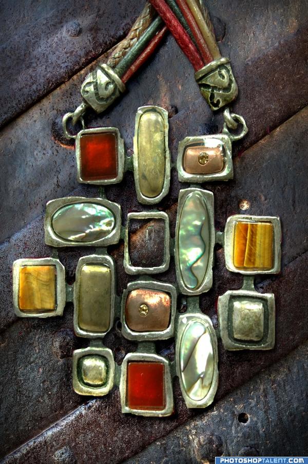
just layered over my photo of a necklace pendent...dodge and burn (5 years and 4037 days ago)

(5 years and 4038 days ago)
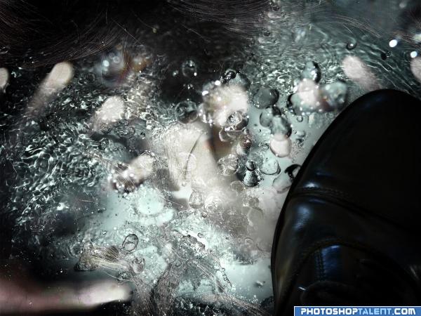
Having trouble seeing the girl...Maybe I'm blind...Good Luck
Scaring, but i like it..! Good Luck 
Reminds me of the Apple Vendor in the Movie Orlando... clever.. good luck
A little more detail on the frozen victims face. Hand is eerie and the shoe is not a little ominous. Well Done.
good idea, but without SBS difficult to understand
neat
One of my favorite! Good job!
Howdie stranger!
If you want to rate this picture or participate in this contest, just:
LOGIN HERE or REGISTER FOR FREE

Always the bride picture make, never the bride lmao
1 thing i have problems with is shadowing, so any advice is much appreciated :) (5 years and 4049 days ago)
12 pictures in one... dämn, i'm tired, going to bed...  good luck!
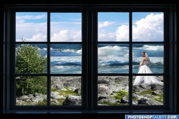
Why would she be walking on wet smelly rocks in her gown?
hey ive seen woman get married in the ocean in a gown lol..... i think they have toooo much money to waste 
Very nice author
Don't really see any shadow problems that are obvious..of course could nit pic if there was a Hi Res pic.. but I kinda like it just the way it is.. good luck author
I like this image...IMO the light on the bush is wrong..Light is coming from the left not the right...Hope that helps...Good Luck 
nice
good
looks good, you might put some of the rocks above the window line and some ocean below the window line.
With the light coming from the left, the right side of the bride needs more shadows, particularly her train.
a perfect day indeed
thanks cristy and dan  i will get onto the shadow help today
Nice idea. The light from the source image is from the left, but then the bush in front gets light from right. But then I also see that the bush is part of the whole frame and rocks, etc. Uhm...so maybe you can flip the sea to match with the light? Good luck!
Howdie stranger!
If you want to rate this picture or participate in this contest, just:
LOGIN HERE or REGISTER FOR FREE

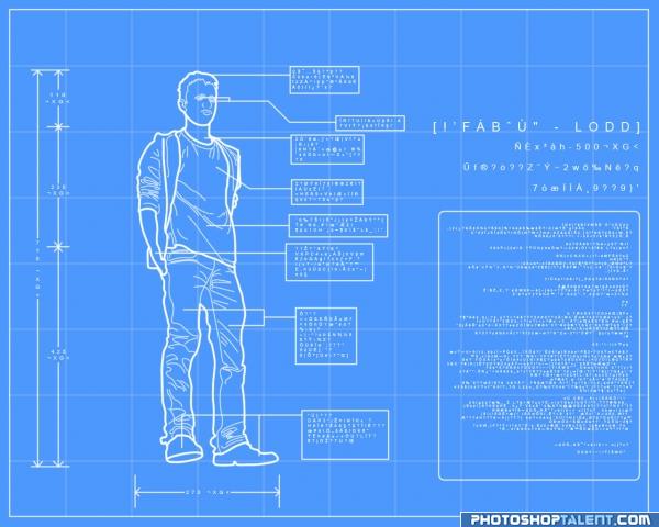
Just made a simple linetrace from lodd source... Then made some grids on a blue background and combined the stuffs to make it look like a blueprint...
And for the text, I just opened a executable file in notepad and pasted away... (5 years and 4054 days ago)
 very clever and stylish work
  good luck!
what do they say what do they say what do they say what do they say.... just saving the other commentors some time.. hehehehe.. LOVE THIS LOVE THIS LOVE THIS..just wonderfully fantastically belly ticking greatness
creative work... well done  goodluck.
this is what i get when i think of perfection! xD it's a very good idea I hope you win
this is very very good
Clever idea, well done 
Great idea, impressive. GL
High marks! Gratz
perfect... ^^
Great idea and result.
nice work on edges.....high res. luks preety cool........
Fresh twist here
lol, lodd is taking over everything =0 good luck and nice job
The bionic lodd.. Hahaha - very clever idea. A high finisher here.. GL.
Good one!! good luck!
Awesome loving this
COOL i really like it very nice well done and good luck!
This is clever and different, stands out , i like it a lot!
good job and good luck
Cool idea, but Lodd's leaning-back aspect doesn't quite work with the straight-on perspective of everything else. Instead of a 2D blueprint approach, a 3D CGI approach might work better.
nice creation
Thanks everyone for your comment.... I am glad that you liked my work... And @ DanLundberg yeah I agree, incorporating a 3D look would have been better... I thought of making wire frames, but sadly I don't own or know how to use 3D software... And was too lazy to make them manually =P
great ! GL
interesting idea  GL
GL
Great idea! Good luck 
congrats 
Congrats, very clever 
Congratulations, celebrations, well done  Keep up the good work
Congrats!
Congratulations.
Congrats!
Thanks everyone... I hope to make better entries later on...
Congrats!!
Congratulations for 1st
Congrats!!
Congrats for 1st
congrats
Howdie stranger!
If you want to rate this picture or participate in this contest, just:
LOGIN HERE or REGISTER FOR FREE
for such a simple idea it really came out well, you really can't see if anything was done at all and that is very skillfull.. under high res I see lots of cuts.. but they could be the actual jewelry textures.. LOL.. very good job.. fun to look at
You're supposed to USE the source pic, not just slap stuff on top of it...
True - this is lazy in a way, but at least it's my own image..even my own necklace - I didn't go to Deviant for it..Hee Hee! ANd I have used the source in a couple of other entries, about to post one here.
cool
nice image very realistic work.....But CMYK46 is right....
This IS using the source. It may be a 'simple' use, but overall it is a really nice composition. The different textures and colors are what make this interesting. It's visually very pleasing. I personally like when I can see a thought process when looking at an entry. You know the saying..."If it fits...wear it." Nice job, author.
nice one, but don't use source image only as a background
nice
looks nice
Howdie stranger!
If you want to rate this picture or participate in this contest, just:
LOGIN HERE or REGISTER FOR FREE