(5 years and 2830 days ago)

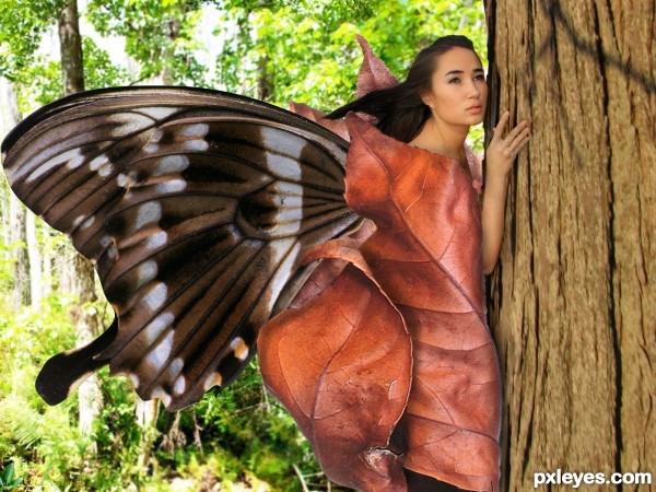
inspired by caterpillar to butterfly cycle. (5 years and 3407 days ago)
This is very lovely!
The only real visual discrepancy is that the woman is blurry when compared to the butterfly wing and the leaves around her, and the edges of your elements are too sharp.
I would suggest you use a small Blur Tool brush, with the "sample all layers" box checked, at about 20-30%, and go around your edges to soften them, and that you apply the Blur More Filter to the Wing and the leaves to make them less dominant in the image.
Really nice concept!
The idea is great, the only thing that missing is mood. Try to play with the adjustments layers specially Gradient Map, Solid Color with different layers mode.
thanks mossyb you are always a great teacher.. thanks for the comments.. it helps me improve.
thanks dreamboy i will try it next time.. thanks for comment..
Idea is great without any doubt...Dreamboy is right u should create some more layers to achieve moody feel...Also u could flip the girl up side down to get real position for the transformation in butterfly...If u have time made some changes for better score...Best of luck
thanks erathion.. truly i learn a lot from this site.. thank you guys..
Very nice concept ... agree it could have used a bit more "moodyness" but you are certainly headed in the right direction. Sorry my comment is so late!
thanks arca.
Howdie stranger!
If you want to rate this picture or participate in this contest, just:
LOGIN HERE or REGISTER FOR FREE
I do not know what is going on here.... it is as the Bermuda Triangle is swallowing a ship and a plain? That is what I see..... You could have done this to make the image look better.
1- Making the ship smaller and closer to the Swirl mouth, and setting a bigger plane in the foreground. Perspective plays a lot here. Just an idea.... Good luck!
Howdie stranger!
If you want to rate this picture or participate in this contest, just:
LOGIN HERE or REGISTER FOR FREE