(5 years and 3490 days ago)
- 1: source1

(5 years and 3493 days ago)
Howdie stranger!
If you want to rate this picture or participate in this contest, just:
LOGIN HERE or REGISTER FOR FREE

Pls Do comment.... (5 years and 3535 days ago)
hahahaah very cool
The ground is blurred compared to the rest of the image but great idea author. GL
Howdie stranger!
If you want to rate this picture or participate in this contest, just:
LOGIN HERE or REGISTER FOR FREE
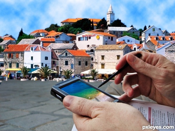
Credit: for earth image
NASA/Goddard Space Flight Center Scientific Visualization Studio, and Digital Globe/QuickBird; Space Imaging/IKONOS; MODIS Rapid Response Team, NASA/GSFC (5 years and 3633 days ago)
It looks good... is the earth screen suppose to be off... if not try to center it. also imo, try to make the reflection lighter. gl
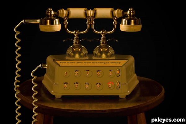
Great idea, Author! Only one remark, I think you have a bit overdone Bevel and Emboss layer style. The phone looks a kind of weird on the left lighter side, better lower the opacity of highlight mode option or change its blend mode. You can also touch Soften option. Well, it is only my opinion. Perhaps you have wanted to achieve some odd effect 
neat.. but yes you might need to work a bit as Cornelia suggested.. but still tht's just our opinion, if it was intentional we have no problem.. 
I don't know, for me it's perfect!... 
It's very good !  Nice job!
Looks great now 
Fine composition
Howdie stranger!
If you want to rate this picture or participate in this contest, just:
LOGIN HERE or REGISTER FOR FREE

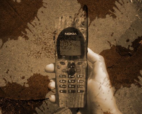
Thanks to horia varlan for the picture of the wood.
Thanks to thelastminute for the picture of the phone. (5 years and 3644 days ago)
High res would have been nice -- blending of the phone and the wood is hard to see with the grunge background and the single color. Try masking the wood over the phone then try various blending modes (a layer in overlay mode with a copy above in multiply is usually a good spot to start) Then play with the fill or opacity levels
PS . Look for a better wood source the one you have now is too blurry and will not blend as well as a sharper image -- good luck
Is it also a wooden hand ?
Nice effort.....
I think the splash layer has to be under the hand layer... 
GL
agrees with Alan
Howdie stranger!
If you want to rate this picture or participate in this contest, just:
LOGIN HERE or REGISTER FOR FREE
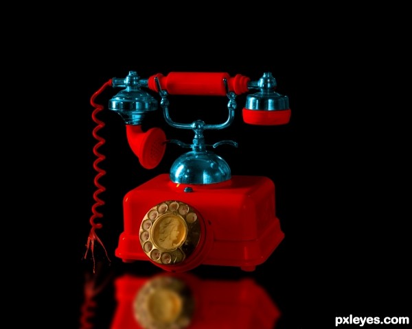
All you did was change the colour and added a normal reflection. Simple but imo it does look better from the original. GL
Well, yes...rather minimal, though nice. You got the reflection quite off, though--the reflection is tilted while the object remains flush against the ground.
realy need to fix the reflection i know they can be quite difficult with 3d objects if u want a mirror image. might be easier to do a more vague reflection using the same colors
I like the effect of the broken cable. And as it was said before, reflection is wrong (try to do it looking an object on a mirror, with the same perspective).
Howdie stranger!
If you want to rate this picture or participate in this contest, just:
LOGIN HERE or REGISTER FOR FREE