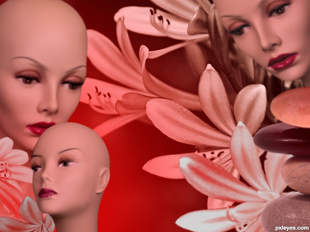
Many thanks to the following:
kgreggain for the models, topfer for the stones, and duchessa for the flowers.
I hope this fits the criteria! Only variations of red were used in making this image. (5 years and 3578 days ago)
(5 years and 3579 days ago)
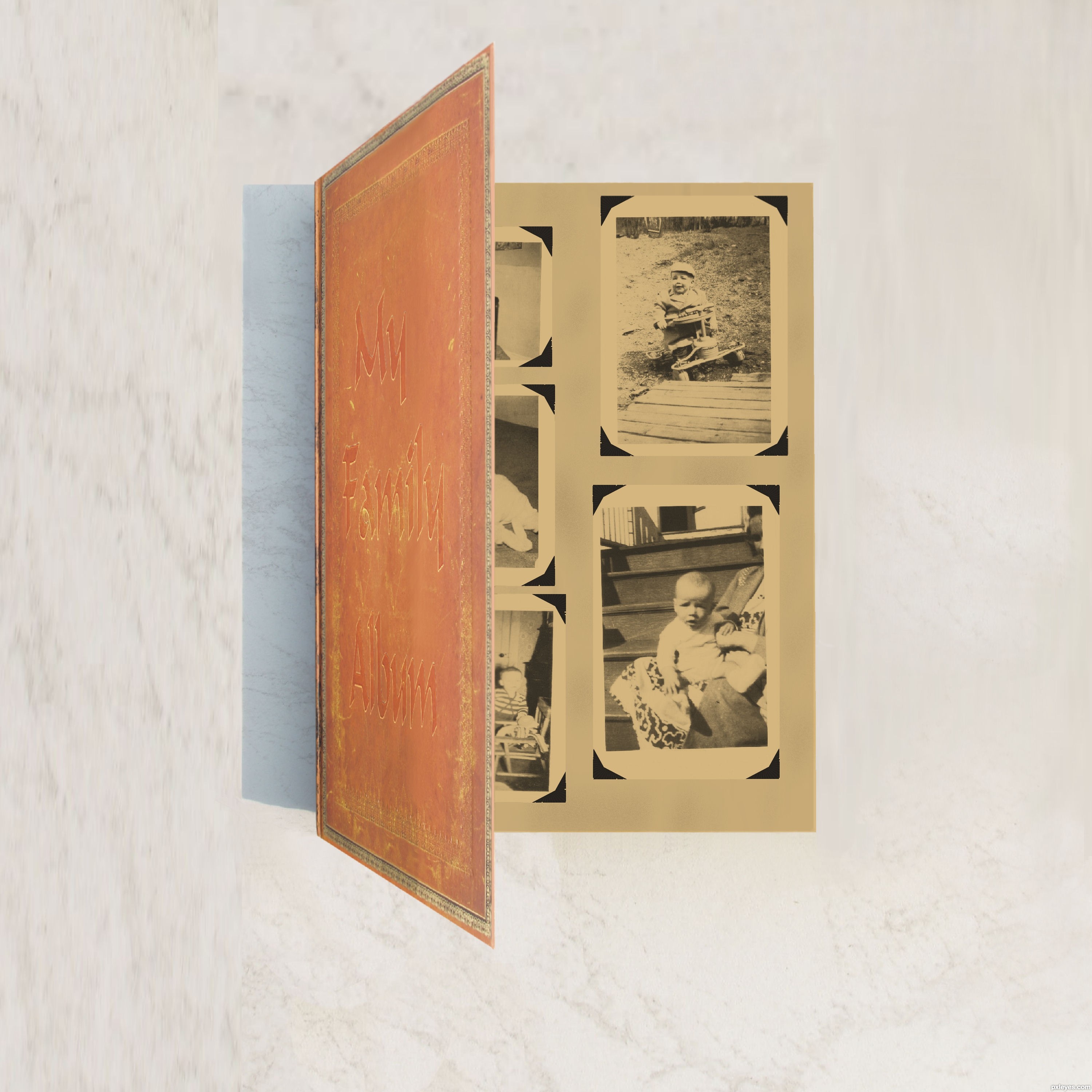
The cover is too garish, and the ribbon just stops abruptly. Try to make this more realistic, keeping in mind the cover could be more subtle. It also would have a light source, and hence a shadow. GL.
Thanks CMYK46 I hope this is what you ment. I did a little retouch far as the ribbon its just a marker and I didn't do anything with it. Its the same as original was same spot. I could have cut it out maybe?
Do you see how you made some parts a bit dark just on the edge of the binding of the book (to the left)? Trying doing that to the whole front of the book to give it an older look. Try giving it an overlay tone that makes it look older.
Thanks k5683 I did some changes to age it I think that was what CMYK46 was trying to tell me I added three colors to add some age to it does it look any better?
author... it's gud but cover is very bright.. and inner part is luk like old so give original book color to color than look like nice.. and your inner color(gray) that's need some grunge background than luk older book
i think you understand wat iam say
Ok Thanks all I have scrapped album and redid it I hope this looks better.I used original with adjustments.
ya.. it's seems gud but gray paper seems it creating paper so remove gray color and add old paper to your album
Ok Thanks here is change removing gray.
Howdie stranger!
If you want to rate this picture or participate in this contest, just:
LOGIN HERE or REGISTER FOR FREE
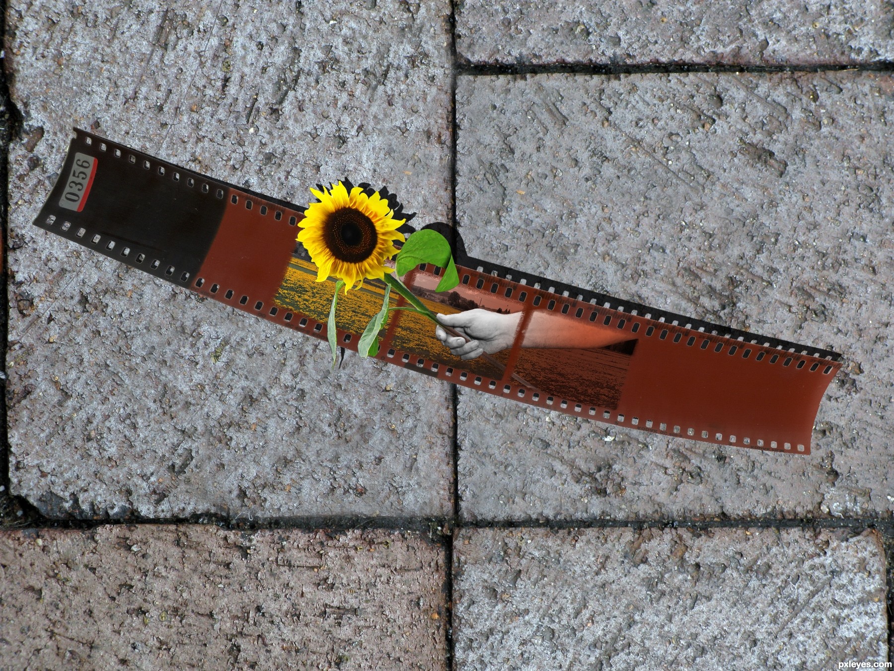
A forgotten photo negative, coming to life. (5 years and 3626 days ago)
Very clever idea! But if you put negative effects on the nega itself, it would be better IMO... 
I agree with Erikuri, also, if you want the flower to stand out more, cast the shadow downwards...and add a blur to the shadow too! GL 
I agree,but high marks for idea from me...good luck author
GL
like the idea so much ........... gud luck author ....... 
nice effect
Now that's a creative idea! GL!
Howdie stranger!
If you want to rate this picture or participate in this contest, just:
LOGIN HERE or REGISTER FOR FREE
(5 years and 3678 days ago)
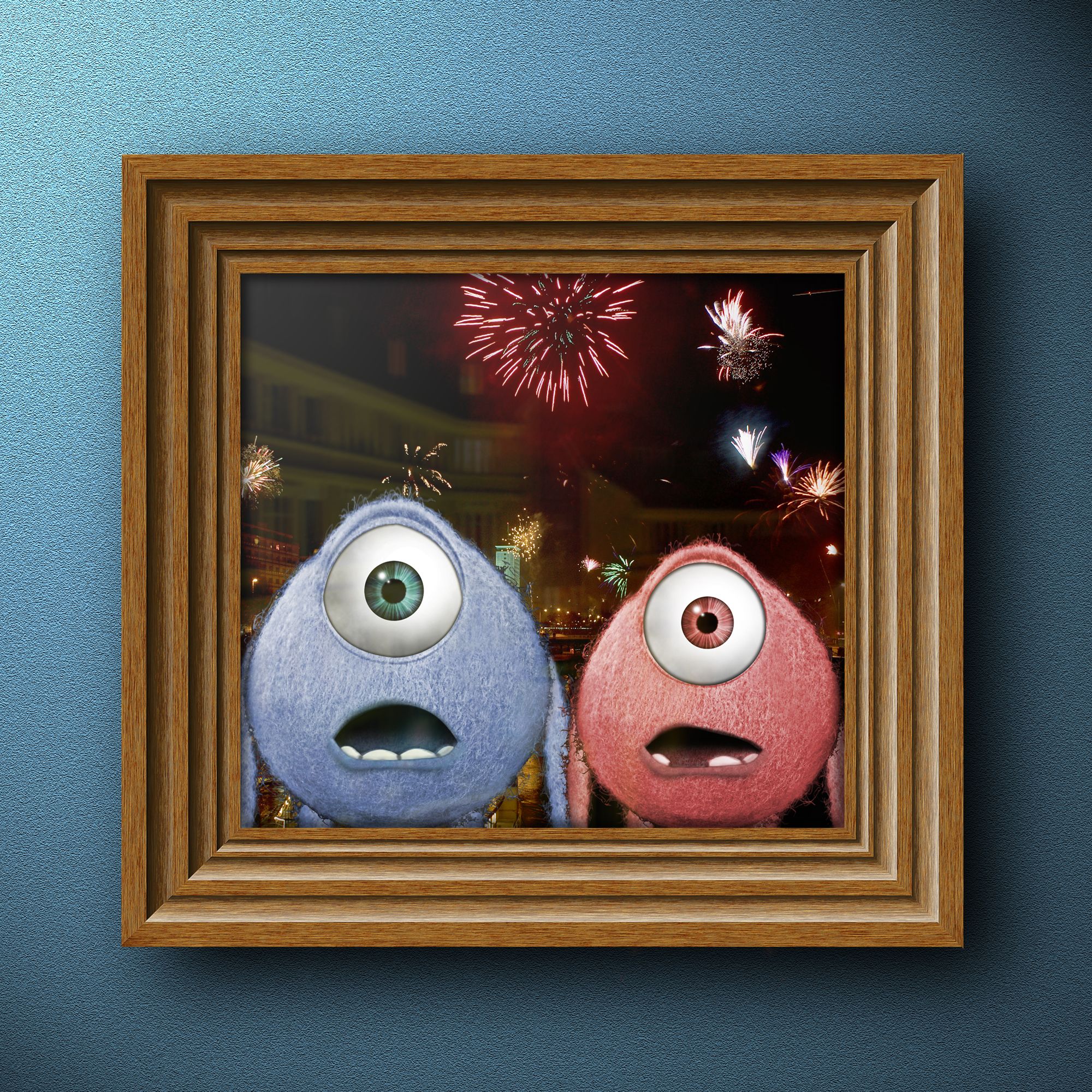
Monster's, Inc. characters are ©
EDIT: I hope they don't pull it either. Just a suggestion, maybe put the texture of the tennis balls on them. It would match the source better and be less like Monsters, Inc. because right now it doesn't seem like you used the source much and without an SBS, I can't tell. GL!
I'm almost sure this is an HOMAGE to Wazowski's old avatar.. hehehe... (and because it's not a direct copy.. I'm sure it will be okay) AUTHOR.. red flag this yourself so you don't get pulled... but I'm pretty sure you are in the clear.. GREAT JOB
There have been more waz entries on this site than I can count, and I've never seen any pulled.
Very funny! It's possible to see the tennis ball texture, but uploading your sbs you'll avoid troubles... Good luck!
tx for the comments SBS added...
woow, very creative idea and it looks so funny
haha i'm in love!!! nyahaha
Its very good that u changed the mouth of the second creature... nice... GL.
Haha nicely creative! Good work!
Awesome
very nice...well done author...good luck
NICE work... glad to see someone hasn't been too lazy and masked out the ball fur, well done!! Just a comment imo a bit blurry where you've cloned out the white seam thingy!
Congrats for your second place, Brandon!
Congrats! for 2nd
Congratulations for 2nd
Congrats!
Howdie stranger!
If you want to rate this picture or participate in this contest, just:
LOGIN HERE or REGISTER FOR FREE
special thanks to creations. (5 years and 3688 days ago)
author.. please supply your sources (even if it is your own picture you have to put a copy of it into your step by step) very on theme image.. hate to see it pulled on a silly technicality
(just go to my stuff, my contests and click the add SBS thingy on the bottom) and up load the original pic and/or source
IT's a shame you couldn't get a more in focus picture. Yeah as Drivenslush said, just stick the pic in your SBS and you will be fine. You have to make an SBS anyways so the mods won't remove it.
nice idea
Howdie stranger!
If you want to rate this picture or participate in this contest, just:
LOGIN HERE or REGISTER FOR FREE
Photography and photoshop contests
We are a community of people with
a passion for photography, graphics and art in general.
Every day new photoshop
and photography contests are posted to compete in. We also have one weekly drawing contest
and one weekly 3D contest!
Participation is 100% free!
Just
register and get
started!
Good luck!
© 2015 Pxleyes.com. All rights reserved.


For the moderators: Image is now correct? (I hope)
Howdie stranger!
If you want to rate this picture or participate in this contest, just:
LOGIN HERE or REGISTER FOR FREE