view Highres before voting. (5 years and 3700 days ago)
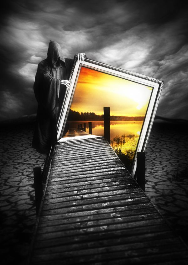
Sorry if the resolution is not that high, it depends on the sources. Also, to avoid misunderstanding that this work can be off theme, I explain the center image is just the photo, so actually this is the world without water. (5 years and 3703 days ago)
ohhh wow.. well done gl 
I don't know if you didn't put the stakes of the bridge of this side on purpose, but it's only a detail. Very, very impressive work! GL! 
Why doesn't the reaper have a right hand?
great work...good luck author
Thank you for commenting. @erikuri: hmm, it'll be better with some stakes, right? So I'm doing on that ^^. @jawshoewhah: he doesn't have foot and face, too :p. However, because of your question, I will make some changes  , thank you very much
oh.. scary......good job! 
love it, very clever. 
Wonderful! 
love this
Well I'm glad you could see where I'm coming from. Looks better now. GL! I think you got another winner 
dammn thats nice
very nice good luck
wonderful ! 
light come from behind as yo see by the reaper so i miss some shadows, just my mind, but a really great job gl.
realy scary, gr8 work!
Stunning work....Amazing creativity and imagination.....Great vision.....
Congrats, nice work and really creepy 
Congrats for 1st
Congrats, very creative!
Thank you for your congratulations, I love you all 
gratz
Congrats! Nicely done!
Congrats! 
Congrats for your first place, Langstrum!
Congrats
Great work,Congrats ! 
Thank you my friends ^^
I can see how this got first place. Simply amazing work.
Howdie stranger!
If you want to rate this picture or participate in this contest, just:
LOGIN HERE or REGISTER FOR FREE
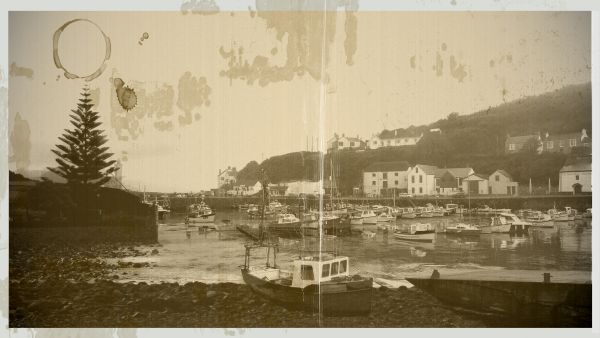
harbour, boats,old (5 years and 3713 days ago)
this is really pretty, really well done ...GL :P
Nice work,very realistic....good luck
Nice result, it's believable for sure. Maaaaybe you could make the pine a bit lighter so you see more color (or maaaaybe my screen needs a color check...), but that would be about it. Good luck!
Good work!
nicely done.......GL
good blending  gl
gl 
congrats....
Congrats for your second place, Kathy!
Congrats on 2nd!
good effect
Howdie stranger!
If you want to rate this picture or participate in this contest, just:
LOGIN HERE or REGISTER FOR FREE
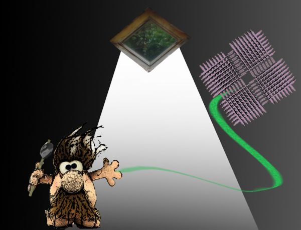
a caveman that lost his kite.
(thanks to Imamon)
btw im 14 (5 years and 3721 days ago)
i think i would've used some more time chopping 
lol..

Howdie stranger!
If you want to rate this picture or participate in this contest, just:
LOGIN HERE or REGISTER FOR FREE
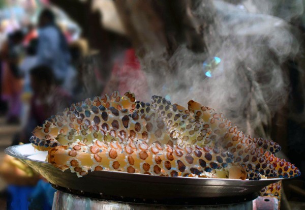
Nothing to saY:P (5 years and 3758 days ago)
there is blue sky in the horsetail. the "steam" is coming from behind it. you didnt cover a piece of corn on the left.
I cant understain you . what u want to say , i think that the smoke is ok.
it doesnt look like it tastes good 
There is blue scky from the original source image. Color replacement would have helped.
nice job 
thank you all.
Howdie stranger!
If you want to rate this picture or participate in this contest, just:
LOGIN HERE or REGISTER FOR FREE
very nice , voted against myself here..... lovely work! good luck
killer image, great work!
you could make the flames a little more hehehe, kidding, it's perfect
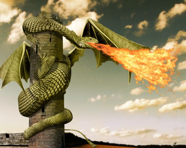
Nice work with the shading, I like the claws too. The lowest part of the tail on the left side can do with a bit more masking and the turn around the tower looks like the dragon has a knack there. If you make the turn from the tail shorter, it will look more natural curved. But well done for the rest! Good luck!

Edit: tail is fixed, including the masking
Great job
thanks for the tips wazowski. i believe i fixed the turning problem of the tail (you was absolutely right), but i'm sorry, i can't tell where is the masking problem.. anyways i hope it's better now.
it seems like your dragon is burning its wing, at least that's what i see. otherwise, i like the idea, good luck to you
Wow... \o/!...
Fantastic work...Few minor observation...fire is just a bit strong and unnatural...and i think that the wings are to low...They have to start in the line of front legs...Beside that...fantastic thing...good luck author
not an awesome entry................ But Its an extra ordinary... Fantastic one......!!!! claps for you...!!
Flame could be better blended in Multiply mode...
My Favorite....!!
niceeeeeeeeeeeeeeeeeeee
i tried different blending modes and different settings for the fire, i was most satisfied with this one.
better without the fire
Really nice chop Author! Well done
thank you.
aaarrggghghh, I've set fire to my bloody wing !!! lol Nice well done
nope. the wings are behind the flames...
nice!
In the top 2 for sure, congratulation in advance
nice!!!
Congrats for your second place, Inanis!
congrats for 2nd place...
congrats !!
thank you all for your high votes, favs and comments.
Congrats!!
Congrats!!
Congratz to 2nd
Congratz to 2nd
Congratz to 2nd
Howdie stranger!
If you want to rate this picture or participate in this contest, just:
LOGIN HERE or REGISTER FOR FREE