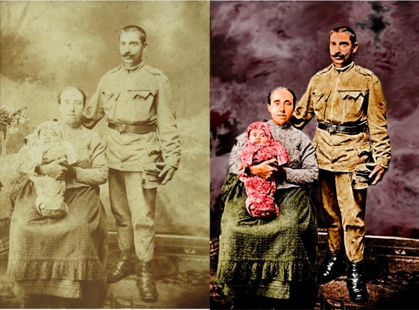
I found this photo in stock exchange. I thought it would be fun to work with it. (5 years and 3761 days ago)
- 1: photo
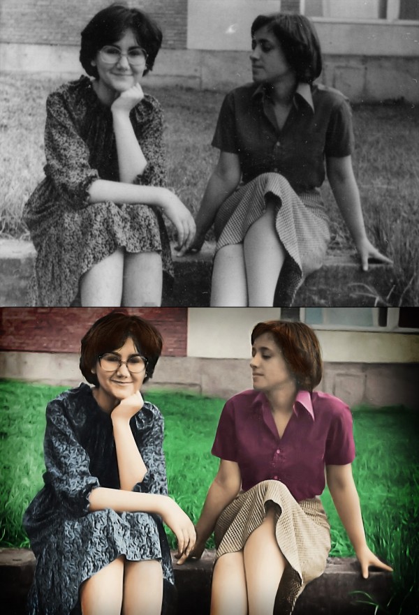
This is a photo of my mum and her best friend taken 33 years ago while they were still in high school. The photo is really small, I'd say as an average business card, so it was really hard getting it to look sharp. I used a special technique for making the edges look normal (since sharpening filters know to make that strange blurry glow on some places), check out the SBS. I also used some other images from flickr for facial parts and parts that were to small to be sharpened with filters (eyebrows, glasses, nose....), it's all listed in the sources.
Hope you like it. =) My mum sure did, she even made me some cookies :D
(5 years and 3763 days ago)
Well done. My favorite part is the look on the face of the girl on the left. She looking at the other girl as if to say, "Don't move. There's a huge bee on your shoulder" while girl 1 is blissfully unaware of the impending stingage. Great job. I'm looking forward to the SBS cause the edges are fantastic. The left eye of the girl with glasses looks like it's half closed. Not sure but it's the one point I see that looks a little unnatural.
Very nice work! In my opinion however, the skin and especially the grass looks very unnatural, i'm really no good at this type of thing so i wouldn;t know what to suggest, perhaps some different shades of green around the grass.
Thanks for the comments guys! Glad you like it =) The SBS will come during the day, I planned to finish it about now, but something came up, I really really have to go now.... Doesn't matter anyway if I lose a bit of reputation, just hope they don't expell it. =)
Oh, and about the grass and the skin.... Yeah, the skin really looks kinda... 'painted' in some parts, probably due to sharpening filters... I'll make sure I fix it.... =) However, I do like that the grass is blurred, kinda looks out of focus, and I really like the effect =) About the eye, hmmmm, it kinda does look half-closed.... Tho I didn't mess with her eyes, couldn't match any I found only with my mum's (the one without glasses)
the grass is surreal, its cool
Thanks all, I added the SBS. =)
An update.... I fixed the skin, and I did some touch-ups to the hair. =) Hope everyhting is OK now =)
You missed a lot of scratches that could have easily been fixed.
Wuuuuuuuuuut?! Where?! O.O I can't see what you mean.... I just can't see what you're aiming at? Have you looked at the SBS?
imo, there are still a number of areas that could be a lot better. the heads and hair on both ladies could be much better, in hi res you can see this...your mother, the one with glasses, her face needs some more work, her nose is not finished well........her arms also look like prosthetics, especially the left one, they lack definition.....imo
Hmmm, some parts could be better, but only if I used external sources for those parts, since they are to blurry. You must understand that the photo is not bigger than an average business card. I tried to do my best here, edges are much sharper, you must admit, but some things just can't be sharper.  Besides, TBH, I think this is maybe the only entry which has cleaner outcome than the original. Most of others are just colouring and scratch-removing and simple usage of filters.... Some are even blurrier than the original.Considering the original, the outcome is great IMHO.
Ummmm....nice work on your entry, but your last comment wasnt true .....Other entries did come out cleaner and sharper.... besides that, you shouldnt be putting down other entries to try and make yours look better.
TBH, I see only 3-4 entries in this contests which are cleaner sharper than the original. Others are just colouring and scratch-removing. I'm sorry for maybe putting down the other entries, I was just pissed off by the fact that I spent hours manually making the edges sharp and clean and even using outside sources to bring up the detail on faces etc and then somebody says that it's scratchy and blurry etc. I mean, maybe it is, but compared to the starting photo it's much better.  peace
peace
great 
Well i thought this should of made top 4 at least.....i have to say that the results are very dissapointing and just dont seem right.
Howdie stranger!
If you want to rate this picture or participate in this contest, just:
LOGIN HERE or REGISTER FOR FREE
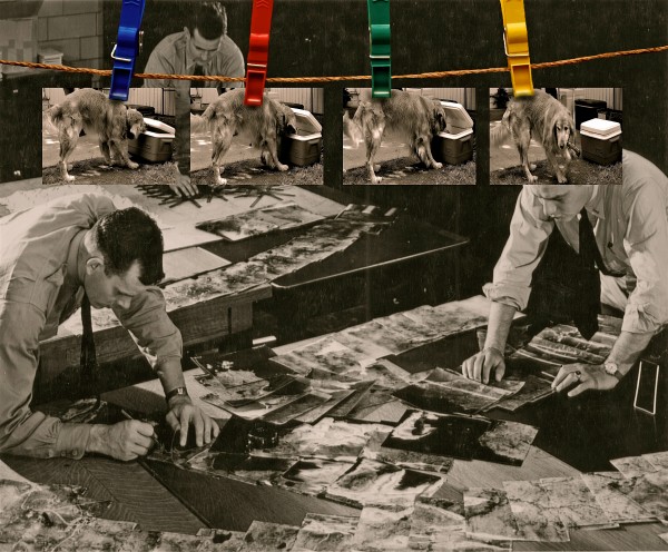
Who has stolen the beer for the new years party!! (5 years and 3764 days ago)
Glad to see someone is on the case. Very original.gl
Great idea. If you could make the pins greyscale or even wooden to fit the rest of the picture I think it would fit better.
The photos on the pegs should not be so perfectly straight.
Thanks for the suggestions chaplain& solkee, sorry it's toooo late to do anything about it ....or I would have.
agrees with previous comments. better luck next time
Howdie stranger!
If you want to rate this picture or participate in this contest, just:
LOGIN HERE or REGISTER FOR FREE
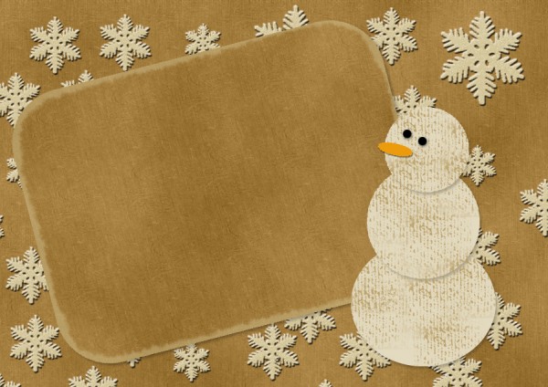
Thanks to lusi at sxc.hu for stock image of snowflake and pshero.com for grunge brush (5 years and 3776 days ago)
this is good i like,and liked you stp by step,good luck
very nice entry.... gl
Very appealing with a very informative SBS. Is the big blank space where one would write a personal message? I think this would be an even stronger entry if you were to write in your own non-trite, heartfelt message that matched the charm of the card you've created here.
This entry will do for a nice stock after the constest is over 
Howdie stranger!
If you want to rate this picture or participate in this contest, just:
LOGIN HERE or REGISTER FOR FREE
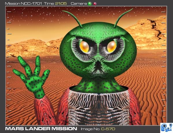
I had just seen the trailer for a new movie called "The Fourth Kind" where those abducted kept seeing owls which were actually their alien captors. I guess this guy must be an "Owlien". His message to Earth: "Let me have two 8x10's, six wallet size prints and Angelina Jolie's phone number."
Only background is outside source all else contest source and photoshop. (5 years and 3794 days ago)
looks real good... good luck
Oh come on, everybody knows Martians have THREE eyes!  (Good pic, author).
Very very nice work...i love it author....GL
love the colours you have used. great alien skin. great use of source.
good work,gl
Too funny !!!!
Original idea and well done!
LOL 
Let me guess...It's a mutant martian leprechaun. Only the big green hat with martian shamrock symbol is missing LOL! 
Howdie stranger!
If you want to rate this picture or participate in this contest, just:
LOGIN HERE or REGISTER FOR FREE
Why is that man wearing a dress? :P Excellent coloring.
Nice restoration. The skin looks a little red, great job otherwise.
what the hell is with the smudge tool and the background?!
I bet they only had one kid, she looks more butch than he does....
You made this look more like a painting than a modern photo...
The skin tone looks very orange and the background is not remotely like the original.
nice
Howdie stranger!
If you want to rate this picture or participate in this contest, just:
LOGIN HERE or REGISTER FOR FREE