
guess the water fall how it looks (5 years and 2934 days ago)
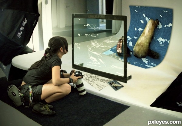
With the violence of today, some adventurous are choosing to do indoor expeditions. (5 years and 2944 days ago)
Nice idea and good source find. Only thing for me is that the seal looks a bit too cut out. You wouldnt prefer to keep the body from the seal as how it is in the source (head has a good transformation!)? Good luck!
thanks my friend, i will make the changes.
Congratulations on the second place 
Thanks!!
Congrats!
Thanks!!
Congrats!!
Thanks!!
Howdie stranger!
If you want to rate this picture or participate in this contest, just:
LOGIN HERE or REGISTER FOR FREE
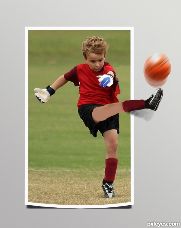
My first attempt at out-of-frame work, helpful advice would be welcome! (5 years and 2988 days ago)
Its a very nice attempt and effect you realized, after looking at your work i got an idea. your picture is laying on a table.. the ball is like a marble laying on top of it, just like now except its missing the background. holding off my vote in case you want to play with it
You're so right. I added a shadow to the ball, but it still seems to be just sitting there on the picture, not actually flying out of it. Hmmm, I'll see what else I can do to it...Thanks!
Ok, I gave some motion blur to the ball, and moved the shadow. I think that helped a lot, although I think I may have added too much blur...Thanks for the advice, this is definately a nicer chop.
Thanks so much for the help!
I like what you've done author. I'm a big fan of O.O.B. imaging. Perhaps if you crop the picture on the left or right side and allow either the hand or foot to go 'out of bounds' with a shadow cast on the table it might help prevent the ball from looking like it is just bouncing. Right now, it's the only item that is defying the 2D rule. Does that make sense? Nice job, author!
smudge the edge of the ball very soft n slightly to get it nicely rounded again and you get rid of the dark line around it.. perhaps a soft blur will help too on the balls edge.. its a great improvement author.
ok, I swear this is my last attempt. Even with my poor drawing of the new leg and foot, I think you all have helped me create a much more interesting chop. Thanks for all the help!!!!
dont think the drawing of the leg was such a bad attempt at all to be honest lol my own drawing skills are far worse  yur chop for sure got more interesting, and you might not want to chaneg anything else here anymore which i can understand very well but for your next chop you have a lot to take with you in consideration
  .
.
Howdie stranger!
If you want to rate this picture or participate in this contest, just:
LOGIN HERE or REGISTER FOR FREE

My Nephew's new Photo Frame. (5 years and 2996 days ago)
Very cute kid, very cute frame
Howdie stranger!
If you want to rate this picture or participate in this contest, just:
LOGIN HERE or REGISTER FOR FREE

(5 years and 3053 days ago)
The roof looks uneven and blotchy, and the faces are a bit too dark.
Thanks MossyB - I've tried to fix it up a bit - thanks for your help 
you have missed a few scratches right next to the kids legs and the bottom edge is showing little scratches too. you tried well to restore the damage face but you can see half the hairband from the original face that was there. either cover it completely or keep the childs original hair completely then it doesnt get noticed as fast that its the same face as another kid. Maybe you could even flip the face so it looks a tat different when its mirrorred. the child far on the right, in the middle of her shirt is a scratch too. at first it looks like its the line of her jacket/shirt, but its going straight thru the buttons at the bottom so it cant be a clothes edge, its a scratch or a fold.
Thanks Eladine - I'll tackle some of your suggestions as soon as I get a chance. Thanks for your help 
looks like you got to fix them things. good improvement 
Howdie stranger!
If you want to rate this picture or participate in this contest, just:
LOGIN HERE or REGISTER FOR FREE
Howdie stranger!
If you want to rate this picture or participate in this contest, just:
LOGIN HERE or REGISTER FOR FREE