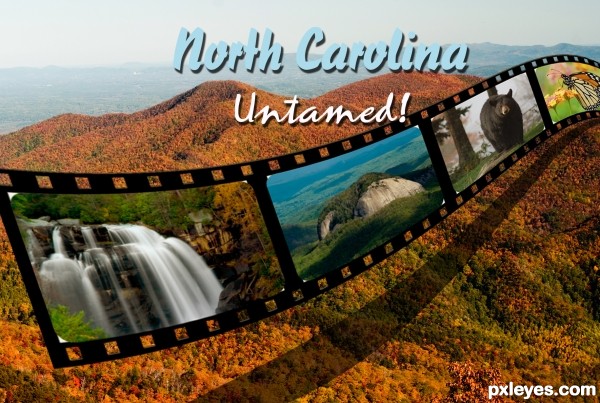
this is a bit improved from my first upload. here I used the beveled layer effect on the filmstrip to give it more of a 3d feel.
used the filmstrip tutorial found on photoshop roadmap (5 years and 2785 days ago)
(5 years and 3225 days ago)
 love it! You are quick on the draw author I was gonna do something similar. You done good.
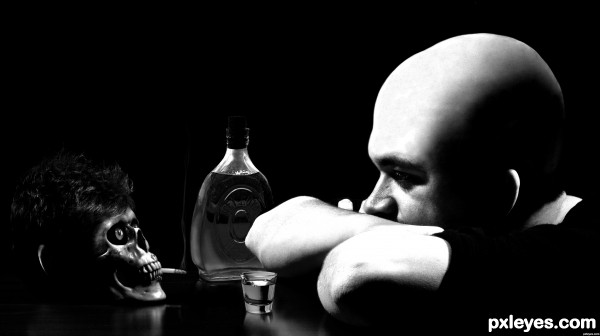
funny how you switch hairs...
LOL......yes....funny......and very clean. folks will think that it is an origin photo not a manipulated one....
Great job, great switch ... love the title and the bottle and shot glass add a perfect dimension to the image!
Really good work author! (I knew it was a toupee)
nice and perfect
thanks for the comments folks.
lol very good!
Brilliant composition and excellent humor.
Congrats Glockman, awesome work 
thanks all.
Congratulation on your 1st place!
Congrats!!
congrats
Howdie stranger!
If you want to rate this picture or participate in this contest, just:
LOGIN HERE or REGISTER FOR FREE
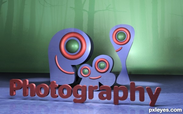
I was thinking,more about pxleyes wallpapers,than ads,banners.But,You may use them in many ways.I was creating simple 3d logo and play fun with different textures and setups.Almost pure renders,so no PSD,no layers.More in SBS. (5 years and 3282 days ago)
cool creation author
very nice,......pxleyes wallpapers ? .....aha...I thinks it will be interesting contest's theme for the next contests to come....

super cool work...gl
nice depth on this one
Cool 3D look 
Thanks for Your comments and votes.
All 5 walls,in full resolution 1440x900,You can download here:
http://basickind.deviantart.com/#/d3fd5kj
or my PXLeyes album section.
Howdie stranger!
If you want to rate this picture or participate in this contest, just:
LOGIN HERE or REGISTER FOR FREE
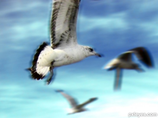
Using only the source and adjustments, with abit of filter help, this is what i came up with (5 years and 3436 days ago)
I have to disagree.. this is good photography, amazing it would be a flying Burning seagull !!
It show movement. I like it..... good luck.
Howdie stranger!
If you want to rate this picture or participate in this contest, just:
LOGIN HERE or REGISTER FOR FREE
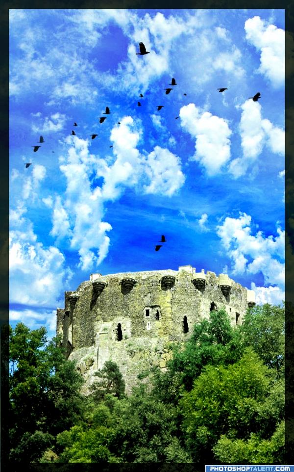
Imagine if we could take pictures as beautiful and colorful as that!
Thanks to svenic and asifthebes. (5 years and 3944 days ago)
very nice
very good! gl
good, but too much contrast
good
Decreased the contrast and color a little.
alfred hitchcock eat your heart out...
i agree with the description  but it's a bit too much for me personally (the color) so if you have the vibrance option (not sure when it was introduced in ps), lower it a little bit. if not, contrast or even reduce the saturation by a few points.
Highly decreased the vibrance and saturation in some parts like the castle.
cool
Howdie stranger!
If you want to rate this picture or participate in this contest, just:
LOGIN HERE or REGISTER FOR FREE
Howdie stranger!
If you want to rate this picture or participate in this contest, just:
LOGIN HERE or REGISTER FOR FREE