(5 years and 3562 days ago)
- 1: source1

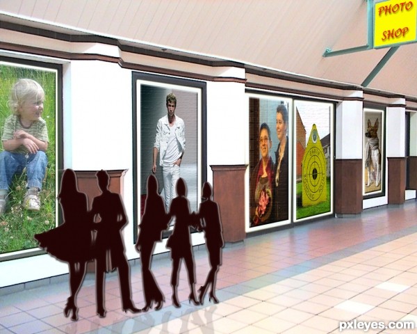
This is my interpretation of a "photoshop"
(a store/or shop where you can by pictures/or photos)
thanks to eqphotolog for image of store (514786)
thanks to biewoef for image of people (1146297)
(5 years and 3568 days ago)
Good idea, but I think it get a better effect if the people were real and not twodimensional siluettes.
ok, thank you for your comment, I'll see what I can do
Yeah. Real ppl instead of silhouettes.You should work with the sign too, not very stylish at the moment. The colours and font looks like a cheap oriental junkfood shop or something 
i think the outlines of people isnt as effective as real ones
You can put real people and lower the lighting, creating a shade on them, for example... 
Howdie stranger!
If you want to rate this picture or participate in this contest, just:
LOGIN HERE or REGISTER FOR FREE
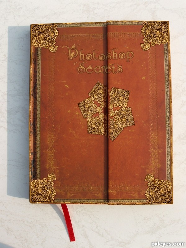
Hello everyone I hope you like it! For this I used no sources other than the one provided. I used gradients and allot of the elliptical marquee tool. 64x64 image is in the SBS. (5 years and 3581 days ago)
Congrats! 
Congratulations for 2nd
thank you all 
Congrats
Howdie stranger!
If you want to rate this picture or participate in this contest, just:
LOGIN HERE or REGISTER FOR FREE

Thanx to barefootliam from DA (5 years and 3582 days ago)
Need a clear break in the letters where the two covers meet -- as was done with the snowflake-thingy in the center (but with a recognition that the left-side-cover portion needs a shadow from the right-side-cover portion).
ya.. thank u now i did..
Howdie stranger!
If you want to rate this picture or participate in this contest, just:
LOGIN HERE or REGISTER FOR FREE

(5 years and 3602 days ago)
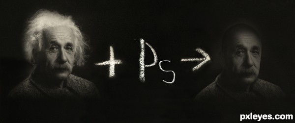
Clever idea...but it would be better if you could make Einstein look as if he was drawn in chalk. Right now...it has only a chalk center.
I 100% agree,..... actually I have made Einstein in chalk but the result is not good,...if I were good at painting......
nice idea .......... all the best to u ........... 
Funny! 

Howdie stranger!
If you want to rate this picture or participate in this contest, just:
LOGIN HERE or REGISTER FOR FREE
less glow and this image will be a lot better
thanks for advice
I agree with elficho.
this image is pretty cool
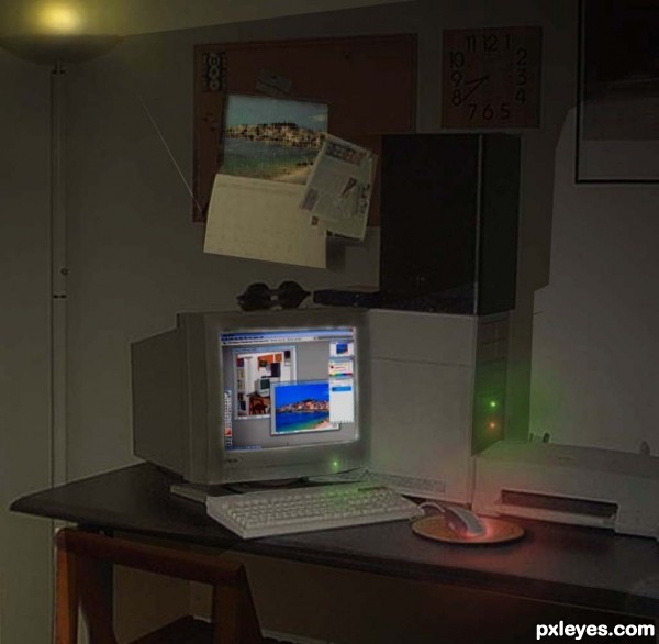
This could be done with any "Photoshop this"-type contest. Plus the illumination from the floor lamp/torchére is a bit strange (too constrained). I personally would like an image that tells a more coherent and compelling story driven by the contest pic itself.
I was thinking the same thing, but not only with this entry this week
Howdie stranger!
If you want to rate this picture or participate in this contest, just:
LOGIN HERE or REGISTER FOR FREE