(5 years and 2608 days ago)
- 1: Lakela notified
- 2: lolahowle
- 3: Vorstius
- 4: itchys
- 5: uberculture
- 6: patman7 notified

(5 years and 2608 days ago)
no sources used for this entry
Please refer to SBS to see how I made it. (5 years and 2789 days ago)
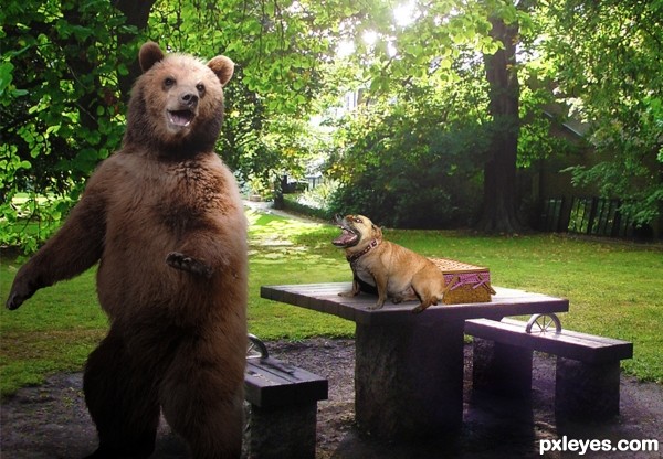
Beautiful work, author! Love the basketweave, napkins, straps... 
Thank you very much!
Completely agree with pearlie about the napkins and basket weave. I just love the color of the napkin. Well done  . Good Luck.
Thank you for comments and fave 
fantastic idea and I really like your use of styles.
Thanks very much!
fantastic idea and I really like your use of styles.
Right on target 
Thanks for comment and fave.
it's fabulous !! love it
Thanks lolu!
Great use of the shape and also a great entry 
Would make a good icon.
Thanks very much Rob. 
Excellent work and a fabulous sbs too, thankyou 
Thank you madamemonty, and thanks for looking at sbs 
This is amazing piece of ingenuity. Just WOW! 
Thanks very much bcabilan 
Hearty congratulations !!
Well Deserved Congrats!!!
Congrats, well done! You had me at the wicker! 
Congrats on first! Such a wonderful entry and it looks like it was a lot of fun to make. 
Congrats  wonderfully done
Congrats!! nice work.
Thank you everyone for all the nice comments, congrats and favourites for my entry.
Congrats Valerie, beautiful work!!
Congrats !
Howdie stranger!
If you want to rate this picture or participate in this contest, just:
LOGIN HERE or REGISTER FOR FREE
1 sources only, own photograph (5 years and 2922 days ago)
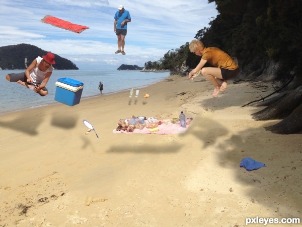
I like the idea especially the cooler and guy with red hat. It seems to represent the best light source from the beach. One suggestion for you...perhaps lighten or 'brush' away the tops of the shadows in the layer mask with a 50% opacity brush. This might help give the shadows some depth. Also, if you squash the shadows a bit...more like 'flatten' them by distorting them they will have a more believable plane. Does that make sense?
Thanks, I was hoping somebody would come up with some suggestions for improvements.
I think he is a she (the 'guy' with the red hat, that is). 
I agree with pixelkid with the shadows perspective, I would work a bit longer on some of the masking. Mostly the woman on the right around the head region. Also The guy behind the towel keeps distracting me. I don't know if its the location or that he is right behind the towel. I would try to move the guy closer to the ground and see if it helps with the composition. Although I could be wrong. Good Luck!
I have uploaded a better version, (I hope), further suggestions are welcome.
Using Gaussian blur on the shadows will make them less sharp (and warp will shape them also) , and running a blur tool brush over your masking edges help images to blend better (Using distort to make the shadows more perspective correct helps a lot as well (if you don't have warp) )
But the more you practice the more you figure things out, this is a great effort.. (Reduction of the amount of floating things might help as well, less is more  ) but that could just be me and always IMHO
Howdie stranger!
If you want to rate this picture or participate in this contest, just:
LOGIN HERE or REGISTER FOR FREE
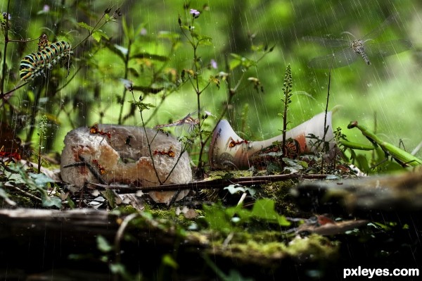
Not much, tried to get things as natural looking as possible. Masking out all the different elements was the real challenge. Otherwise this is a very simple entry.
Be sure to check out the high res to see all the details.
Edited (5 years and 3595 days ago)
Make sure to check out the high res!!
Nice mood! Just a few suggestions; Blur the insect on the right above the tree to create a nice depth. The insect will look like its more in front. (you could also do that to the insect on the left) Also blur the rain drops that are in front of the fallen tree, because they are even closer then the tree itself they should be blurred at least that much. Brighten the upper part of the cup a lot and darken the lower part more because there is stronger light coming into the scene. Good luck!
Thankyou for your tips Ressiv, I have reworked the rain as you had suggested, something that I had meant to do to start out with. Also fixed the shading on the cup and the blur on the front lower part of the left ant as well as blurring the preying mantis a bit . I am happier with it now, how does it look to you??
Getting better! You could blur the rain in front of the fallen tree even more. If you see how blurred the tree is and considering the rain is in front of the tree it should be blurred as much as the tree or even more. But it's a cool scene anyway! 
nice work and a beautiful entry........... but i dont feel the ant's are in a picnic mood .............. all the best to u........... 
Cup could be intact, many people throw it that way (it's desgusting to see trash in any place than trash can...) Very well done, gl!
Howdie stranger!
If you want to rate this picture or participate in this contest, just:
LOGIN HERE or REGISTER FOR FREE
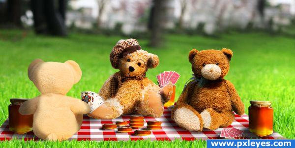
- Ey, you play unfair...
- No...
- Yes...
- I won! Pay honey now...
:) (5 years and 3846 days ago)
That's great!! Wow!
so cool.. nice job!
This is really cute and well done! Perhaps soften your edges. Right now they are a bit harsh...
Gotta love full house Aces and kings... and betting honey... love this entry!
Poker playing teddy bears... Very funny idea  And really cute with the little bear on the back of the cards. I'd love to know, what the other bear with the glasses has for a hand
  Good luck!
Haha! Very well done!! And high-res is amazing  GL
GL 
great job author!
I like this a lot! The expressions are priceless. Shadows are such a tough thing - the poker chips and cards on the blanket look like they are floating (bears a bit, too). Great choice of bears and the masking is outstanding!
nice work
Very cute!
Very cute.......Nicely done.....G/L Author.
Glückwunsch zum 3. Platz!
Congratulations for 3rd
Congrats 
Congrats!!
thanks! 
Howdie stranger!
If you want to rate this picture or participate in this contest, just:
LOGIN HERE or REGISTER FOR FREE
LOL!! Love it!
Howdie stranger!
If you want to rate this picture or participate in this contest, just:
LOGIN HERE or REGISTER FOR FREE