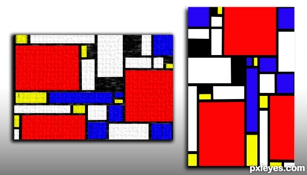
Pieter Cornelis "Piet" Mondriaan
http://en.wikipedia.org/wiki/File:Mondrian_Composition_II_in_Red,_Blue,_and_Yellow.jpg
work of a master
PLEASE view the image to this link to see where I got the idea for this image (5 years and 3317 days ago)
1 Source:


Nice to see a Mondriaan , have to admit I'd like it more if it was made with brushes instead of vector lines. I'm pretty sure the entry would "live" more by using different textures and/or brushes. Good luck!

PS the international name is Mondrian, but I'm glad you used the original Dutch name
Love Mondriaan...well done, author! Agree with above. Textures and brush strokes really help make Mondriaan so stately and detailed. If you add that to this great foundation you'll really improve this!!

EDIT: I'm likin' the textured one!
Okay Guys.. over texture version just for you coming up
 (he loved it, cause it made it so much interesting) but still drove him nuts
  5 thumbs up for each of you

Edit one version for you guys (over textured on purpose to be cheeky, then super clean version in honor of Victory Booge Woogie, which he constructed out of cut plastic and paper (thus no textures would be apparent.. I personally think Mondrian would have had a blast with vector graphics, he was always evolving with refinement (though not using green was very frustrating) used to drive my professor nuts
Great selection author...this is so effective...well done
There was no need to mention that you're entry was "pulled by mods". If you insist on stating that then you should explain that you were given a warning because you didn't provide the link or image as required by the contest description.
Very interesting work!
Howdie stranger!
If you want to rate this picture or participate in this contest, just:
LOGIN HERE or REGISTER FOR FREE