(5 years and 2505 days ago)

(5 years and 3101 days ago)
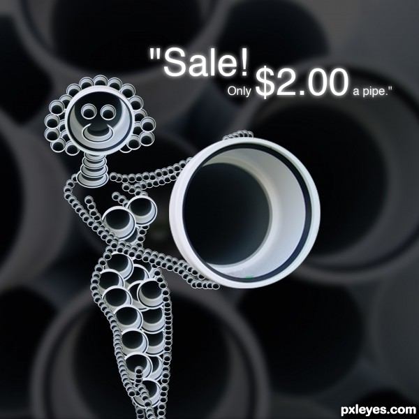
Very original! The text needs a bit of work - "Sale! Only $2.00 a pipe." (Translations into English can be somewhat small for clarity...)
I like the weekend flyer feel.. good luck author 
her neck looks more like Thailand tribal women, hehe, nice idea, good luck
interesting approach..very original  GL!!!
GL!!!
Howdie stranger!
If you want to rate this picture or participate in this contest, just:
LOGIN HERE or REGISTER FOR FREE

(5 years and 3216 days ago)
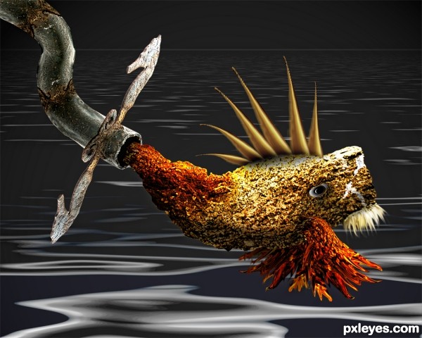
cool looking fish...is she/he eatable for all or just for plumbers...
Howdie stranger!
If you want to rate this picture or participate in this contest, just:
LOGIN HERE or REGISTER FOR FREE

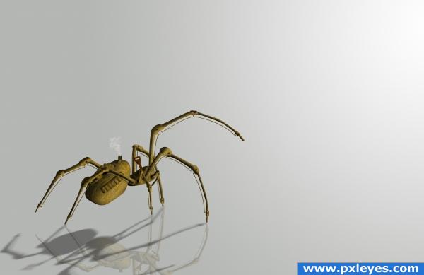
Oh well... This is the first time I ever attempted something like this lol...
Please watch in High Res and comment... Need advices as where I made mistake and where I need to improve...
Well I dunno whether I will be able to implement it now, but it will be useful for me in the future...
And thanks to Claudia Mayer for that nice spider pic...
Edit: Brassed it... (5 years and 3894 days ago)
very nice done! 
purely awesome
great job author! 
Fantastic.. this is very, very good. I'd like to see a steam-punk background of some sort.. but don;t change it unless you want to.. because this is INCREDIBLE!
i love the shadow and the reflection, caught my eye straight away... I am trying sooo hard to make something for this contest inbetween painting the kids room lol
Thnx all for the comment... @ponti55 I did thought of adding a different background, but then I would have to change the shading of the spider and ground reflection... Well this particular background shows the light source and is kinda cool... So will stick to it... Will implement a more steampunk background if I make an another steampunk art... My head is bursting with ideas lol... 
Edit: Thanks cmyk64, well I did thought of going brass at one time... But decided to go a bit modern style... Will keep that in mind though in making further steampunk stuff... 
Edit: @DanLundberg thnx for ur comment... Well I did admit it was a bit modern, I didn't say it was not steampunk... Also now a days the concept of steampunk is very much diluted... About the material okay I didn't used brass or iron, and about the background hmmmm just cause I didn't give a steampunkish background doesn't mean the subject becomes "non-steampunkish"... But oh well different poeple think differently... 
Edit: @Ponti Thanks... It's okay to leave 3 comment in one entry... P.S. The reflection is still there, but barely...
Edit: @Christy He he he it's small coz I wanted to strain the viewers eyes... Just kidding... Well I wanted to make it big, but then I have show nicely on how the boiler gets connected to a burner/fuel tank which is connected to a engine whose piston are inter connected with cylinders which is linkable to a flywheel and stuffs like condenser, valve, gauges etc... Which I am not really familiar on( btw which I am working on)... So I apologize for it... Will try to make an even better working mechanism next time... 
Haha, okay! It was just a suggestion, but it's just a hassle to change it, so leave it the way it is.. again - good luck!!
just a wonderful mechanism.. just super!!!
very good
Great image, nicely done.
Very cool image great work on this!
Excellent work! Just one suggestion: steampunk stuff is usually made of brass (sometimes iron). This would look extra cool if it was brass.
Cool, but as you admit, this is modern and not particularly steampunk because of material and background (as others have pointed out).
brass looks great too! well done! 
a huge steampunk fan, I love the construction of this, great sbs!
i realy like the reflection overlaping the shadow... realistic... good luck...
Author, the change you made looks nice, and definatley on theme - much more so than your previous one, but in my opinion, the futuristic or modern one looked a lot better. the reflections you made on the body itself looked great. I'm not saying you should change this back, because i do think this is more on theme, i just wanted to let you know, in case you were having second thoughts, that you're previous entry was absolutely magnificent. Good luck, once again (sorry to have left three comments on one entry.)
Make the spider HUGE! Show me how he works 
GREAT work!! I love it 
i love love love this very well done high marks from me
the high res is excellent...very well done
Congrats for your second place! 
congrats
congrats on 2nd nice work
Congrats!!
congrats!
Thanks all... 
congrats!!
Congrats!!
Congratulations for 2nd
congrats!
Howdie stranger!
If you want to rate this picture or participate in this contest, just:
LOGIN HERE or REGISTER FOR FREE
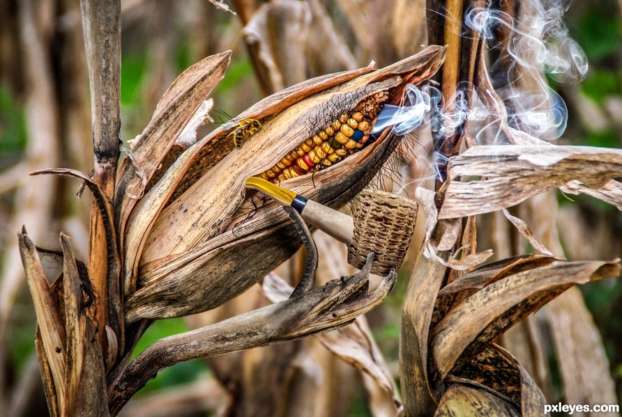
Fun image. Steps 5-7 6 don't work. Looks pasted on.
What a fun and great Idea for this contest. Lovely imagination... (the bee as an eye makes me twitch because they scare the hell out of me) giggle snort
GREAT JOB!!!
Thanks so much!
Very creative! Love the bee.
Much appreciated!
Adding smoke is always so hard to do, you did a great job on that!
Thanks!
Congrats Randy!!
Thanks!
Congratulations Randy!
Thanks!
Howdie stranger!
If you want to rate this picture or participate in this contest, just:
LOGIN HERE or REGISTER FOR FREE