(5 years and 3026 days ago)
(5 years and 3104 days ago)
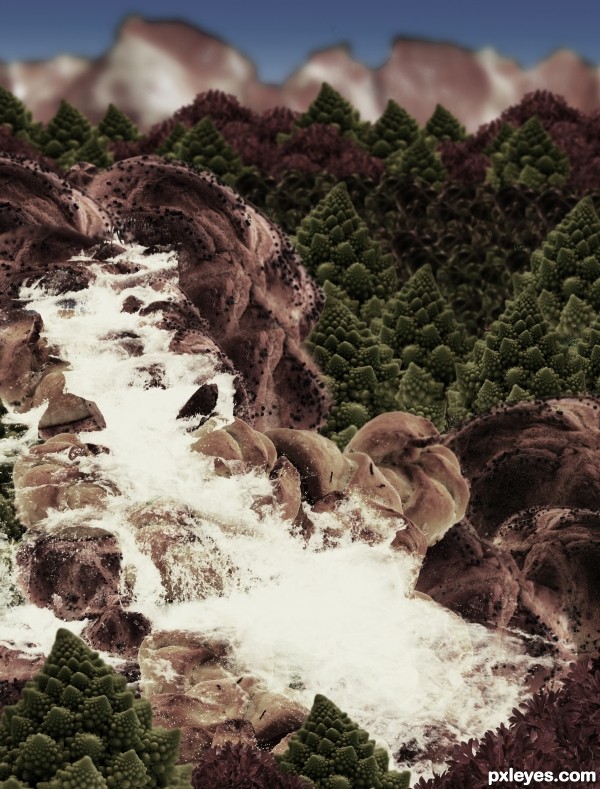
It's so dark and monochromatic, you can neither make out the differences between all the sources you used, nor appreciate the wide variety of different items creating the foodscape.
Carl Warner lets the food be the landscape, not hide it behind overly dark values. Perhaps lighten it up and allow some of the real color to show.
do u think that step 9 will be ok?
step Nine is much nicer then the dark version for being able to see the actual food.. IMHO
EDIT: Much Improved!!!
Thanks a lot Drivenslush!, I'll change it
I would drop the pizza, and I would go back to step 9, desaturate and colorize a little bit. If you blur the farther away parts and the farthest even more, it'll give it some depth. Also, in an actual landscape, the farther hills and mountains are from the camera, the gradually lighter and duller they look. Check out this picture you'll see what i mean
http://www.redbubble.com/people/natureshues/art/2059066-blue-mountains-sunset
I think you have the pieces and everything for a great entry, just needs a little tweaking  hope this was helpful, best of luck!
Changed it, hope it's better now!
WOW! What a difference that made! MUCH much better, I'm glad I waited to vote. High score from me, you've done a wonderful job!
YAY! Absolutely great! What an awesome improvement! You take suggestion extremely well 
Thanks for your comments 
Howdie stranger!
If you want to rate this picture or participate in this contest, just:
LOGIN HERE or REGISTER FOR FREE
hot boy or hot pizza (5 years and 3136 days ago)
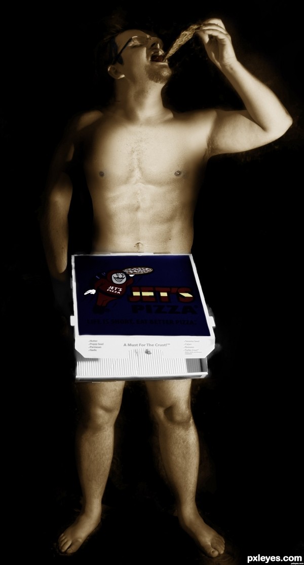
Is a very cool picture
The pizza is a weird color, but still a decent colorization job.
Howdie stranger!
If you want to rate this picture or participate in this contest, just:
LOGIN HERE or REGISTER FOR FREE
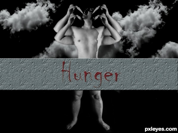
I gave it a little change. For this, I used cloning, duplication, and image blur for the arms. I made the sky with a brush that I have installed earlier. Then I made a sort of wall with the title on it to hide the box. Thats it. (5 years and 3136 days ago)
I have edited my entry. Now you can view it in hi-res.
It looked better without the skull, which adds nothing to the image.
The additional nipples also look like overkill.
You also have way too much dead space on the sides.
It was a good image as it was. Now it's trying too hard...
Ok maybe I forced a bit. I'll remove it. Thanks MossyB. Anyway, I'm a beginner after all. thanks again.
My entry was removed temporarily because I forgot to upload my SBS... lol. Now I'm back.
Cheers..!!
Howdie stranger!
If you want to rate this picture or participate in this contest, just:
LOGIN HERE or REGISTER FOR FREE
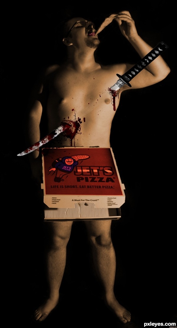
1:pick the lasso tool and make a outline of where u want to blood to ur pic.
2: now fill in with red color.
3:set to layer into Color Burn.
4:Now select Smudge tool, Burn Tool and Sharpen Tool, brush size that is about 1/4 the width of your blood spot, try different burshes as well.
5: now start using these tools until ur setisfied. (5 years and 3136 days ago)
should title as "Will do anything for a pizza"? .... bloody good job 
thx and good suggestion
Howdie stranger!
If you want to rate this picture or participate in this contest, just:
LOGIN HERE or REGISTER FOR FREE
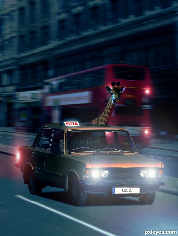
right into my favs, I had a simulair idea but not with a pizzaboy great job
  ill try something else now
Thanks Eladine!
Good blend & very funny!
LOL love it!!
instant fav!!.
I LOVE GIRAFFES! great thinking!
great job with the lights
Gratz well earned!
congratulations
Howdie stranger!
If you want to rate this picture or participate in this contest, just:
LOGIN HERE or REGISTER FOR FREE