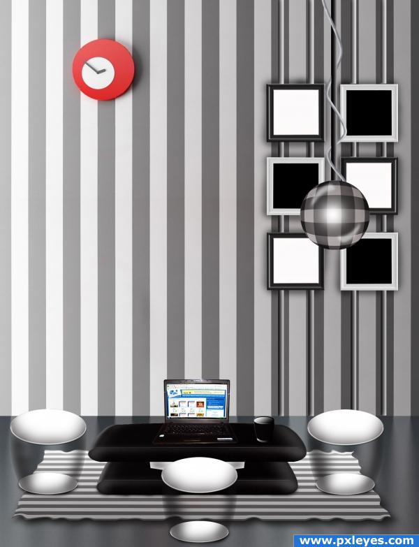
Only use original image.
PXL Screenshot (5 years and 3962 days ago)
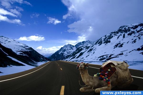
Credit to night-fate-stock on DA for source 1 - road (5 years and 3969 days ago)
...interesting xD Good luck!
Some snow on the edges of the road would make this more convincing, but good idea.
good idea, nice image but i agree with CMYK a little snow on the edge of the road would be great!
Interesting image! I love it.
they just don't match- one is as if it is almost night and the other is lit as if it were mid-day
Howdie stranger!
If you want to rate this picture or participate in this contest, just:
LOGIN HERE or REGISTER FOR FREE
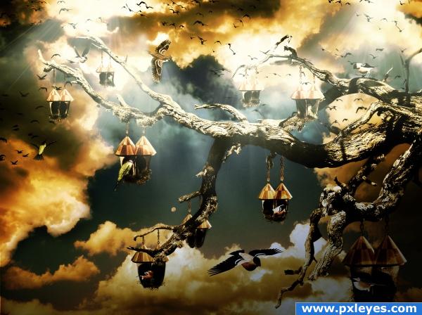
I selected the tree from an image offered by "pkv" on Deviantart.
I added the sky and clouds.
I selected the roof of an actual birds house and all the pairs of shoes in the source image.
I added the shoes and the roofs onto the branches.
Added different birds in different positions. Added chains to connect the little bird houses to the tree.
Colored, added shadows, added light beams, some adjustment layers (gradient map and brightness and contrast).
Credits to:
1. "Pkvstock"on Deviantart for the perfect tree with branches that I was looking for. Please visit account at: http://pkvstock.deviantart.com/.
2. "Shoofly-stock" for some great PNG files (birds and nests). Main account at: http://shoofly-stock.deviantart.com/.
3. "Mouritsada-stock" also on Deviantart for a very useful chains PNG file. Mian account at: http://mouritsada-stock.deviantart.com/.
I hope you're not going to find it too dark for your taste as I kind of like it this way...bit extreme in colors...I guess this is my first time when I'm being so daring with the tones....hope it's just a phaze...! (5 years and 3982 days ago)
nice image, buti dont really see much use of source here...wish you could find a way to include the source a little bit more..
Wow, very nice mood... good job!
Not bad, but the light beams make it look like there are 3 different light sources...
Very nice idea and performance! This scene looks like at the sunset/semi night but the sky looks a little from a day time that was darkened, maybe you should work a little on that.
yep...this image has one of those feelings where ya know its gonna be in the top three 
grt image..........................gr mood...............
cooooooolllllll...........awesome lighting effects......welldone author...
great!!
very stormy weather.. 
lovely use of the "surreal" style.
Looks like bird heaven! Very nice.
Howdie stranger!
If you want to rate this picture or participate in this contest, just:
LOGIN HERE or REGISTER FOR FREE
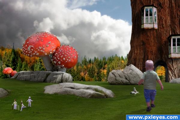
credit to:
nzmu
Izabelha
YaaL
mygod
from sxc for their great images.
clouds are my own (see SBS) (5 years and 3985 days ago)
A strange place indeed! It's a very nice image overall, but there are a couple of blends that seem a little too soft, for example around the mushroom. i also think the forst in the background is a little too blurred, but the image itself looks nice. good luck!
Good idea, but edges need work. Tree arch & tree edge are blurry, cut edges of forest need a bit of blur, birds are blurry. With a few tweaks this will be great. Good luck! 
wowzers! this deserves a really high mark and you've gotten one from me! and the rocks edges are a little blurry
Very nice image, look real. A tip to make it look better play with the color matching and add some fantasy effects (like clouds) to create a glow effect.
quite the party.. hehe.. good luck
very good!
very pretty
Wow, very creative, nice!!!
I love the crickett game.
so much fun!! Beautiful!
Love the little people!
could try making the colours in the scene match better but otherwise great job!
very strange place lol, really nice 
Howdie stranger!
If you want to rate this picture or participate in this contest, just:
LOGIN HERE or REGISTER FOR FREE
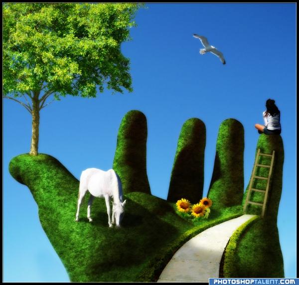
Actually I wanted to make a tree out of the hand, but after 10 unsuccessful tries, it developed more and more to this one.
I tried adding other thing (more flowers, animals and so on) but it just looked worse, so I decided to leave it as it is.
Comments are always welcome :)
Fodor has been notified. (5 years and 4028 days ago)
that a good idea nice pic
great
nice ideea 
excelent idea!! i really like it, just two nit picks, everything has great lighting except the sunflowers and seagull, which lighting doesn't match the rest. The other suggestion i have, is that the visual zone that atracts more in an image is the upper right quadrant, and right now it's totally empty, that somehow gives the feeling like something is missing, and that's accented by the fact that the four finger tips and the right side of the tree completes a rectangle, i suggest you to place the seagull in the mid space between the 2 middle finger tips and the top of image 
hope i made myself clear, if there's anything you'd like to ask , don't doubt to contact me...
Thanks a lot for that huge and helpful comment, Mike! I'll change it, as soon as possible 
I love the feel of this pic, author...you did a great job!  (Just one small thing: if you flip the seagull it will match your light source). Good luck!
I like this pic, really great work, I too have a slight nitpik, it is about the blurred edge below the thumb, before the wrist. Should this area be blurred? My eye seems to go straight to it.
Great use of the source!Great chop!

that looks awsome 
Nice work.. This looks familiar for some reason?? 
I'm going to take you to
My special place
It's a place no amount of hurt and anger
Can deface
I put things back together there
It all falls right in place--
In my special space
My special place
~~My Secret Place by Joni Mitchell
Thank you all very very much for your nice comments  I flipped the bird, changed it's position and tried to work on the sunflowers. Thanks Mike and CMYK
@Richie: No, that shouldn't be blurred... seems like I was a little bit too enthusiastic with my eraser 
@animmax: I don't know why it looks familiar to you, but I swear, that I didn't steal anything. Ask my mom... She was suffering for 2 hours, because I asked her all the time, what I can add 
Good Job.
Very nice...
Very clever. She just needs some music up there to make life complete.
I think its art
very very beautiful, good luck 
Very nice, looks very nice
Nice one  GL!
GL!
Author: I hope you didn't take my comment that you were stealing?? I just said it looked familiar to me? I cannot place where or why.. No accusations involved.. Honest..
wonderful idea author everything was well put together.
Very Nice idea Author.......G/L.
Great idea and nice work 
awesome!!
Thanks again for all your nice comments and favs 
@animmax: I just wanted to make that clear  I know, that you didn't meant it like that
great entry - the idea is wonderful and the execution almost perfect... I have only few suggestions: if the hand is made by grass, shouldn't be the edges more fluffy? And the girl seams to have a slight shadow around her, and she cannot drop in reality that shadow unless the sky is a piece of paper... but, overall, it's a wonderful entry, good luck 
nice image.... good job author 
@Hymerion: Thank you for your suggestions  I already tried to make the edges more fluffy, but it looked so bad and I wasn't satisfied with the result at all, so I decided to leave it this way. Concerning the girl: I'm not really sure what you mean, I don't see a shadow around her?!?
great idea!!! 

I like it very much well done!
very neatly done! nice 
very good image 
Nice outcome, author  . I do think Hymerion has some good advices about the grass shape for the edges of the hand. It doesnt have to be all around, but what you can try is juuuuust use a bit of smudge tool to make a suggestion that there's more than a sharp edge. And I also see some kinda aureol around the girl, or at least on the right side. Doesnt have to be bad for the entry though
  . Good luck!
very nice work, different
great work
This is nice... 
So great! Lovely picture : )) Super good job author.
Very good work, well done. I really like the work you ahve done here, nice one 
good image, reminds me of a idea i had in my mind for another contest in the past i havent posted. good idea, also the main idea! I love trees 
 good job!
very nice job author ... i love your image  GL
GL
Thank you all so much for your nice comments 
Congrats! Well done!
Congrats Lelaina  very nice image
Gratuliert, lelaina!! Up to the next one! 
Congratulations for 1st, well done and well deserved.
Congrats, nice work 
Congrats
congrats for 1st 
Congrats!!
Congraaaats 

you made it??? 


 congrats, mit drücker!!!
congrats!
Howdie stranger!
If you want to rate this picture or participate in this contest, just:
LOGIN HERE or REGISTER FOR FREE
Very nice! But the reflections on the right are way to short! All that should be showing in the reflection are the vertical bars holding the wall decor up. I will hold my vote.
original image... and a print screen, I humbly think...
Howdie stranger!
If you want to rate this picture or participate in this contest, just:
LOGIN HERE or REGISTER FOR FREE