Please look sbs and high resolution! Just source used (5 years and 3726 days ago)
Spec Thanks to PXlEyes for use of their icon used for this project in this contest on pxleyes.com only. (5 years and 3741 days ago)
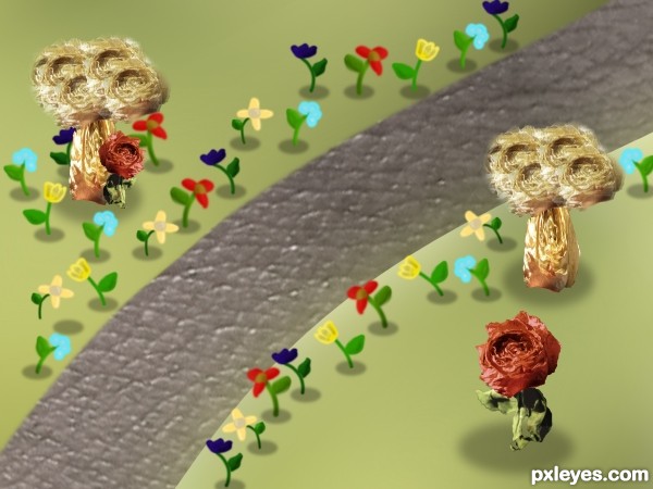
Disco-ball starting point is not spherized enough (far left and right verticals are virtually straight up and down when they should be the curviest). The busy-ness of the globe overwhelms the text so I would just eliminate it. Not clear why the [blurry in hi-res] PXLeyes family is flat in front of the sphere without any shadow (consistent with the sphere behind it). The reflection is like an odd shadow when a true reflection is identical in size and shape with the original.
I agree with Dan.

Nice one....
Thanks guys This is a re do any better?
Interesting
Howdie stranger!
If you want to rate this picture or participate in this contest, just:
LOGIN HERE or REGISTER FOR FREE

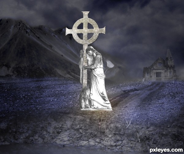
All images used were my own except for the cross which is the contest image.
(5 years and 3747 days ago)
Please post source links.
workin on SBS at the moment it includes all sources
Your selections seem a bit rough and a bit too feathered, i also think that a black and white image (maybe at about 80% opacity to bring in a bit of colour) would look great. Good luck!
You have a very beautiful idea, author...I'll echo, however what ponti said about the edges looking a bit unrealistic. Also, is it just me, or are there two shadows being cast in opposite directions? I think it looks pretty good in color as is, but it would be interesting to see in B&W.
well done author
Thak you all for your comments and input
Please mods do not remove this entry.. I have recieved your notification.. I will have the corrections made tonight..
dang I hope so Author and yes clean up and blur edges a bit.
I will wait to vote 
Author, just say it to the mods when you flag it.
Good job author...gl
the adjustment you've made is better. nice work.
Howdie stranger!
If you want to rate this picture or participate in this contest, just:
LOGIN HERE or REGISTER FOR FREE

(5 years and 3794 days ago)
this is a really really neat idea, GL :P
It is beautiful, GL !
source links or sbs uploads???
good but confusing...
Seen this done better before...
Interesting!
source links don't work. Maybe you should add them in the right place. Edit your entry and add them in the 'url' place provided so we can click on them .
Nice idea,not bad work...fix your sources and add SBS...
nice funny
one of the good entries, gl
nicely done..
Howdie stranger!
If you want to rate this picture or participate in this contest, just:
LOGIN HERE or REGISTER FOR FREE

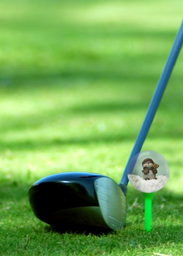
Unfortantly a golfball is small so it might be hard to see the it well, but I wanted to put the globe in a place where you would not think to find it. (5 years and 3803 days ago)
lol ...
the idea is cool, but the globe looks flat. maybe if you make a globe who looks transparent and then put the image inside. to look transparente you have to remove first the golf ball. good luck
cterraza: You are absolutly right, and I have now removed the golfball. Thanks U
poor little critter  hope its not tiger woods that about to have a shot then ;-p
 Nice one.....Good effect of the transparency of the globe as well....
Howdie stranger!
If you want to rate this picture or participate in this contest, just:
LOGIN HERE or REGISTER FOR FREE
Pretty good
shadows need to be more effective... I like the concept
i agree with hereisanoop, but the idea is good
Very nice.
good luck
Howdie stranger!
If you want to rate this picture or participate in this contest, just:
LOGIN HERE or REGISTER FOR FREE