(5 years and 3595 days ago)
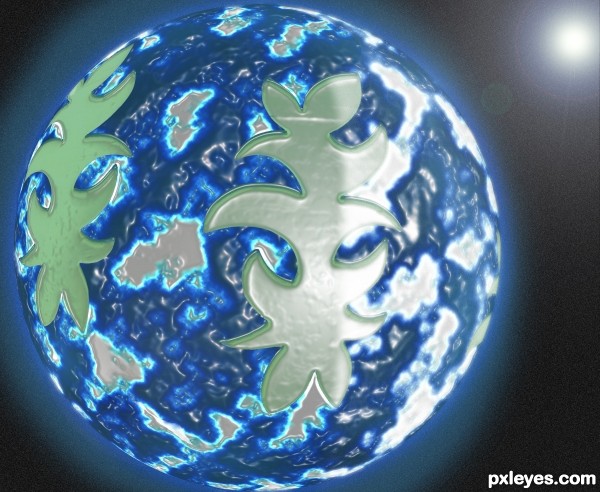
Made this from scratch using only the source layer. Steps:
Step1 : Enlarged canvas, used color picker to select closest gray to source image and brushed in the white space using this gray.
Step2: Used the clone brush to add a few more shapes
Step3: Used the magic wand to select everything but the shapes, created a new layer filled it with black and rendered some clouds on this.
Step4: Adjusted the levels of this layer and then played around with the color levels till I got something I liked.
Step5: Merged my layers and applied the plastic wrap filter to it
Step 6: Made a circular selection with the marquee tool then spherized it
Step 7: Added a few more layers and played around with blending modes to give the planet a nice hue and then used a inner shadow + outer glow layer effect to give it an atmosphere.
Step 8: Deleted the background, added a new black layer as background and used the "add noise" function to give it a starry effect then played around with brightness and contrast to make it look a bit more realistic.
Step 8: Added some lens flare and used a diffuse light filter to make it seem like one side of the planet is receiving direct sunlight. That's it.. One icy blue planet with atmosphere, clouds, water and landmass!
This is my first attempt at something like this so I hope everyone likes the idea and isn't too critical of the outcome.
(5 years and 3598 days ago)
good work
well done ! 
Good luck !
GL
nice
Howdie stranger!
If you want to rate this picture or participate in this contest, just:
LOGIN HERE or REGISTER FOR FREE
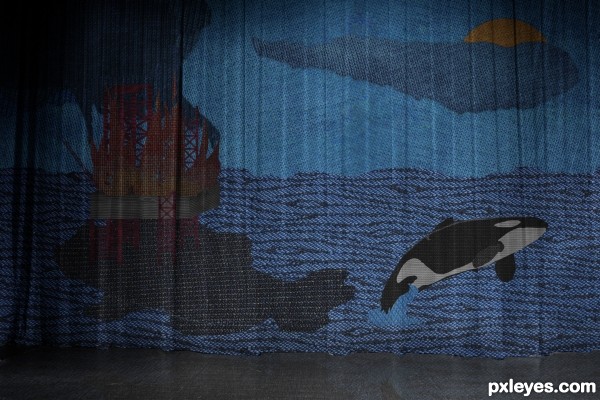
Inspired by the disaster in the Golf of Mexic.
Thanks for the sugesstions.
After alot of thinking I came up with this :).
Hope you like it.
Comments and critics are welcome!
Peace! (5 years and 3613 days ago)
Great start with a great subject, but please read rules and take what you have here, which is what would be considered a single quilt block, and incorporate it into a quilt being displayed or used in some way. Big order, I know, but know you can do it!! Will vote later.
Very good idea 
It's a really neat work, it seems a real quilt... but like Artgirl suggested, you need to turn it into a panel, or a bedspread, for example. I'll hold my vote for a while... 
GL
good luck
congartulations!!!... for 4th place...
Howdie stranger!
If you want to rate this picture or participate in this contest, just:
LOGIN HERE or REGISTER FOR FREE
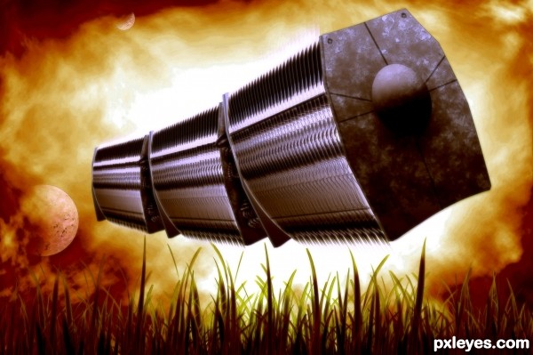
Cargo transportation of the future. No outside sources used. (5 years and 3625 days ago)
Good
Very Well done.. very unique entry.. good luck 
Thank you 
nice work......
nice 
good work.
good luck. lov the otcome
Howdie stranger!
If you want to rate this picture or participate in this contest, just:
LOGIN HERE or REGISTER FOR FREE
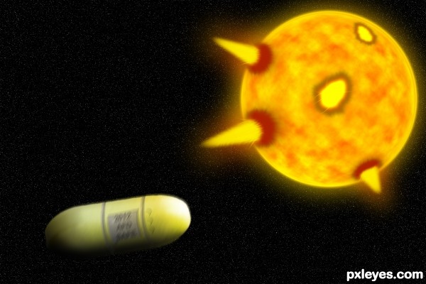
I took a pill and escaped from death. (5 years and 3629 days ago)
I like the idea, but i feel like the whole image could;ve been executed a little better. You could try smaller stars at full opacity, and also try experimenting with different colours and blend modes for the solar flares. Good luck!
Haha, thanks for help, I'm lucky I saved the psd so I can re-edit it... Thanks again.
I confess I don't really understand this. I completely agree with ponti55, however. I would also observe that your gray additions to the pill assume that it's a cylindrical sausage when in fact it has a much more interesting shape with a flat band encircling it. A solar flare or two on the right side of the sun might add some balance.
To make it look more realistic, I would add some motion blur to the capsule (not too much though or you would distort the capsule too much) 
I like it! I think it's pretty good! Nice job! 
I would agree to the fact of giving a bit motion blur to the capsule...Also the opacity is kept higher for the stars is better as it gives a feel of DOF of the capsule and the stars and sun...Overall a nice effort.....
nice idea , gl author 
There, It's fixed, if you would like something else added, leave a comment. Thanks for comments.
The solar flares still look extremely unconvincing, if you can't make them look more realistic, maybe remove them all together and simply have the capsule and the sun.
It's not the sun it's planet Earth in lava and fire! And those are not solar flares, those are powerful explosions, witch are dragging in!
nice effort.good luck.
hopefully......good luck
Howdie stranger!
If you want to rate this picture or participate in this contest, just:
LOGIN HERE or REGISTER FOR FREE
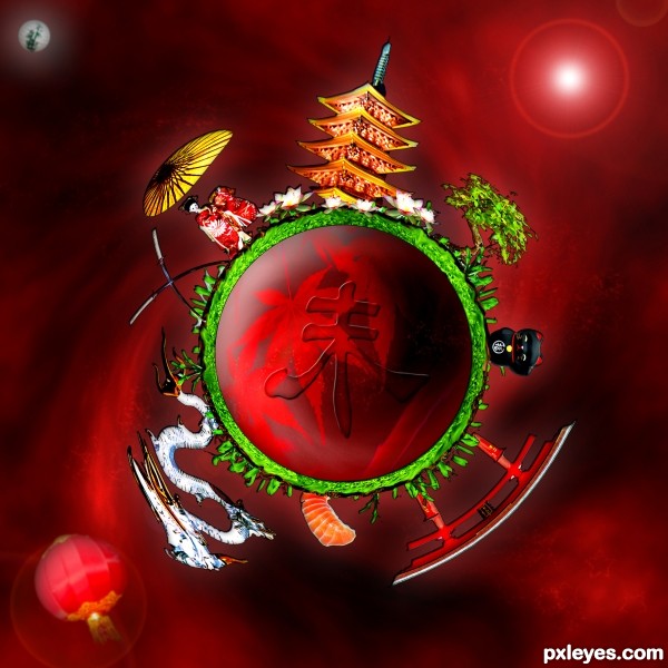
Nice! Very nice! I've lived there for almost 13 years, and everything you put on this image is so beautiful!...
thanks to clix for his picture of the lamp, thanks to japa-chang for the nenuphar picture and thanks to lizerixt for the umbrella picture.
Great idea and executed well! Good luck!
great stuff
hahaha !! very funny thanks
great job
nice ................
Howdie stranger!
If you want to rate this picture or participate in this contest, just:
LOGIN HERE or REGISTER FOR FREE