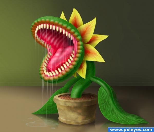
Photoshop only (5 years and 3910 days ago)
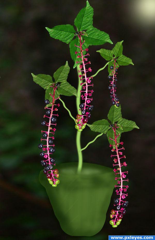
I used only the source image.
Modified. (5 years and 3919 days ago)
Maybe try make the pot more realistic? overall good feel to this...GL
Very well done!
Howdie stranger!
If you want to rate this picture or participate in this contest, just:
LOGIN HERE or REGISTER FOR FREE
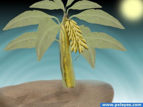
I used only the source file (5 years and 3936 days ago)
Very nice work!
Sweet idea  A double banana tree
  Maybe you could colour the leaves in slighty different colours, so they don't look all the same and have a little bit of variation. And maybe you could work on the shadow of the tree, cause I'd suggest you to make a shadow, that starts right on the trunk. Right now you have a space between the tree and the shadow. Good luck!
Thank you for your valuable comments. And I will do the changes.
Howdie stranger!
If you want to rate this picture or participate in this contest, just:
LOGIN HERE or REGISTER FOR FREE
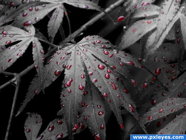
I gave it this title cos thats what i see :D
First of all I made a duplicate layer of the bush then used turned it black and white !!
Then made a layer mask ,I used a normal solid brush and painted the rain drops out on the black and white image to reveal the coloured image under it .
Once I had done that i selected the mask layer (Ctrl+click) then went to select >inverse ,then select>modify>feather for 2 next select>modify>contract for 1
(5 years and 3937 days ago)
Is it 4:20 Yet??? hehehe whoops.. HIGH MARKS as well
amazing
Good idea and execution...you missed a few, but high vote anyway! 

Very good idea 
very nice image choice and s/c author 
Thanks everyone for your comments 

Wonderful job!  That would look very good in a frame on my wall
  Good luck!
Congrats for your third place, ReapRevenge!
Congratulations for 3rd
Nice job Reap...Congrats to you!
congrats
Congrats 
Congrats!!
Congrats 
Howdie stranger!
If you want to rate this picture or participate in this contest, just:
LOGIN HERE or REGISTER FOR FREE
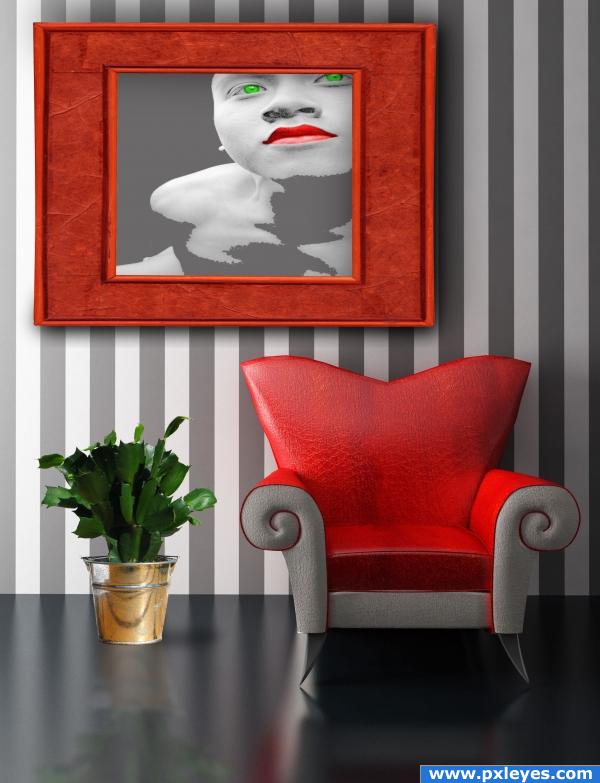
(5 years and 3965 days ago)
Kudos for changing the male to female..I would add a bit of variants to the potted plant (more light grays... the color in the portrait is a difficult thing to balance because of the saturation) I feel you need something below to draw the eye down.. but thats just me... very well done
I know I know.. the title is Painting.. but I'm thinking of how I would have to work my butt off to show this properly in decor situation (and whoa NELLY... I'd use this in a TON of situations as a fantastic accent)
edit: YOWZA
The plants reflection looks a little to sharp compared to the chair. Else it's a very nice image. Good luck 
It looks good, i reccomend adding a shadow around the frame, just to make it look more like it's on the wall. I would also add a shadow under the plant (just a little one) because right now it looks too pasted on. Good luck!
ponti shadows are there . but thanks any way the one on the painting maybe bit less of Gaussian blur it wood be ok,i will do it. thanks
nice
Howdie stranger!
If you want to rate this picture or participate in this contest, just:
LOGIN HERE or REGISTER FOR FREE
WOW!! Great job!
beautiful very good
i remember this one ... very nice job ...good luck
great
Remember this entry and the tutorial on how to do it I'm sure, was brilliant! and still is defo a high vote from me one of my all time favs:P
Wow!......feed me...lol
very good work :p
AMAZING! gl
Great job .......Nice creativity.....G/L Author.
Great job.
Great! Nice to see it again!
Very well drawn author.
beautiful
Congrats, awesome work
Congrats for your first place, Krigios!
congrats super job !!
Congrantulations....well deserved.
Thank you all!
Congrats
Congratulations for 1st
Howdie stranger!
If you want to rate this picture or participate in this contest, just:
LOGIN HERE or REGISTER FOR FREE