Photoshop Pictures: Plate


results 1 - 5 of 6

Happy Thanksgiving - created by skyangel


Happy Thanksgiving
Favs: 0SBS: n/aHi-resRank: 5/5Score: 50.7% (0)10251 views

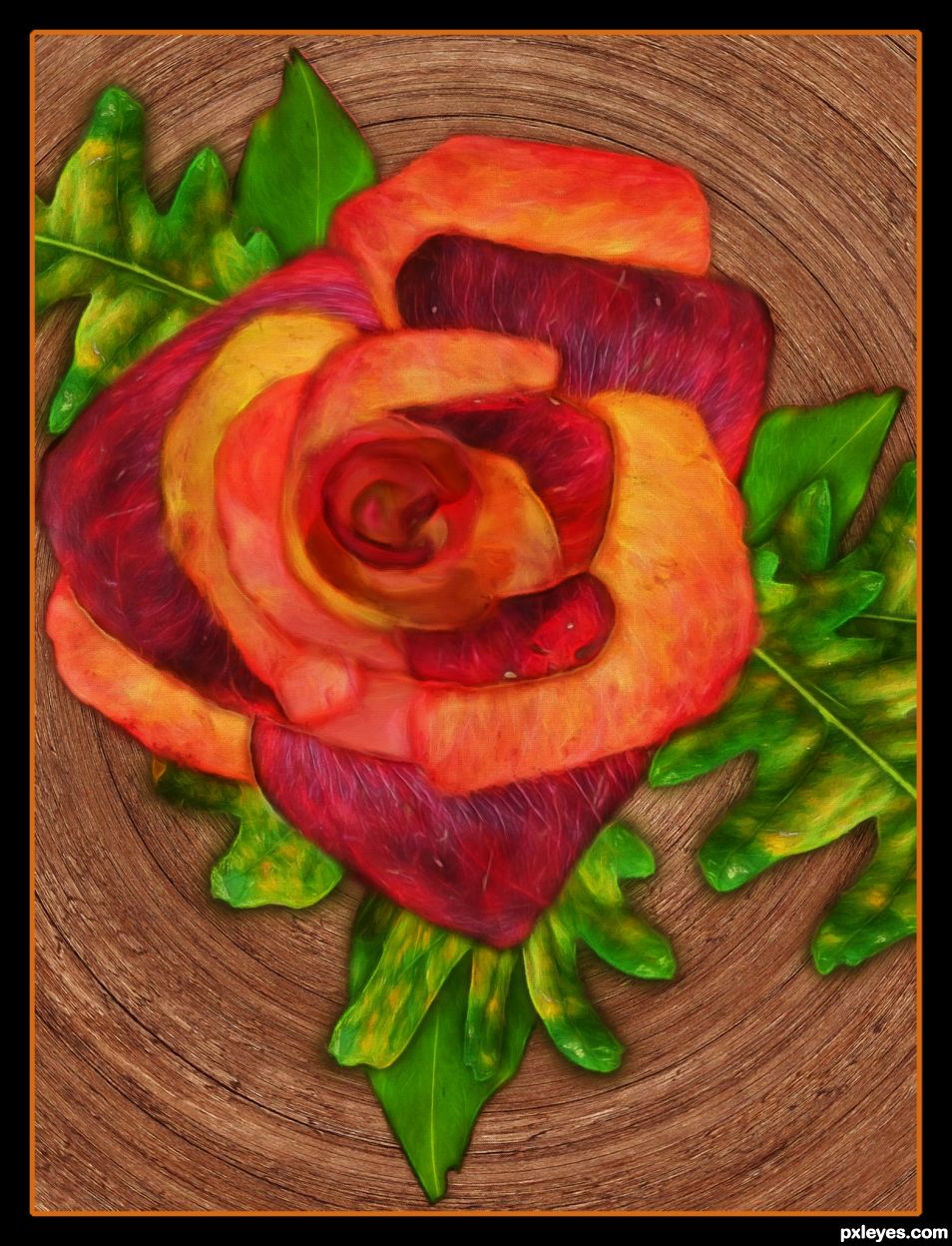
Source leaves were cut out, flipped vertically and horizontally and placed on opposite side. Autumn leaves cut out and pasted in center.
Layers were darkened by duplicating the layers on multiply mode.
Font is Hobo Std. Wood grain texture from source was used to fill the font. Drop shadow effect was added to layer style.
Art filters used were fractalius and oil paint.
Simple border added.

Happy Thanksgiving to all. (5 years and 739 days ago)

1 Source:

No comments yet... Be the first!Autumn, Leaves, Thanksgiving, card, empty

Howdie stranger!
If you want to rate this picture or participate in this contest, just:

LOGIN HERE or REGISTER FOR FREE


Autumn Rose - created by skyangel


Autumn Rose
Favs: 0SBS: 8Hi-resRank: 3/5Score: 54.3% (25)11973 views

(5 years and 739 days ago)

1 Source:

avatar BWR
BWR says:

Congrats SA.

author says:

Thanks.

(5 years and 733 days ago)


Howdie stranger!
If you want to rate this picture or participate in this contest, just:

LOGIN HERE or REGISTER FOR FREE


Gold Plate - created by ganjagoddess


Gold Plate
Favs: 0SBS: 5Hi-resRank: 5/5Score: 49.8% (0)7900 views

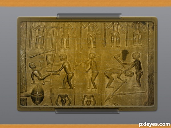
Its supposed to be a gold plate looking down at a display. Like in a museum or something (5 years and 3372 days ago)

No comments yet... Be the first!Plate, Gold

Howdie stranger!
If you want to rate this picture or participate in this contest, just:

LOGIN HERE or REGISTER FOR FREE


I hate onions :) - created by Derivatix


I hate onions :)
Favs: 0SBS: n/aHi-resRank: 4/5Score: 53.5% (0)13900 views

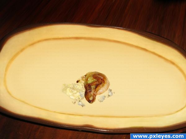
all source :-)
I exctracted the onions and some bread to make crumbs, used the stamp-tool and the warp tool (don't know if it's the right name, it's the transaction tool that lets you bend things) the make the plate rim, for the bottom of the plate I created a muster from the rim and used the noise-filter (I have the german version of cs2) on it. For the table I extracted the piece in front of the plate and distorted it behind the plate.
That's about it, hope you like it! (5 years and 3730 days ago)

avatar GolemAura
GolemAura says:

Upload the HIGH RES version... you are loop the frippin loop.... LOL.. love it

avatar ponti55
ponti55 says:

Great job!

avatar Eladine
Eladine says:

o.o; onions are gooooood!!!

author says:

thank you! I uploaded the high res, it's pretty large, though.
@ Eladine: in fact, I love them! In real life I wouldn' t leave them on the plate.

avatar Eladine
Eladine says:

whew.... good cus they almost the best of my burgers o.o; looking at the image again, im missing some shades o.o; on the plate from the crumbs n onions if you look back at the original, im sure you can reproduce the right shadows welcome back btw

author says:

hi Eladine, yes, happy to have found back. Thank you for your comment, as a matter of fact, there ARE shadows, I just set them very slightly, as otherwise they did not look real on my monitor. I see them on my monitor. Now I don't know what to do. I have a calibrated Eizo, should I darken the shadows more so others can see them? Hm, I guess I should leave it the way it is. I already received votes and if I change the image, that wouldn't be fair.

avatar Eladine
Eladine says:

i see shadows but they are in no way so dark as the one from the plate on the table, or if you look at the side of the bread the shadow there on the plate is very dark too.. i just think they should be darker but you can wait n see what the others leaVE for comments or try n see n think what you like better

no avatar
Keiley22 says:

i always get extra onions and pickles lol... so pass the plate over please.

avatar woodztockr

Nice image... good luck

avatar Leanord
Leanord says:

Cool idea, but if you just ate an entire burger there would be juices and crumbs all over the plate, not just in a nice little pile.

author says:

Oh, Leanord, I didn't want anyone to know that I licked the plate around the onions! Couldn't resist, the burgers were just toooooooooo good, sorry!

avatar CMYK46
CMYK46 says:

Needs some subtle shadows, otherwise well done!

avatar Lelaina
Lelaina says:

That's an entry made for me. I really hate onions! Very good job in recovering the plate! Good luck

Howdie stranger!
If you want to rate this picture or participate in this contest, just:

LOGIN HERE or REGISTER FOR FREE


Exotic Dancer - created by arkncheeze


Exotic Dancer
Favs: 0SBS: 18Hi-resRank: 5/5Score: 58.1% (0)32921 views

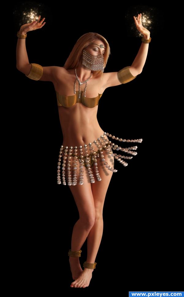
First time I saw this source and this is almost what I pictured lol...

Image of girl from deviantart...

http://mjranum-stock.deviantart.com/art/Various-7-55383588

Thanks to Marcus Ranum( http://www.ranum.com/)

He says it is okay to use his stock for contest and outside da... here is his usage link http://mjranum-stock.deviantart.com/journal/12259531/

The brush used for the sparkle is her hand is called "50UltimateFractals"...

Forgot where I got it, probably da or brushyzee...

Make sure your mature filter is off if you plan to see the source... And sorry for the plain background... (5 years and 3756 days ago)

1 Source:

avatar ponti55
ponti55 says:

excellent use of source.. a fantastic image!!

avatar GolemAura
GolemAura says:

giggle... very very very cute

avatar vapaholic
vapaholic says:

I went to sbs hoping to get a peek. I hate censorship. Nice work though

avatar Eladine
Eladine says:

the woman needs a better cutout theres a hallo all arround her o.o; i hold off my vote

avatar Akassa
Akassa says:

I think you should add some background, it's a little "empty" with the whole black thing.

avatar CMYK46
CMYK46 says:

Brassiere isn't very good. Everything else is...good luck.

avatar Tuckinator

wow pretty cool image author i like this one!

author says:

Thanks everyone...

@Eladine I do admit there seems to be a halo type light on the left side of the girl... But all over her I don't think so... Coz I am not that bad at cutouts... I stared at the pic for a long time after you said that... I even changed my monitor calibration a lot of times, but couldn't find halo all over her... Even then I deleted some 2 px of her body... That should take care of the halo... I think that halo you mentioned was due to the color "vibrating"...

@cmyk46 blame it on wonder woman lol... j/k yes I admit the brassiere doesn't match up with the rest... Believe it or not, making that brassiere was the toughest part...

@vapaholic I know, i hate it myself... But gotta follow rule... Visit da if you want to see the uncensored version of it...

avatar mellowdesign

Maybe slightly soften where her hair is cut out...and I agree with CMYK re bra...but otherwise a cool image!

avatar Richirajd
Richirajd says:

Nice manipulation.... Funny comments, tho. Lol

avatar nemanja
nemanja says:

o, o, o, what to say... there is hardly any source image... just kidding... this is great use of source... i like it a lot...

avatar Lelaina
Lelaina says:

Beautiful I really like the swinging... (well, I don't know the name) the swinging things around her hip. Good luck!

avatar Eladine
Eladine says:

on her left hand is a hallo arround her hair is a hallo and the whole right side.. maybe its the light reflecting on her body or the original bg, i cant tell im just telling you what i see o.o; im sorry i dont mean to insult you but yes her body is cut out nice, her hair looks choppy tho even on the left side where you didnt worked on it o.o; and now im being picky XD the shadow from the bracelet on the right arm seems to create that same halo effect maybe it should be darker ? dont feel insulted i liked the image thats why i hold off my vote and paid more attention to the details

avatar Eladine
Eladine says:

http://www.brusheezy.com/brush/283-50-Ultimate-Fractals and theres the link for your brushes.. :p just googled the name you said

avatar elficho
elficho says:

nice idea! very good

author says:

@Eladine jeez when did I said I was insulted... If I felt insulted I won't have bother to check the image... It's just that I couldn't see the halo anywhere( except for the left side)... I can't really fix what I can't see... Seriously now I feel insulted... LOL j/k

avatar k5683
k5683 says:

the plain background is perfect because you can see the important things better.

Howdie stranger!
If you want to rate this picture or participate in this contest, just:

LOGIN HERE or REGISTER FOR FREE