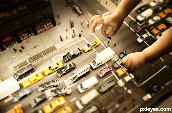
for some reason the hands images are not available in web page link
for that reason i added the images in the step by step guide (5 years and 3405 days ago)
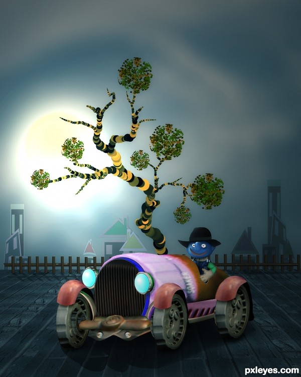
all source and PS custom shape and brushes,.. (5 years and 3410 days ago)
This one is so CBR'd, I can't make out the source image at all..
YOU are kidding, right mossy??
OMG.
the tires is part of teh source. the front of the sprayer.
the bumper is teh turn on valve on the source.
the ground the car is sitting on is from the brick wall.
the body of the car is the actual nozzle of the sprayer. notice the "soaker" printing??
i admit there needs some work done to blending of things..but CBR? not really. i've seen worse. ALOT worse.
@ mossy,...CBR ? yes..maybe something wrong with your eyes...hehehe...and jadedink's eyes are sharper than yours...I hope your eyes have no problem to read jadedink's comment,...@ jadedink, thanks a lot...
The car image is nicely done, and realistic. The rest is flat & cartoony, and IMO doesn't fit. Still, good work here.
YOU ARE SILLY AUTHOR!!! ... in a very great way LOL.. awesome
True, there are some issues with varying degrees of sharpness, but overall, I love the whimsy and design of this, very clever use of source, author! Great tree and buildings, would make a wonderful children's book illustration. 
Fantastic work author...whole image is great compilation of different styles and i see great uniqueness in that...hat down for u author...well done
congratulation!
Howdie stranger!
If you want to rate this picture or participate in this contest, just:
LOGIN HERE or REGISTER FOR FREE
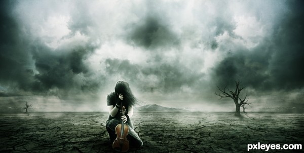
An old image of mine that i feel fits the theme :) (5 years and 3428 days ago)
Dramatic. Moving the figure to the left a tad in conformance with the Rule of Thirds might oomph the impact. I confess I personally don't get a 'spooky' aspect as required by the contest description. (The title is awkward. Something a bit more abstract like "The End of Music" might work better.)
i love it and i'm fell spooky
That's a really beautiful work as usual but Im afraid Source 1 is a pre-manipulated image. Im just warning you cause I don't want this great entry to get pulled out 
Lamantine, Source 1 hasn't been pre-manipulated. I use it often in my images.
Dan, Thank you for the comment, i'll change the title to your very apt "The End of Music" but unfortunately because it is an older image, i don't have the .psd
Hazem, thank you for the comment and the favourite 
This needs to be a scene from the next final fantasy!!!  Great job.
SHOULD HAVE KNOWN!!!!  I'm such a big fan!
i think it's awesome.
Lovely image ... perfect title and very expressive.
very nice!! 
Good one.
Fantastic image,great mood,and cool colors...but author, what is surrealism here?
There's still plenty of beauty in our world Erathion, not hers.
Howdie stranger!
If you want to rate this picture or participate in this contest, just:
LOGIN HERE or REGISTER FOR FREE
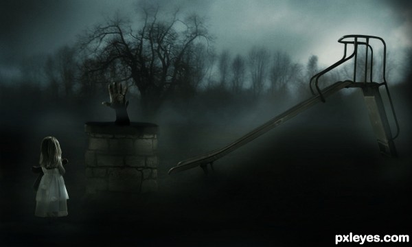
Credits to ~stockmichelle , ~bp-girl-stock , Rosenwald and Andrzej Estko. (5 years and 3432 days ago)
Very dramatic scene, not sure if it's deadly but it will surely hurt to crash into that wall >.
Light source on girl is opposite lighting on hand & slide.
i like it ,good luck
Nice mood,should say creepy...
very cool work author...IMHO top3 for sure...best of luck
Congrats for your first place, Aqiil! 
Very well done, congrats on first place!
congrats on first place 
You must be proud of yourself, you did a wonderful job.... Congrats for your first place....!!!
Congrats Lamantine  very eerie
Congrats = )
Thanks a lot for all the votes and comments ! 
Congrats!!
wow congrats!!
Congrats Lamantine!!!
Thanks !
Howdie stranger!
If you want to rate this picture or participate in this contest, just:
LOGIN HERE or REGISTER FOR FREE
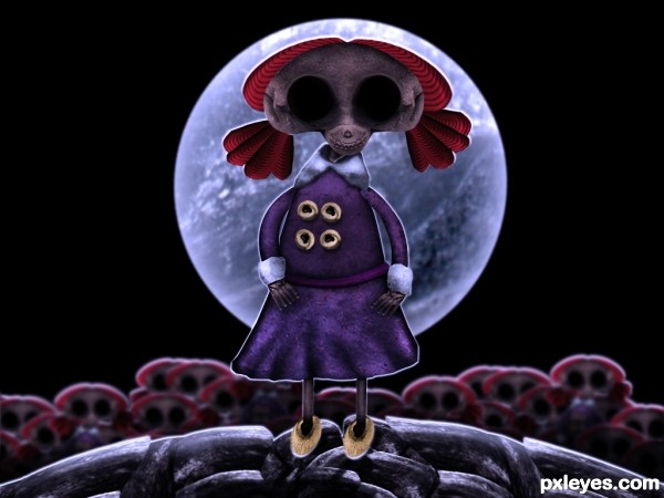
It's almost time for Halloween, and Molly,our little skeleton doll, has brought some friends.
Will you come and play with us?
Happy Halloween everybody :D
All source with Reference (5 years and 3444 days ago)
This is creepy, yet very cute!
The white outline is distracting, though. If you mean it to be rim lighting, I suggest you blur or feather it more, so the edges are not so hard.
VERY creative, Happy Halloween!
It's very nice, different style. GL
that's funny! Good work 
Why didn't anyone like it? Very good for Halloween, it reminds me the Corpse Bride 
cool thing author...she is fantastic
She is too cute!! Best of Luck 
Howdie stranger!
If you want to rate this picture or participate in this contest, just:
LOGIN HERE or REGISTER FOR FREE
Good match on the lighting...maybe just slightly blur the edges on the hands, and GL.
excellent lighting.
Very innovative idea... love this!
thanks,
i will try to blur it a little bit
Very funny and well done Best of luck
Fantastic piece author...extra points from me for unique idea...gl
Great idea! Giant's offspring could be dangerous when playing
I love the idea of playing around with a tilt shift!
Howdie stranger!
If you want to rate this picture or participate in this contest, just:
LOGIN HERE or REGISTER FOR FREE