(5 years and 2940 days ago)
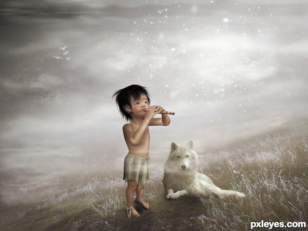
- 1: Thanks to squidlarkin
- 2: Mountains
- 3: Flute
- 4: Wolf
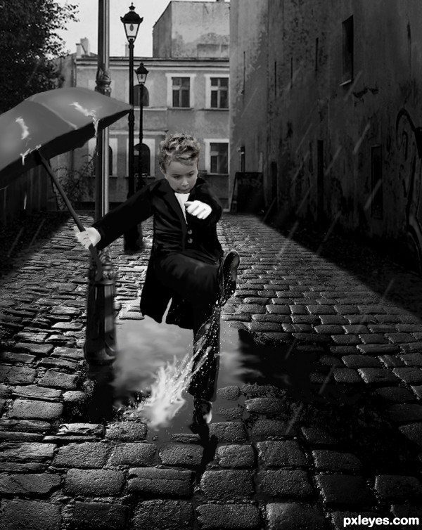
I drew the tux, rain, and umbrella.
Mattox has been notified. (5 years and 2966 days ago)
nice to see something else then the soccer outfit 
Very well done indeed. My only problem is the puddle in the final version doesn't look realistic. You need to post a link for the splash, and I'd love to see how you drew the tux in your SBS.
Nicely donr GL 
Nicely donr GL 
gratz good job!
Howdie stranger!
If you want to rate this picture or participate in this contest, just:
LOGIN HERE or REGISTER FOR FREE
(5 years and 3016 days ago)
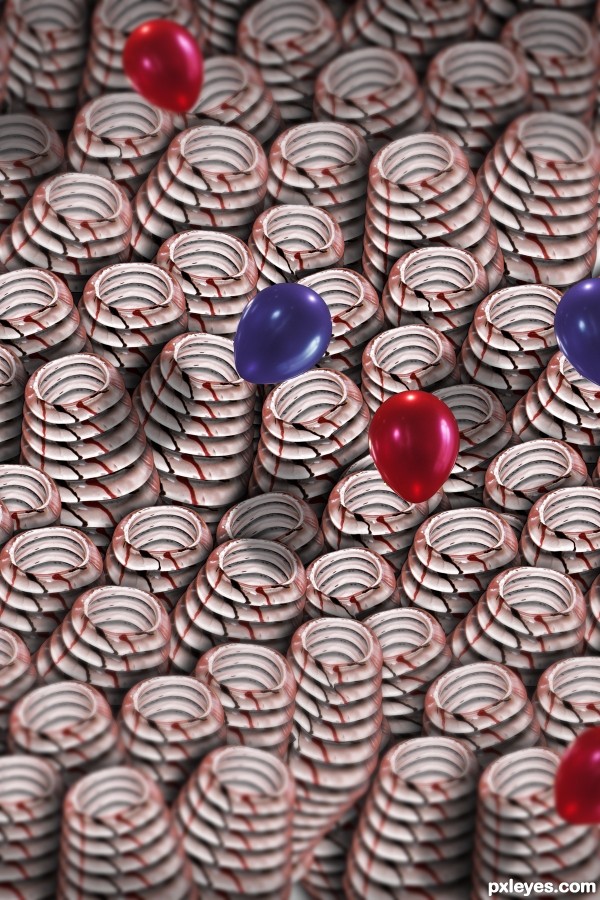
Good idea, very whimsical! 
Howdie stranger!
If you want to rate this picture or participate in this contest, just:
LOGIN HERE or REGISTER FOR FREE
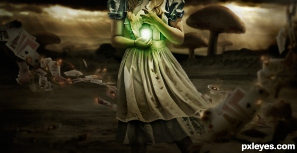
I found a great source image and just went from there...I do wish she had a head haha but oh well I think the composition worked out in the end. The card source images are in the SBS and I didn't end up using the rabbit in the final picture so I wasn't sure if I needed the link but I gave it just in case :) (5 years and 3054 days ago)
This is probably the Red Queen's Alice Fantasy...
Goodness knows she cried, "Off with her head!" enough times - looks like she got her wish...
Great mood, well done!
Very nice work, though I must say, I like it with the rabbit, but final outcome is still good. 
Wow looks fantastic, love the way you played with the fantasy attributives and the lights. Originality on the character's choice by excluding it's head :P
Haha thanks everyone and great point mossy I didn't even think of that  I did really like the rabbit, but I just couldn't get it and the feet to look like they were actually on the ground realistically. Also I liked the framing better this way
the overall texture is fantastic!
superb, awesome, mind blowing!!! for sure my favorite.
The mood is superb. The blurred backdrop adds up perfectly with the overall scene.
@Author, Good thing you didn't include the rabbit. It's such a perfectly dark scene - a rabbit would've ruined it. :p
What a perfect mood and wonderful job!
I loved every detail! Instant fav!
Special mention to the theme!
Good luck author! 
CREATIVE =)
Thanks everyone so glad you all like it!!! 
nice work, my favorite, good luck.
Professional quality ... but if I was a paying client (and they can be wrong but they are always "right" I'd ask for the cards to be a touch lighter. Not only to add a bit of contrast but also because reflected light bouncing off them adds depth -- imo
Looks great....and great source!
Just AWESOME!..looooove it!!!
high marks,my fav and.. smells like a winner to me. GL

congrats, I thought the top three here were all very good.
Definitely the most unusual entry - and skillfully done. Congrats!
Congrats!!
Congrats Robert  fabulous work
Congrats !!!
Howdie stranger!
If you want to rate this picture or participate in this contest, just:
LOGIN HERE or REGISTER FOR FREE
(5 years and 3165 days ago)
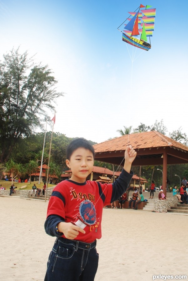
Soft burn brush on the "Sails" could add some depth and shadow to the kite.. all IMHO.. it is far away so detail would be a bit amiss.. good look 
Great Idea all around, love the image and good luck 
Howdie stranger!
If you want to rate this picture or participate in this contest, just:
LOGIN HERE or REGISTER FOR FREE
wow ......
Wow²!
Great job!!
very nice feel and atmosphere .... checking the sbs the 3d model is correctly proportioned, as for in the final result his arms look much bigger than his legs... don't know why .... good luck
Awesome!
Magic.
Beautiful..... nice colors and a something to think about.... good luck!
Congrats!!
Congrats. This one was beautiful.
Thanks for Your comments and votes.
Congrats^_^ I love it
Howdie stranger!
If you want to rate this picture or participate in this contest, just:
LOGIN HERE or REGISTER FOR FREE