(5 years and 3183 days ago)
- 1: thx brittahaal
- 2: thx xvoltagex

(5 years and 3473 days ago)
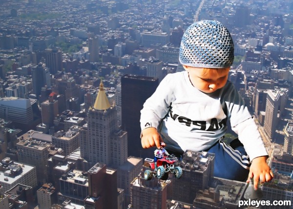
Good job except for some edges on the girl's arm & side. Blur the back of the club head, fix distortion on the crouching guy.
nice but the bushes on the left side of the wall look as if they just fade into the air...and the guys with the golf kart seem to have the sun beaming from the opposite direction as the guy squatting....oh, and the guy swinging the golf club has a chunk of his hand missing and seems to be growing grass his arms and other parts throughout his body....not gonna mention the girl...
good idea
nice work .....but I think lighting on girl is entirely different from rest of the scene.
Idea is nice, but the lady in the front is like a cut-out image
Howdie stranger!
If you want to rate this picture or participate in this contest, just:
LOGIN HERE or REGISTER FOR FREE

(5 years and 3516 days ago)
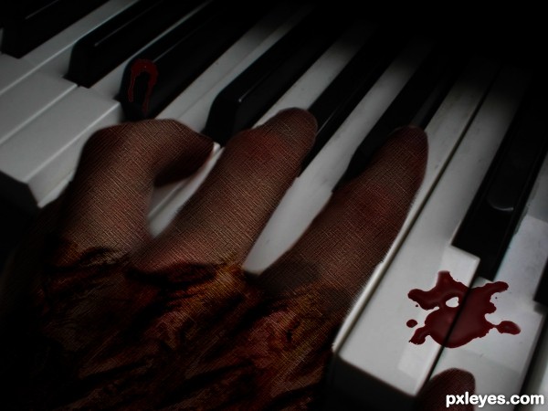
Why are all these piano player entries slathered in tomato sauce?
You need to work on the keys. They're extremely distorted and two of them are welded together. IMHO, this would be much better if you just used the original position of the hand and texturized it, rather than having to do so much smudging on the keys.
@ gamemastertips thanks for your suggestions i'll defiantly change it
@ gamemastertips i have made changes as u suggested
If I were you, I'd remove the "noise" on the hand. IMO.
The downside of the drip looks a bit blurred..
GL
@eriikuri thanks 4 ur advice i'll look through it...!!
@nickk thanks
@erikuri i have made changes
good idea....well i mean "bad" idea, get it? just kidding
@tuckinator thanks
Howdie stranger!
If you want to rate this picture or participate in this contest, just:
LOGIN HERE or REGISTER FOR FREE

All she ever does is play that piano all the time, non-stop. Every day. All Day. It's driving me insane....Please stop. Please make it stop........
Credit to ~KeReN-R for the blood brushes and jelleprins for the model. (5 years and 3516 days ago)
Very creepy! But blood isn't much convincent... 
agree with erikuri
hands are to bright and blood looks like fake on first sight...But the idea and tittle are very nice,so would be good to make some changes author,because work have a potential...good luck
this scared me.....and in Singapore right now...the hungry ghost festival is on......
Howdie stranger!
If you want to rate this picture or participate in this contest, just:
LOGIN HERE or REGISTER FOR FREE

:) (5 years and 3543 days ago)
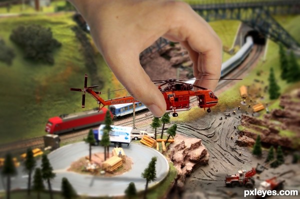
AWESOME CREATION.. little nitpick.. the back of the thumb is missing (only noticeable in high res.. but I know that urks a LOT of peeps) looks pretty easy to fix.. and GREAT JOB!!!
Nice work -- (See above)
Nice work on the repair -- looks very realistic very well done
Thanks! I fixed the thumb now.
Thank you for noticing Drivenslush.
Cool idea edges need a little more work removal of white lines on the rotor blades and parts of the hand. Plus I would say that the helicopter is still a little to sharp even tho it is the main focus of the image maybe soften it up a touch
nice source choice!
Tried to fix the sharpness, but I´m not sure it´s very visible - kind of lost the psd-file...did a try though.
Looks cool 
Howdie stranger!
If you want to rate this picture or participate in this contest, just:
LOGIN HERE or REGISTER FOR FREE
:o
Howdie stranger!
If you want to rate this picture or participate in this contest, just:
LOGIN HERE or REGISTER FOR FREE