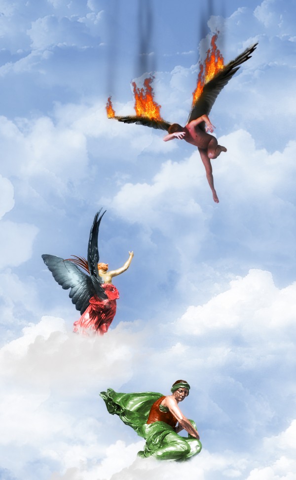
"Look! I did tell him not to fly too high!!!!"
...
Male model thanks to Felixdeon in DeviantART.
Clouds brushes thanks to JavierZhx in DeviantART (5 years and 3764 days ago)
- 1: Wings
- 2: Fire
- 3: Model
- 4: Clouds brushes
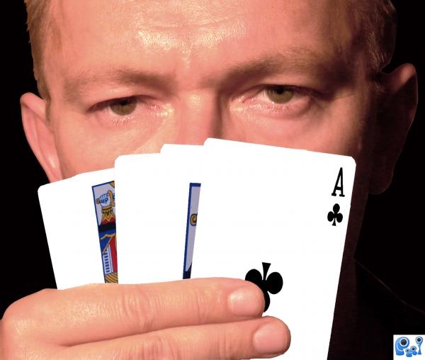
This man sells double-sided playing cards.Who wins? (5 years and 3786 days ago)
Can you please upload a high res version? This is a unique idea, however, even in low res I can see where you need to fix the jagged edges on the fingers. Welcome to PXLeyes.
LOL...what Jaws said...don't make us come over there.  (And why are the cards purple?).
nice image. good idea.
Howdie stranger!
If you want to rate this picture or participate in this contest, just:
LOGIN HERE or REGISTER FOR FREE
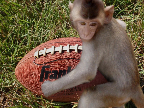
Used in a sentence:
This chop was a bad idea, like a monkey playing football! (5 years and 3806 days ago)
LOL...that's not how I heard it...
fur needs some work
hahaha........I know the real saying and this fits it to the tee! GL
Howdie stranger!
If you want to rate this picture or participate in this contest, just:
LOGIN HERE or REGISTER FOR FREE
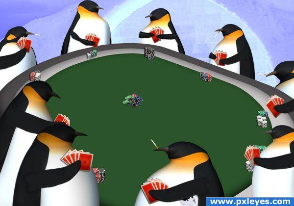
Penguins playing poker. Best viewed in high res. (5 years and 3821 days ago)
heheh!!
love it great job
Looks like a tricky bunch to me! LOL nice
Haha, funny idea  . It looks like you used some kinda dropshadow for the cards and the "money", this make these objects look like they're floating a bit. Make sure that there's only shadow on places where the shadow from these objects can fall on (small example: the most left penguin has these cards in the hand, some shadow from the card is on the penguin's body, rest of the shadow on background. Is in this case not logic). Good luck!
How the hell did I miss that? Only obvious with two penguins’ shadows facing each other. I did use a drop shadow and once you pointed it out, I saw what you meant. Toned down the drop on the cards and fixed all the shadow so they are going the right way now. Thanks again! : )
lol very cool
Pretty good. Interesting way to go. Should have put some hats and other accessories but i'm sure this took forever anyways.
that's great 
gwoodyii: I was thinking about that, like shots of whiskey and beers and green visor poker hats but yes it took me a while to get right.
fun use of source, good colour use.. nice final outcome. GL author. 
Howdie stranger!
If you want to rate this picture or participate in this contest, just:
LOGIN HERE or REGISTER FOR FREE
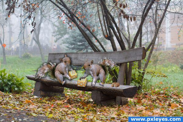
For the photo http://www.sxc.hu/photo/1116007 I' ve received permission from the owner to use this photo in this contest Thanks to Olga Machkova (5 years and 3833 days ago)
Really cute!
Very cute idea  Maybe you could rotate the left squirrel a little counterclockwise or just move it a little bit lower, cause it looks like it's floating right now. And I'd also suggest a shadow for the right squirrel and the nuts, cause as far as I can see it, they don't have a shadow. And saying that: I high res would be great
  But it's still a very cute idea
  Good luck!
Congrats for your third place, Demi!
Congratulations for 3rd
Congrats 
Congrats!!
Congratulations Demi... 
Howdie stranger!
If you want to rate this picture or participate in this contest, just:
LOGIN HERE or REGISTER FOR FREE
Nicely put together, style supports the theme (perhaps the flames could do with some cleaner edges here and there or another blending mode). Good luck!
Thank you for your suggestion, Wazowski... Well put and I got it, but no time for changes...
Howdie stranger!
If you want to rate this picture or participate in this contest, just:
LOGIN HERE or REGISTER FOR FREE