Spreading Virus - Thoughts on the impact of mankind on earth (5 years and 817 days ago)

(5 years and 3378 days ago)
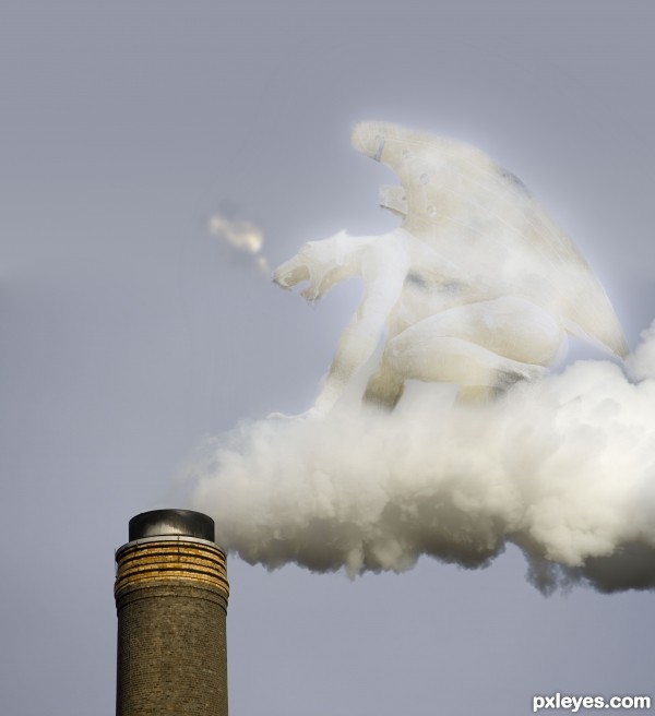
very interesting concept author...u should erase gargoyle lines using big soft brush to achieve that they are made from smoke...just an idea...best of luck...
One thing to be aware of....ZEITGEIST!!!!.....It tells you all..LIKE!!!!!!
Howdie stranger!
If you want to rate this picture or participate in this contest, just:
LOGIN HERE or REGISTER FOR FREE

Hello everyone!
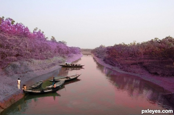
Here I am trying to show the ill effects of pollution.
Comments welcome. (5 years and 3645 days ago)
might look a bit better (IMHO) if you masked the colour adjustment so it only affected the water rather than the whole image
Maybe you could even add something additional to the image... Like Moon, or Sun or something 
Nice effects! It probably burns out of the picture a bit, but otherwise it's great! 
good luck
Good Luck.
Howdie stranger!
If you want to rate this picture or participate in this contest, just:
LOGIN HERE or REGISTER FOR FREE

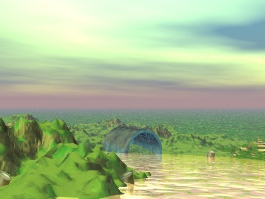
I made this in Bryce 3D with no external sources used.
I didn't save my steps originally so I went through the steps again so I could make a step-by-step guide. Sorry for any inconvenience. (5 years and 3906 days ago)
very nice
i am lost with bryce lol, well done  im still figuring out how to make the trees lol goodluck.
I like the colors of the sky, but not the water and there should be more contrast to the whole image. I also like the perspective, but the landscape doesn't seem to have much detail in lo-res (maybe some random bumpmapping layers?). These things should be easy to fix however.. Good luck!
well if you remember how you did it, you can make it gain and save the steps this time 
aww bugger... hope you plan to remake it  was good.
 half the time, I just play around with different things and don't even know how I got the result. lol I could never get it the same unfortunately. Thanks everyone.
Mmmm. Green jello in our future! I don't mean that as an insult to your work. You obviously worked hard on it. I just like anything that reminds me of food! Good Luck!
this image looks a little unrealistic!
It isn't supposed to be realistic. If so, I would have used actual photos and put everything in perspective.
By the way, I didn't mean my last comment to be snotty--I don't want anyone to take it wrong.
Loved the colors depicting pollution
Super render. IMHO the tube look better with the gray solid color, step 7. Good luck.
Howdie stranger!
If you want to rate this picture or participate in this contest, just:
LOGIN HERE or REGISTER FOR FREE
Author, sources 1 & 3 are the same, please fix this.
...sorry, done.
Thank you
I wanna live there!
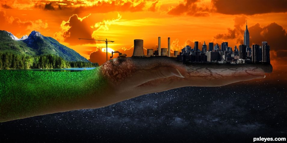
I really enjoyed this Photoshop. It's an awesome concept and made my eyes wander. The faults I see are the overall tone should have been much warmer due to the light source being a setting sun (things are much more orangy at sunset right?). The power plant for example fits in as far as temperature is concerned but right next to it the skyline is really "cool" (bluer) in temperature so they conflict. Also when you have a back lit scene like that, you would see some of the sun's light reflecting off the left side of some of the individual buildings that are getting hit by the sun's light, as well as the right side of the mountains, and perhaps some of top of the arm/hand. This can be achieved via a Brushing Layer, or multiple ones that are "clipped" to the buildings, hand/arm, and even the mountain. Generally you would use an Overlay, Soft or Hard Light, or Screen Layers, but there are a few more you can use. Then just brush some gold/yellow/orange color for your light, varying the brightness and opacity of the brush as needed. The green part on the arm has too much light on the top "half" which does not concur with the back-lit light source (the "back side" of the arm should be more shadowy and less lit up). As for the power plant, it's backwards. The shadowy side should be on the right due to the sun being on its left. If you need some help with this, feel free to PM me.
Good one !
Nice job. 3rd place on your 1st entry. Not bad.
Thanks for the kind words and the advice! I'm glad you like it!
Howdie stranger!
If you want to rate this picture or participate in this contest, just:
LOGIN HERE or REGISTER FOR FREE