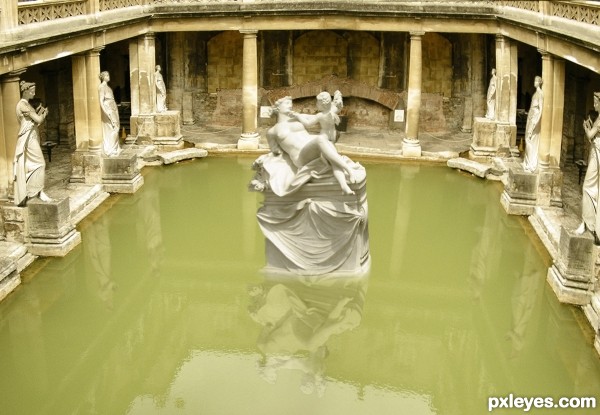
(5 years and 3201 days ago)
- 1: source1
- 2: thanks michaelaw
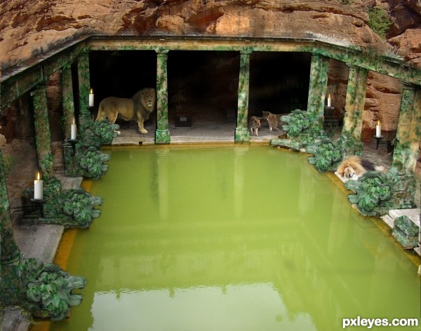
(5 years and 3203 days ago)
Turning the saturation down on all the bright green might help a bit, it's a bit fluorescent, but that's up to you, I like the cave feeling you created (also, a HI RES image is helpful so people can see the detail of your work)
Good LUCK!!
I turned the saturation down a bit - thanx for the comment and the advice 
Very cool, I like the colors and the idea, but the candles seem huge ...
The perspective of the stone lion heads is off, since the image is from above, to see the lion heads in profile means they are all tilted at an angle, on both sides of the pool...Looks strange.
The candles are also way too large for the image, unless the pool is only a couple of feet in width.
Nix the candles. They're at the wrong angle anyway. Ditto about the lion heads.
suggestions:
1) add a little darker to the top of the lions as they are under the shade
2) add a little reflection in the water
3) instead of candles, change to fire
4) have water spray out of the stone lions' mouths
5) look at the light source and adjust overall shadows n highlights

Howdie stranger!
If you want to rate this picture or participate in this contest, just:
LOGIN HERE or REGISTER FOR FREE
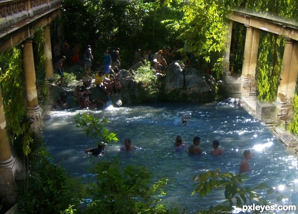
just a little thing...
i own this image.. (5 years and 3204 days ago)
LOL
Neat idea but the pillars seem to be perishing.
Howdie stranger!
If you want to rate this picture or participate in this contest, just:
LOGIN HERE or REGISTER FOR FREE
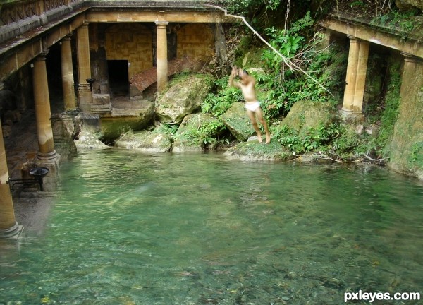
go to swim here and have fun (5 years and 3205 days ago)
Cool idea! I dont's know, I think that something goes wrong with the man! Too blur? I don't know what's going wrong! Maybe it's my idea! Good luck!!
thank you for the nice comment,you`re right,the man (my nephew) look too blur,I can`t shot him with the right position when he was doing jumping motion.i use a pocket camere
Good luck too you to
Good Luck to you too,sorry I was wrong in writing, have a great time,take care
the branch looks broken, if it is so, should add motion blur (otherwise, it looks stiff)
I like to dive in there too  feels cooling
hmm yeah..i agree with you (◑‿â—) I'm not using the blur,because i was too afraid to make something wrong,but i do that..ooooh (•̪â—)
of course you can try to dive here,if you like to come...thank you so much for your input.best wishes to you
Howdie stranger!
If you want to rate this picture or participate in this contest, just:
LOGIN HERE or REGISTER FOR FREE
(5 years and 3206 days ago)
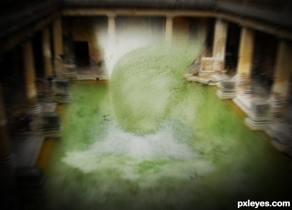
Great splash effect.
thanx a lot.... :P
I'm not sure why the splash is set vertically rather than horizontally (like the original wave), and why the background - the solid building - would have the radial blur effect applied. Water yes, but the pillars and rest of the building, I don't think so.
What i tried to create was a cyclone o something that had a lot of force surrounded around it..... the wave is kinda curved so rotating it kinda made it look like a cyclone... as stated before i wanted to show somethin that had a lotta force thats y the radial blur... somewat like in the movies :P o NFS where when nitro is applied the whole environment seems blured... d same way....... n e ways thanx for the comment guess i didnt potray wat i had in mind the right way......
first impression: "What the ?!"
nice impact on me 
Howdie stranger!
If you want to rate this picture or participate in this contest, just:
LOGIN HERE or REGISTER FOR FREE
Good idea, wrong reflection. The reflection would be perpendicular to the statue.
nice idea and work, all the best to u
Howdie stranger!
If you want to rate this picture or participate in this contest, just:
LOGIN HERE or REGISTER FOR FREE