(5 years and 3962 days ago)
1 Source:
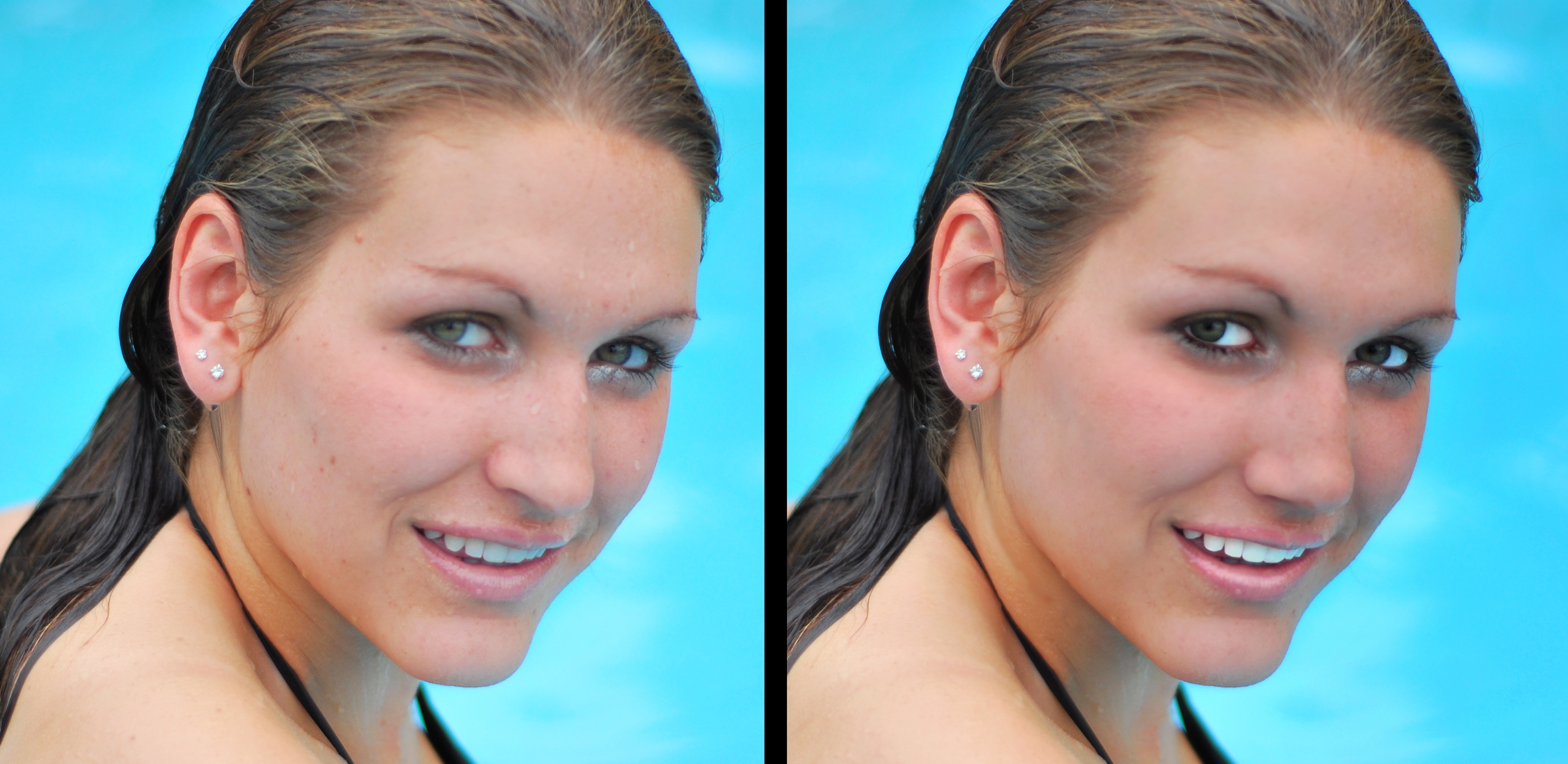
retouching isnt my thing so this isnt very impressive. for some reason it looks lke ther is something slightly rong with her but i cant tell what it is. (5 years and 4032 days ago)
let me help you  her skin is waaay too blurred. if you look at her body, or even the ear, you'll see a huge difference! you did good on removing skin imperfections as far as i can see. Also, about the teeth, i'd tone them down a bit. Just for the sake of realism.
HER TEETH are super brite and the skin tone is a bit too dark..it makes her look black light lit.. play with the background as well..that can have an effect as well (remember the episode of FRIENDS when Ross bleached his teeth.. same effect her) save your work and try a gentle glance with the dodge tool.. that might help
I agree
Looks pretty good, but too red around the eyes...
Skin is too smooth and it doesn't blend with the texture around the ears and and neck. When you use the blur tool set it to a lower opacity (10-20%) so you can control it better...Good Luck
reduce the red around eyes.. looks like an infection she has gotten from all the swimming 
reduce the blurness and red color
she looks like she's been crying for days; besides what has already been mentioned I would make her eyebrows darker and no red

Good Luck
nice
Howdie stranger!
If you want to rate this picture or participate in this contest, just:
LOGIN HERE or REGISTER FOR FREE
Parking lot run off pool is my source (5 years and 4040 days ago)
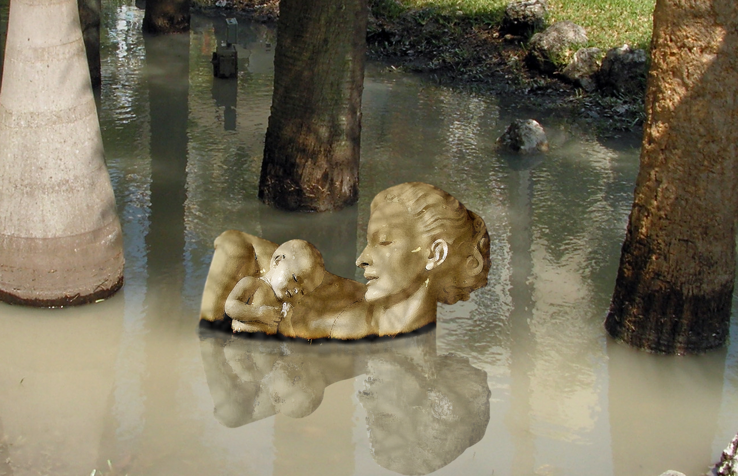
Not sure that the effect on the figure is needed - more obvious in the hires. Also I get the feeling that the light source is a lot higher and on the other side so maybe flip the figure? Your call. GL
animmax..hehehe..you are very right.. why do you think I put the figure half in shade and light?.. after a while I didn't want to deal with it anymore.. (almost chucked the whole thing thinking about all the hassle that poor guy with the giant stone hand in the water had) as to flipping it..I did that about nine times and just gave up.. I just like the image so much I didn't want to chuck it (the other image was a play on picasso, and I don't think peeps are ready to see a mother and baby with eyeballs where their ears should be)
EDIT.. have to admit I hit the texture on the statue very close to the texture of the tree and I didn't borrow from the tree at all..hehehe.. I'm very proud of that LOL
I have junked a lot of entries for the very same reason..
Why texture only on the figure? Edges of reflection need to be rippled along with water surface and blurred.
there cmyk.. I put that ripple blur darkening color on the water.. and I matched it against the tree collars as best I could..
Yup, looks better!
good
nice good luck
gl
Looks pretty nice with those colors. Maybe I'd expect some ripple effect for the reflection of the statue in the water. Compare also to the tree on the right side. It's reflection is way lighter cause it looks like it's in the light (background is covered by shade), maybe you can make the statue's reflection also a bit lighter at the top of the head(so down in the image ). Good luck!
What a find that would be.
Howdie stranger!
If you want to rate this picture or participate in this contest, just:
LOGIN HERE or REGISTER FOR FREE
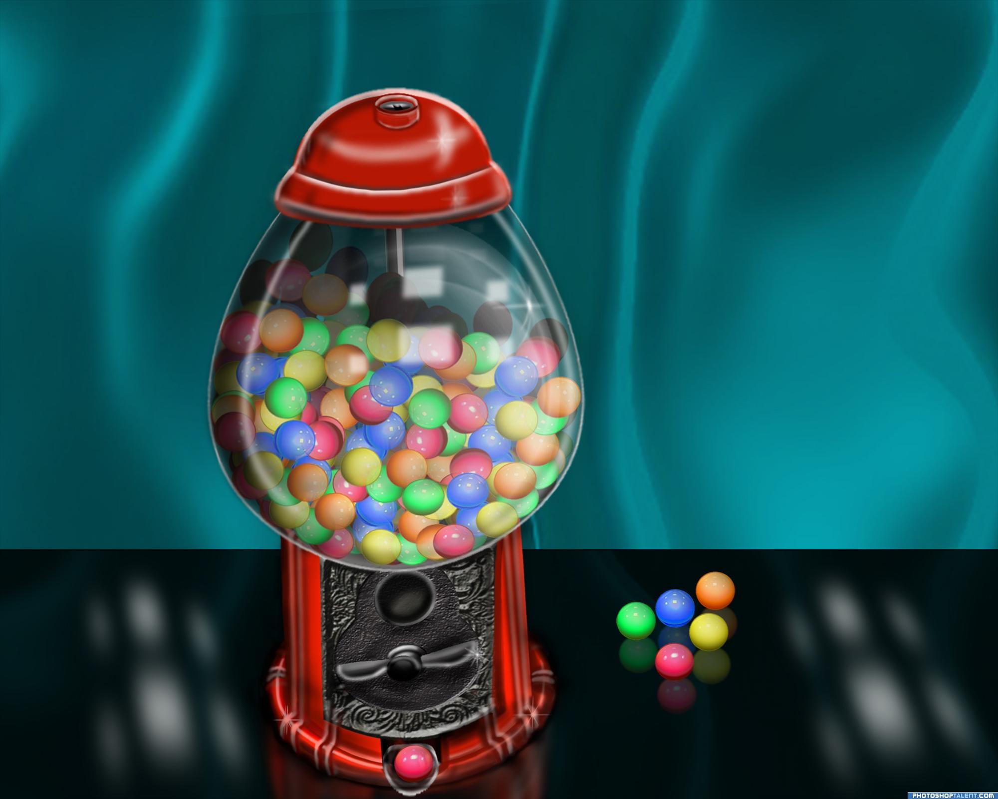
This is my previous entry from the original contest...Ive since gotten rid of some of my older files ans only have steps 7 ,9 and 10 no other sources. used my own textures. (5 years and 4049 days ago)
pretty cool i like it
shoulda made this for the the other contest with the balls as well lol
Very nice work
heh nice idea good luck
nice idea good luck!
Great idea there!
nice
GUMBALLS... NOOOOOOOOOOO.. oh crud.. Missy beat me too it LOL. great picture
great!!
That is cool, nice work. some of the gumballs towards the back look like they are floating rather than resting on eachother, thats all my problems tho
nice
good
Creative!
I like it too!
Interesting image !!!!
Congratulations for 2nd
Congrats!
Congratulations.
Congrats!
Congrats!
Congrats
Howdie stranger!
If you want to rate this picture or participate in this contest, just:
LOGIN HERE or REGISTER FOR FREE
Photography and photoshop contests
We are a community of people with
a passion for photography, graphics and art in general.
Every day new photoshop
and photography contests are posted to compete in. We also have one weekly drawing contest
and one weekly 3D contest!
Participation is 100% free!
Just
register and get
started!
Good luck!
© 2015 Pxleyes.com. All rights reserved.


Awesome use of source....very creative.
Thanks for fav wood
This is what i call a good use of source, maybe too much symmetry but this can be worked out.
WOW
Nice job.
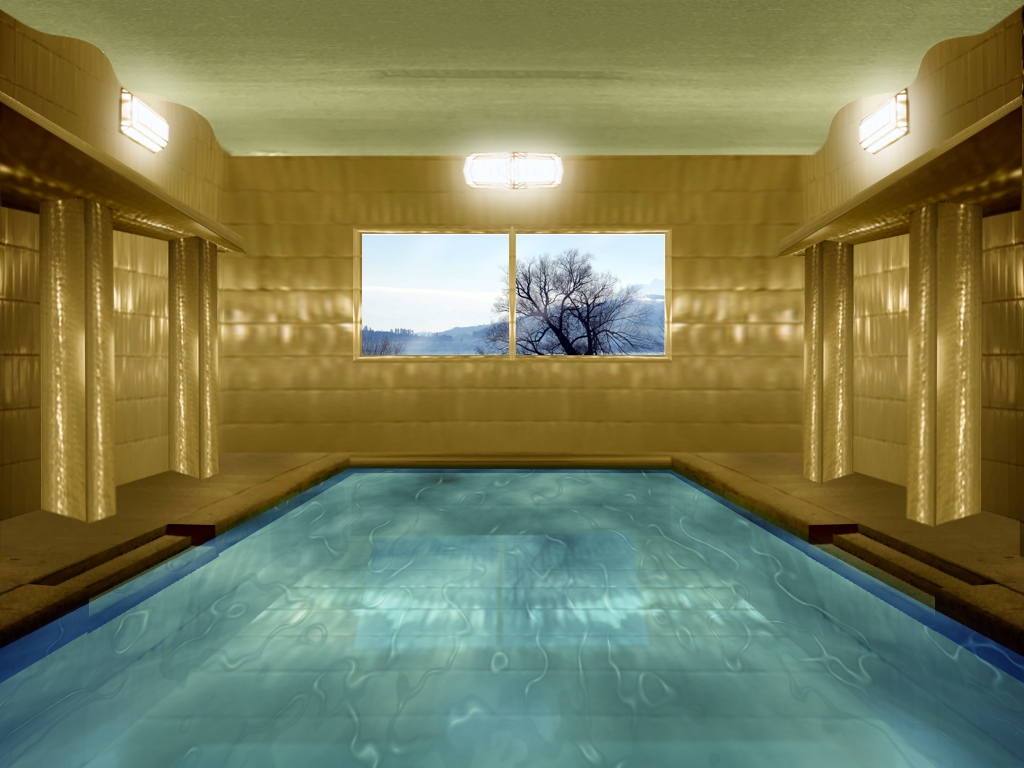
Looks empty...try to add some water effect, and fix the perspective on the window reflection...
nice work but you have to do some work on the beams. good luck
good
Nice use of source. Agree with above comments. These suggestions will help kick this out.
very nice
Congratulations

Howdie stranger!
If you want to rate this picture or participate in this contest, just:
LOGIN HERE or REGISTER FOR FREE