(5 years and 1377 days ago)

Simple idea but with great natural effect imo. Book image is my own. (5 years and 3827 days ago)
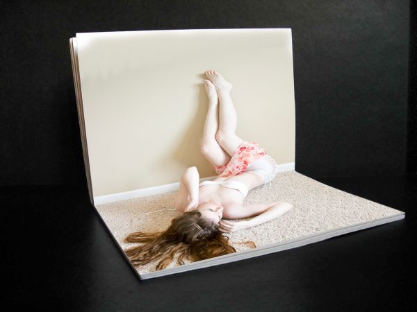
That seems more like a girl laying on a gigantic book 
Well, yes it does maXed  . But after looking at the girl source image, we know better, dont we! :P
off theme...how would it pop up?... where is the crease?
Its on theme donk, you cant see the mechanice of it because the angle and you cant see the crease because its brand new and made from an incredibly fine material. Stop being such a bitch, spamming all the entries.
I don't think its spam... 'donk' ... I think it's making authors aware that their entry is off theme... if you disagree then re-read the contest goal... and your justification is just as bad as "i assume the land mass of my planet represents my country" - It's meant to be a pop up book... technically the pop up book would be broken looking at the angle of the body in relation to the books spine...
RULES : "show the book and the fold with the pop-up elements shown standing up." I have done this !!! there is no mention of a crease. but if it makes you feel better... you can try to use your imagination to picture one there.
Well I still can't see it personally... all you've done is line up the image to the fold in the book... which then makes the woman look as though she is lying in the book like maXed said... she isn't an element thats popping up... I shouldn't have to use my imagination to make your entry 'work'
EDIT: OK OK I actually see your logic... but i think the girl then should look like her feet are attached to the page... so that it makes it clear she is an 'element standing up'...cause seriously it just looks like she is propping her feet up onto the wall... and maybe a fold line where she would fold when the book is closed!!...
AND AS AN APOLOGY:... i had better inform you that you haven't included your own image of your book uncut/unaltered in your sbs... so it will get removed if you don't rectify that...
Well her feet are attached to the wall, it's a flat image placed over another flat image. The fact that you and max stated it looks like she is lyinig on an open book tells me that I have suceeded in my efforts to achieve exactly that impression. Apology accepted  .
.
yes but we are saying that she doesn't look as though she is attached as in 'pop up book '... thats the theme... thats the idea! it's got to look real as though it was a pop up book... otherwise it isn't to theme... and becomes something else... but anyway...
And now we go back to your imagination, Just try to picture it, closing the book, it folds flat. It's a great popup book, enjoy it.
EDIT: If you look at other popup books, the popup does not look attached (from a certain angle). If it did look attached - it wouldnt be a very good popup book 

just get your source image sorted out otherwise ill have to imagine it still in the contest!!... :P
no probs, ill get around to it sometime. But in the meantime, take another look at my work of art, you may learn something lol.
... i could stare at it for hours and still think the same!... and learn nothing... no offence!...
personally I would make it as real as possible to an actual pop up book... not only would it look great, but it would be exactly 100% on theme, without the use of having to rely on peoples imagination... 
Regardless... I hope you place where you expect to................ 
i think what is confusing people is that the girl is tooooo 3d so it just looks like she is laying on the book. It doesn't look like the book would close flat. It is a nice image though.
could be a very interesting idea if you would make the girl looking more flat, like a real pop-up.
very nice work and imagination... but i think it'll be better if u flatten or attach some part of girl to book
where can i buy this book...good luck author
coming to a store near you soon.... will you be disapointed if there are no visable creases on the models ? :P
yes :P as long as they are folds for transporting the model around, and not some old wrinkly hag!
looks mare like you took a pic of a girl laying lext to all wall and cut it out to be the shape of a book, than a popup book, we can use our immagination all we want , its physically impossible to get that look out of folding paper.
edit : after looking at your source it appears like thats exactly what you did. it looks good, little simple, but the end result would not work for a popup book.  sorry
sorry
Well, when I was making this image, I expected it to look kinda 3d'ish but i was surprised at how well it looks. I was so simple, took 10 minutes after i spent 1 hour finding the right image. I named it Simplistic pop-up for that reason. If she were a cardboard cutout which i intended to make an actual pop-up book from she would indeed have a crease from her right butt cheek to her left breast and a separate piece of card board behind the left elbow to make it stand up. So to james D , I apologize, you were right but perhaps you could have said it more constructively.Thanks EvanMugford
great
Howdie stranger!
If you want to rate this picture or participate in this contest, just:
LOGIN HERE or REGISTER FOR FREE
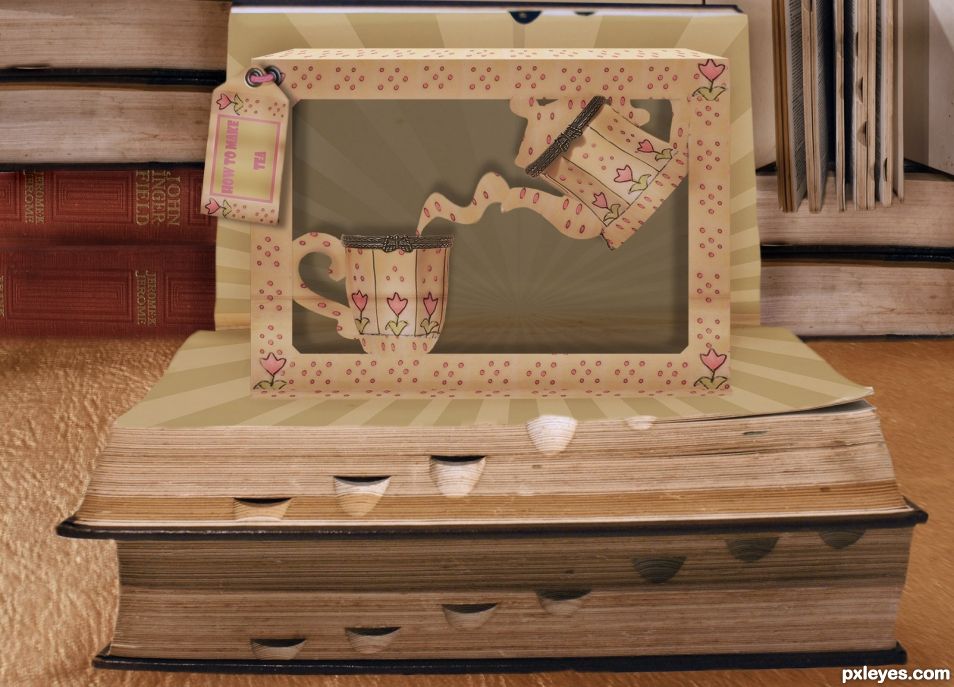
Peculiar image, well done.. Might removing the box top make it look more Flat? Not necessary, but it looks like a box set on top of the book and not a pop up. The bottom edge is EXCELLENT!!! great thinking there.. good luck Its well done all round
thank you . great feedback .
a sample of this style http://www.papercraftsquare.com/wp-content/uploads/2015/04/Easter-Bunnies-and-Trees-Window-Pop-Up-Card-Papercraft.jpg
AHHHH.. now I see.. nevermind.. hehehe
always happy for feedback Thanks for taking the time to comment and help Drivenslush.
Congratulations for 4th
thank you . did not even realise the voting was on .. shows how busy life is at the moment .
Congrats!
Howdie stranger!
If you want to rate this picture or participate in this contest, just:
LOGIN HERE or REGISTER FOR FREE