(5 years and 501 days ago)
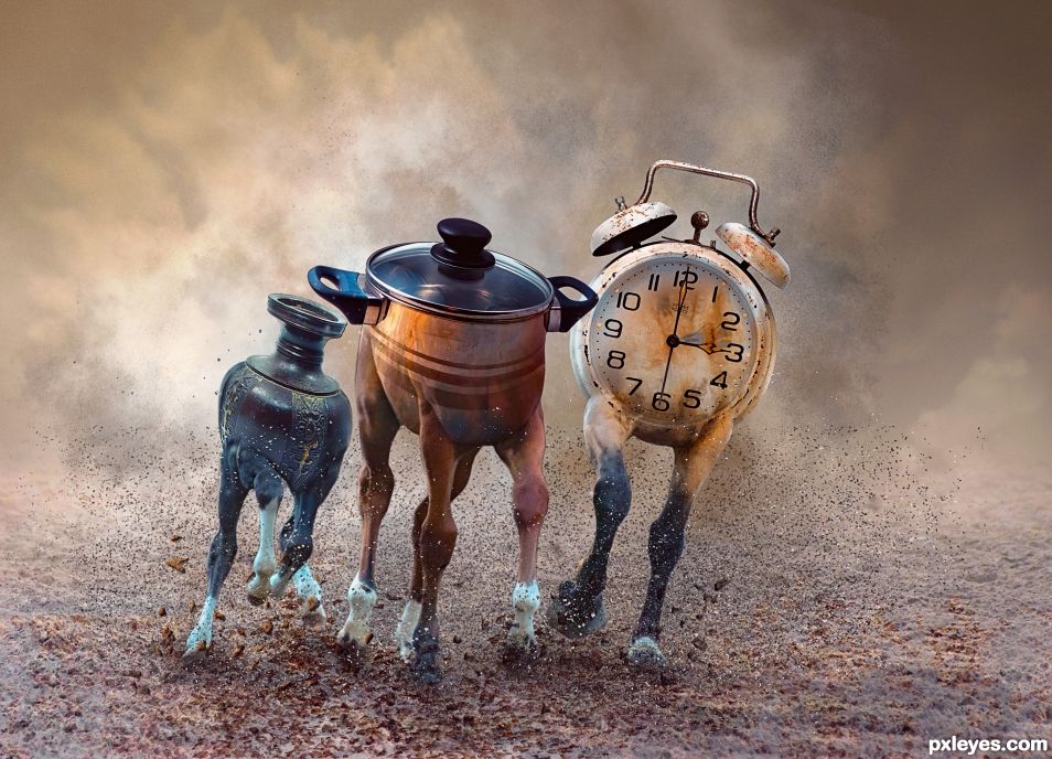
- 1: horses
- 2: clock
- 3: vase
- 4: cooking pot
- 5: stone brushes
- 6: powder brushes
- 7: sand dust brushes.
- 8: cloud brushes.

(5 years and 501 days ago)
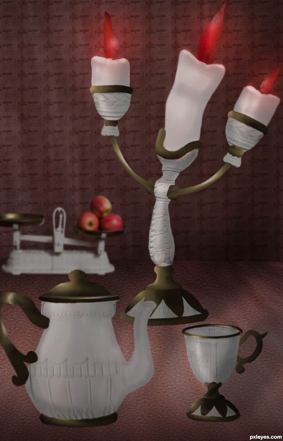
source image only -no outside images used (5 years and 1383 days ago)
Be our guest.. be our guest... be our guest 
Work on the shadows, everything else is good. 
thanks very much . will do .
Congrats!
thank you .. and to you on your entries.
Congrats.
Thanks TorDoni. 
Congratulations...
Thanks George55 
Howdie stranger!
If you want to rate this picture or participate in this contest, just:
LOGIN HERE or REGISTER FOR FREE
(5 years and 2601 days ago)
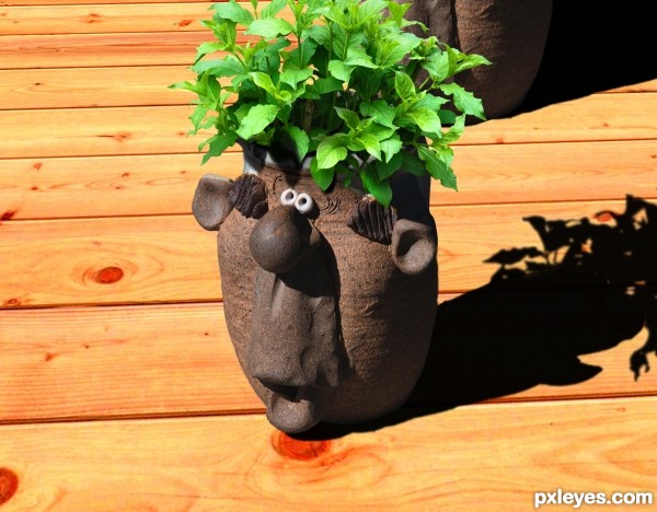
I like this one a lot. Keeping ideas and themes aside, simply for the near perfect finishing in technical terms. Everything looks believable. Nice work.
Howdie stranger!
If you want to rate this picture or participate in this contest, just:
LOGIN HERE or REGISTER FOR FREE
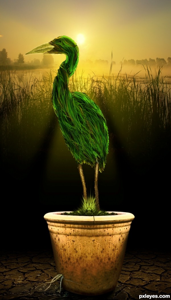
Thanks to the source person:
Bugdog - Heron
Barthetzk - Water Splash
Kovik - Dry Land
Tome213 - Bark
Mzacha - Grass Texture
Maliniakxx - Sunrise background
(5 years and 3307 days ago)
very nice work with the pot and the ground...it look very effective...but the bird is to flat...i don't know how u could change that but work a bit more on shading for better final score...gl author
Thanks erathion, I did big changes to my entry know and I do hope it's worth the effort.
Howdie stranger!
If you want to rate this picture or participate in this contest, just:
LOGIN HERE or REGISTER FOR FREE
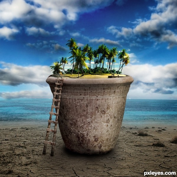
i am living on a small island in the caribbean since 16 years and have to leave it for ever that's why i was inspired to make this composistion as if it was possible to bring it with me in a pot... (5 years and 3312 days ago)
Author, it's sad indeed to hear you have to leave an island paradise, but the light source on the trees is opposite the light on the pot. Best of luck to you! 
I WANNA LIVE IN A POT!!!! dammit (and I'll fork over all the rent.. and the watering)
Just fix the light (flip the stuff in the pot) and it will be fine. Not so hard to do...
Fascinating creation!
love this !!
nice work author.. i agree with you as it's the oppositions of the lights that attracted me
and the idea you said about the microcosm made me love it more
gd luck
Surreal is one thing. Poor technical execution is another. This is a competition, and your concept is a good one, but the obvious light direction will hurt you more than help you, regardless your excuses to try to justify it.
Two suns would CLEARLY show two light directions on the subjects, NOT opposing light reflections on one object (the island AND the pot). Likewise, the sky would show two light sources...
As CMYK stated, it's easy enough to reverse the island to make it read better. To try to justify such a poor choice as "it's surreal" will probably cost you more points than you would have gained had you corrected it.
cute!
It's really nice manipulation I really like the work. Everything is nicely added but I'll have to agree with the light source on this. You still got plenty of time to fix it.
OK i 've fixed the probem of the light source on the trees, for sure it looks better now !
Thanks to CMYK46 and MossyB for their usefull advices
I would like to see SBS! =)
Great imaginary and fantastic final product...best of luck author
Nice Idea
 Wow now that's surreal!!! Nice blending! Looks like a winner. GL!
Great, glad you cared enough to make the quick adjustment. It really polishes it and that little difference could have effected the wonderful work that you did  . Good luck.
love to live there...
congrats for the 3rd place.., welldone
Congrats on your win
Howdie stranger!
If you want to rate this picture or participate in this contest, just:
LOGIN HERE or REGISTER FOR FREE
How fun! zoom zoom zoom.. photo finish
Thanks Ernest and thanks for the fav too.
Super ! well done ! good luck author
Thank you very much Lolu and thanks for the fav.
Congrats Skyangel
Thanks Sylvie
Howdie stranger!
If you want to rate this picture or participate in this contest, just:
LOGIN HERE or REGISTER FOR FREE