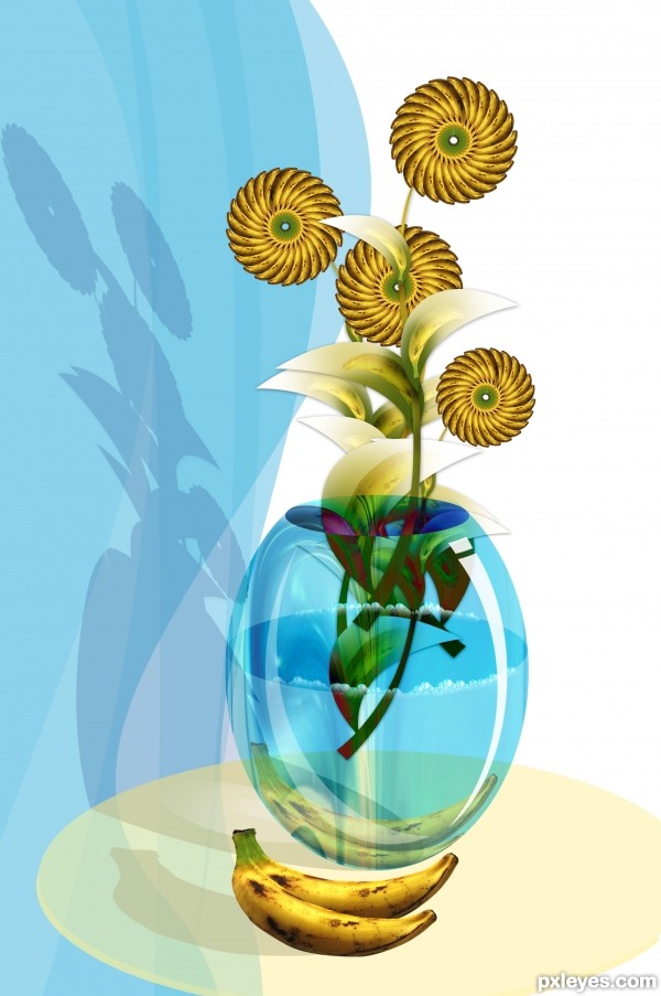
Thanks to sxc.hu & abcdz2000 for 'going bananas'. I used only above mentioned source, rest is done with photoshop cs3. (5 years and 3408 days ago)
- 1: source1
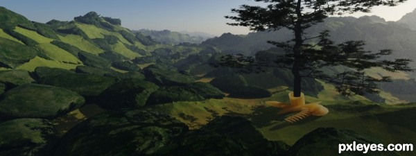
hope u like it... (5 years and 3438 days ago)
Howdie stranger!
If you want to rate this picture or participate in this contest, just:
LOGIN HERE or REGISTER FOR FREE
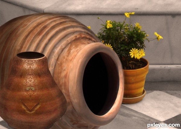
Thanks to gonzalez-alba for the patio image and Klearchos Kapoutsis for the large pot. (5 years and 3464 days ago)
Nice job. A little more shadow on the left side would match the light source.
OK, thanks. Will do!
good work author...nice composition...best of luck
Very clever use of the source, especially the indents.... well done 
briliant 
Cool pot! I would like to have one in my garden 
Thank you all for the comments!
Howdie stranger!
If you want to rate this picture or participate in this contest, just:
LOGIN HERE or REGISTER FOR FREE
(5 years and 3574 days ago)
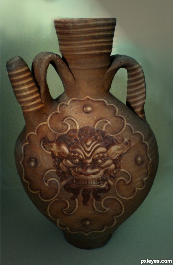
my only criticism is that the stock images central line doesn't seem to be where you have placed the source image... the overall look is good but it just feels lop sided somehow to me... good luck anyway... 
jamesD thank you for your comments.I was just oping if you could be more specific with the comments.I did not understand it Id want this t look better
Great idea. I agree with james. The image appears a little flat on the pot, maybe you could warp it a little to make it look like it's kinda going around the pot. Good luck!
oh no..i cant redo this..i have merged all the layers
the only thing is that i see the pot design below the face, too much opacity, or mask the underlying layer, it doesnt look to realistic...
Howdie stranger!
If you want to rate this picture or participate in this contest, just:
LOGIN HERE or REGISTER FOR FREE
look out sbs... (5 years and 3591 days ago)
I actually like the large flower in step 4 and the color in step 7 image better than the final image.
use layer mask to put flowers inside of the pot.That is my only nit pick,beside that very nice work...good luck
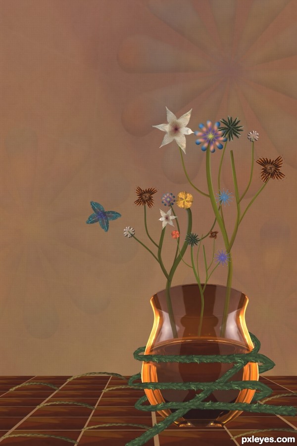
Surface of a liquid is parallel to the ground. Thus we could be looking up a hill here, but then I would expect the flowers to seem to be leaning away from us slightly. Plus the pot base doesn't seem to be sitting on anything and the vines don't cast any shadows. [BTW there's a small vine inappropriately overlapping a big vine on the pot's left side.]
nice work ......... gud luck ......... 
Congrats for your third place, Kevin!
congrats for the 3rd place ......... 
Congrats, Kevin! 
Congratulations!
congratulations!!! 
Congrats!
Howdie stranger!
If you want to rate this picture or participate in this contest, just:
LOGIN HERE or REGISTER FOR FREE
Well I personally thinking that shadow is too harsh, try to reduce that by using Filter - Gaussian blur amount 5 - 8 (try).
Use burn tool on that side where light is not directly contacting to that object it will surely add more life to your composition.
Best of luck!
Thanks for the suggestions Adhir, But I want to show hard shadow & morning light so I didn't gaussian blur to it.
Very colorful! Pretty
I quite like this! It's a very pretty and appealing piece. For mine, it's a little out of balance though, with such a large 'vase' and such small flowers. It has a lovely illustrative feel to it, but I think that the 'photographed' bananas in front detract from this. Perhaps if they were drawn it might have made the piece a bit more cohesive.
Anyway, well done.
Howdie stranger!
If you want to rate this picture or participate in this contest, just:
LOGIN HERE or REGISTER FOR FREE