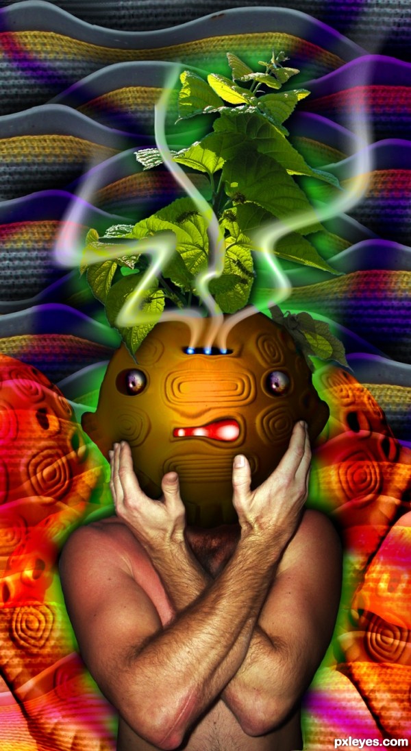
source and my pics (5 years and 3599 days ago)
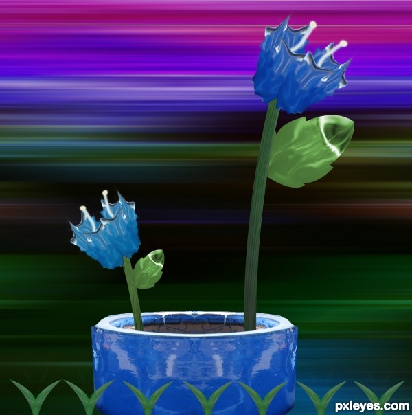
simple pot (5 years and 3610 days ago)
nice..good luck
Thin the stems and flowers will be better... 
I agree just trim the stems a bit and you'll have a winner here.
GL
nice .............. GL......... 
Howdie stranger!
If you want to rate this picture or participate in this contest, just:
LOGIN HERE or REGISTER FOR FREE
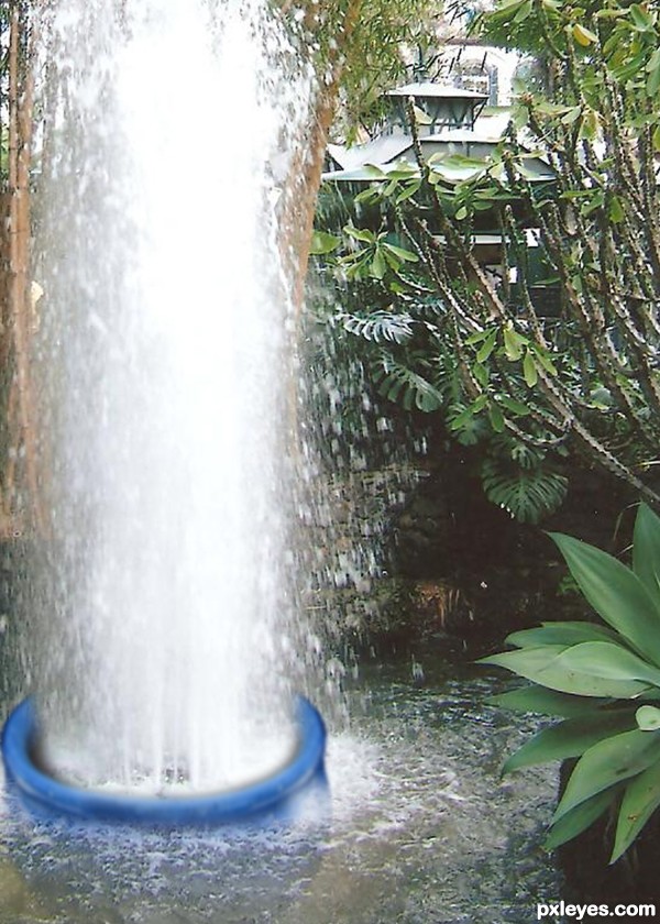
Blue pot making a fountain (5 years and 3610 days ago)
nice idea
good luck
what makes me sad is that the subject is way too close and not paged as it should be... plus, it's too blurry ... GL
Great job author...good luck
Dandesign05 said: plus, it's too blurry ... GL
It's "blurry" to give the effect of the water!
And I'm sorry but I don't know what "not paged propery" means.
This was a nice idea, good luck to you.
nice work author......... all the best to u.............. 

Howdie stranger!
If you want to rate this picture or participate in this contest, just:
LOGIN HERE or REGISTER FOR FREE
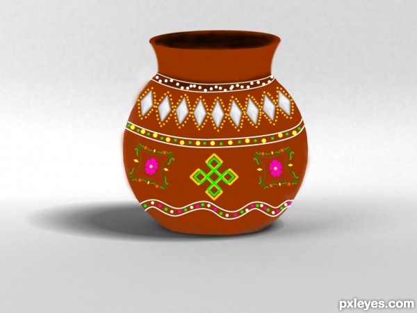
Changed the source using pen tool & warp tool to get the complete pot shape.Then filled with colour.Used the source to get shadow. Drew most of the shapes with pen and filled color with brush. Also some shape tools too. Worked with layer groups. (5 years and 3645 days ago)
If no outside sources are used, SBS is required.
nice pot 
GL
Howdie stranger!
If you want to rate this picture or participate in this contest, just:
LOGIN HERE or REGISTER FOR FREE
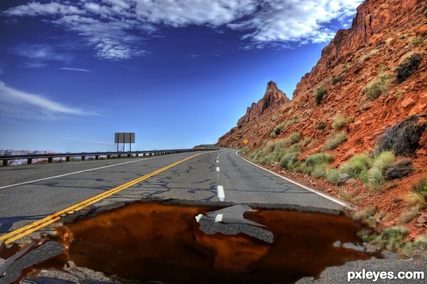
1 source and CS3 (5 years and 3648 days ago)
 ! Author, you painted the hole... so, YOU are the pavement artist!
so it looks really good

Good job, looks great.
This is always my nightmare...... very good job... (I think, removing the brown color over the rod and broken edges (near the yellow devider mark) will clarify the depth. Its only my opinion).... GL
hehehe.. at first I was like.. Hey.. this looks like it just drawn on the road.. and then I realized.. THAT's THE WHOLE POINT..hehehe.. great job author
I wasn't too sure about the color on the edges but I actually like it this way!
I wasn't too sure about the color on the edges but I actually like it this way!
the lines around the edge need to be sharpened to make it look realistic and the middle of it needs to be a little darker...otherwise good entry
nice paint job 
We have these in Colorado hehe. Nice job and good luck

great idea!
Good idea and best of luck!
congrats Chappy! 
Great Job and Congrats on 3rd 
congrats =)
Congratulations! 
congrats 
congrats, Poppa! 
congrats chappy 
Congrats!!
Howdie stranger!
If you want to rate this picture or participate in this contest, just:
LOGIN HERE or REGISTER FOR FREE
lol soooo knew this was you!
Of course it is! Fantastic style, I say... Surrealism on the top!

Btw, author, your model is sunburned!...
good i dea but somthinge missing
great job author

Btw, i guess its for CMYK46 ?
Damn,does he smoke that green thing on the top of the head.Yes he is,i see that in his eyes...LOL...great thing author
great idea ...............
good luck
Howdie stranger!
If you want to rate this picture or participate in this contest, just:
LOGIN HERE or REGISTER FOR FREE