(5 years and 2789 days ago)
(5 years and 2919 days ago)
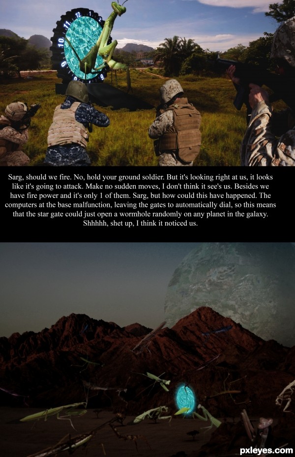
Next time i would leave the text out of the image and put it all in the entry's description box, if you want to give a little narrative to set up your image. all the text in your image does is take away from your image. neat idea, Good luck!
Yeah ur right Bjaockx, I was thinking of putting it in the description. Then I figure it might not go with the movie entry, it would just be describing it. I put the text in the middle cause it divides the two scenes, here on earth and on mantis planet.
Howdie stranger!
If you want to rate this picture or participate in this contest, just:
LOGIN HERE or REGISTER FOR FREE
Thanks to http://www.pxleyes.com/profile/mqtrf/
for the stock
(5 years and 3419 days ago)
Nice done,
Just Change the sky with real star image and pink light is not looking that good with composition.
Best of luck!
i like it ,sweet work
AdhirAnimator :
thank for opinion and i will fix it..
hazem :
thanks brother..
Its looking nice than before 
very nice construction author...love the lighting on the main objects...GL
thanks erathion
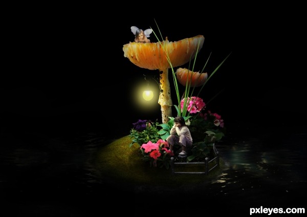
Very nice, but reflection of the lamp in the water is always directed toward the viewer.
Very nice job! 
Superficially extemely appealing BUT: The two-element water reflection doesn't have either of its elements match up with the single light source in the background. And the lopped-off top of that light source (apparently in the heavens) is kind of weird. In any event, the background light doesn't explain why the the foreground elements are lit from the front upper left (without any water reflection let alone creating any shadows BTW). The minimal use of the contest source strikes me as an inconvenient afterthought at best.
thanks DanLundberg ,
I improve my best...
Beautiful image... good work.... good luck author.
So cute! Great photos to combine with the source to create this. 
Congrats!  It a well deserving placement.
Congratulations for 2nd place!
Congratulations! 
Congrats for 2nd place... 
Congratulations on your 2nd place 
Howdie stranger!
If you want to rate this picture or participate in this contest, just:
LOGIN HERE or REGISTER FOR FREE
(5 years and 3529 days ago)
good work
I love that creepy mood!
Good work and good luck Author.
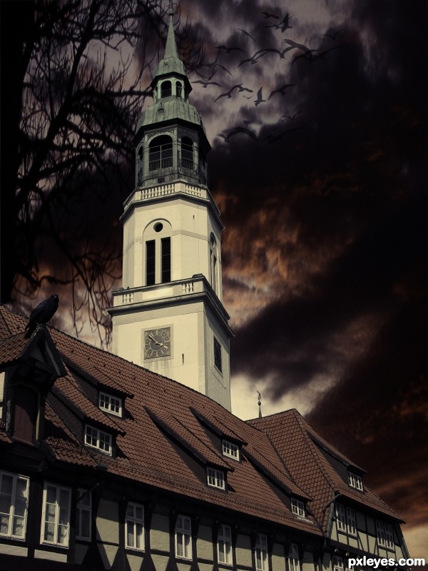
I think the background image is a bit stretched... To avoid this, when you resize an image, do it pressing shift key. 
XD
I think the size of the crow is not realistic at all . U should have change the time of the clock its never that dark at 4 o' clock otherwise is looks ok gl
Howdie stranger!
If you want to rate this picture or participate in this contest, just:
LOGIN HERE or REGISTER FOR FREE
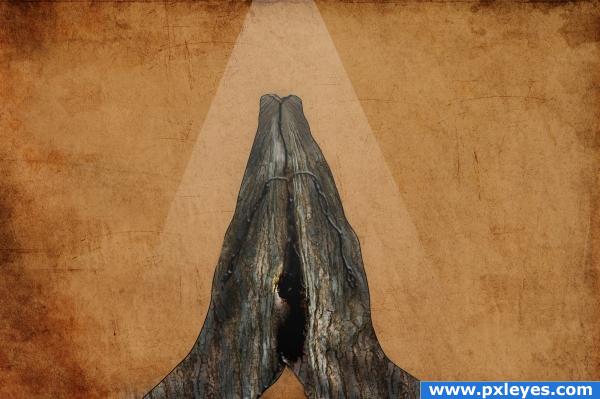
1.copied the tree thrice and then arranged it and merged
2.used free transform >wrap
3. used the stock image of hand and use it as mask
4.then added some details with brush and used layer style
5.then for background i added the texture (thanks to grunge textures by `Princess-of-Shadows) and overlay it on new layer with background colour (5 years and 3911 days ago)
Nice idea, but imo I think you can make the wood look more like parts of the hand. Right now the wood still looks quite much like it's a straight texture without a real interaction between the shape of a thumb or wrist and how the wood would look like. Try to look more for thé perfect wood parts to make a thumb or finger, show more that the hands are really wooden (for example by making the edges of the hands more rough or just use the tree's edges, would be the easiest) and warp a bit more around the wrists to get a more round effect. Good luck!
i like this image a lot it could use some shading though i love it a lot!
Listen to Wazowski. 
Howdie stranger!
If you want to rate this picture or participate in this contest, just:
LOGIN HERE or REGISTER FOR FREE
How about some shadows to match the light source?
aha you are right thanx
thanx
Very hard work
Nice setting for the source. Good work. GL author.
Howdie stranger!
If you want to rate this picture or participate in this contest, just:
LOGIN HERE or REGISTER FOR FREE