Photoshop Pictures: Pride


results 1 - 5 of 6

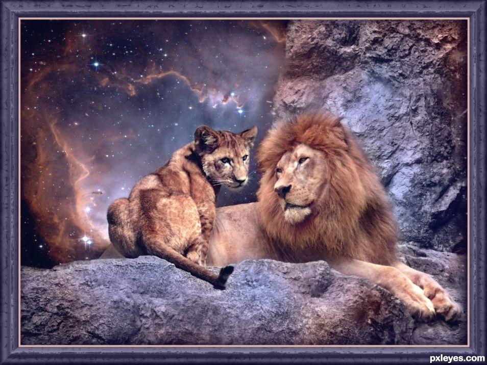
Lion King - created by skyangel


Lion King
Favs: 0SBS: n/aHi-resRank: 4/8Score: 58.6% (20)19591 views

Night comes quickly to the Pride Lands.
The sky turns violet and shatters into stars.
At this magic hour, Mufasa and his son
sit beneath the slowly turning galaxies,
surrendering themselves to
the rhythms of the nocturnal world.

Mufasa passes along the wisdom of the pride,
telling Simba how the great kings of the past
look down from the stars and will always be there
to guide him.

(5 years and 1031 days ago)

4 Sources:

avatar George55
George55 says:

I like the story...the image... nicely done...

author says:

Thank you George. I love the story. I actually saw a live stage production of it once and it was just awesome. If you ever get the chance to see one of those, I highly recommend it.

(5 years and 1030 days ago)


George55 says:

I have seen the play on TV, and believe me... it is incredible....

(5 years and 1027 days ago)


Howdie stranger!
If you want to rate this picture or participate in this contest, just:

LOGIN HERE or REGISTER FOR FREE


Regional Pride - created by metalbagg


Regional Pride
Favs: 0SBS: n/aHi-resRank: 5/8Score: 64.5% (15)19090 views

(5 years and 2551 days ago)

3 Sources:

author says:

Hmmm, that is really odd, as I added the url to that image. Trust me, I'm the biggest stickler in the world about using high-quality purchased images.

Why the screenshot though? Is it because I was red-flagged? Just curious, as I haven't been asked to do this yet. Only been a member for a few days.

Man, I was really building up my ranking on this. Do you guys normally disqualify first before asking questions regarding these things? If so, I need to pay much more attention.

author says:

Dear moderators, sorry for the mix up on the stock images. Hope all is good now.

Moderator says:

Author, entries that are not completely correct are only temporarily removed to allow any problems to be sorted out. Asking for proof of purchase is standard practice for us, when paid images are used, you can either add the screen shot to a step by step, blacking out your name and any other information, or you can send it as an attachment to mods@pxleyes.com
Welcome to pxleyes, you might want to have a quick read through http://www.pxleyes.com/guidelines/ and also http://www.pxleyes.com/blog/2009/06/how-and-where-to-find-legal-source-images/

author says:

Ok. I didn't know where to submit the screenshot. Now I do. but we don't normally need to do anything other than provide a url to the image correct? Well, I should probably just read the links you provided. Sorry guys. On it.

(5 years and 2551 days ago)


Howdie stranger!
If you want to rate this picture or participate in this contest, just:

LOGIN HERE or REGISTER FOR FREE


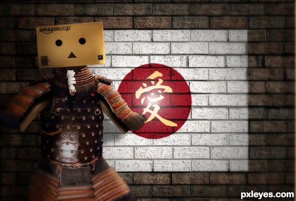
National Pride - created by junkieball


National Pride
Favs: 0SBS: 7Hi-resRank: 8/8Score: 46.8% (0)6533 views

(5 years and 3667 days ago)

1 Source:

avatar smsm
smsm says:

what is your idea ? you put hand sign on flag !

avatar ponti55
ponti55 says:

looks way too simple, but it looks like a nice selection of the hand.

Edit: Ohh wait! After lookigbn at your steop by step[ guide i understand what you were trying to do, however it doesn't really show toow ell. What you should do now is move the displaced flag on a layer on top of the hand and set the flag to something like 'Overlay' or 'Multiply. This will really help sell your effect, and earn you MUCH higher marks. (try it with full opacity as well)

author says:

ponti55 layers were arranged as per your comments i have now tried changing the blend mode from multiply to overlay and at full opacity. Not sure how successful this has been, Believe the effect maybe weaker than it should be due to the diplacement map as the hand was fairly smooth. Will try to look at this.

avatar RayTedwell

author, log on to youtube and do a search for Gavin Hoey , he has a tutorial on exactly this type of work and it will help you greatly. GL
author says:

RayTedwell Thanks for the heads up will look later and see if i can improve on the effect

avatar genuine2009

gl

avatar jawshoewhah
jawshoewhah [banned] says:

I like this one more than the second one you did.

author says:

Only did one entry in this competition?? but thanks!

avatar chakra1985

nice job

Howdie stranger!
If you want to rate this picture or participate in this contest, just:

LOGIN HERE or REGISTER FOR FREE


Pride - created by Akassa


Pride
Favs: 0SBS: 4Hi-resRank: 8/8Score: 54.1% (0)6445 views

It is identified as a desire to be more important or attractive than others, failing to acknowledge the good work of others, and excessive love of self. (wikipedia)

Thanks to:
- faestock (http://faestock.deviantart.com)
- lilnymph (http://lilnymph.deviantart.com)
- code1name (5 years and 3727 days ago)

5 Sources:

avatar ponti55
ponti55 says:

Good representation!

avatar k5683
k5683 says:

nice

Howdie stranger!
If you want to rate this picture or participate in this contest, just:

LOGIN HERE or REGISTER FOR FREE


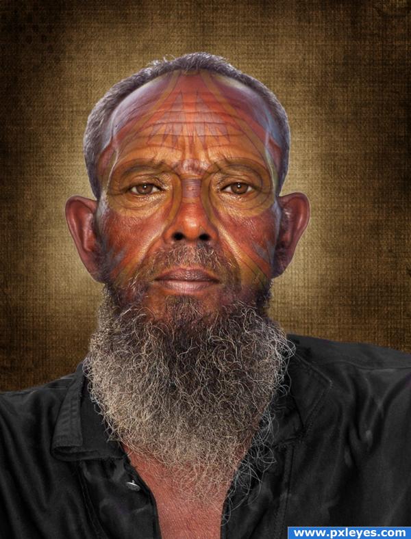
Tribal Pride - created by sparklen


Tribal Pride
Favs: 1SBS: 9Hi-resRank: 8/8Score: 54.4% (0)11137 views

This was an easy one for me...I do this work every day as a photographic portrait retouch artist. THAT is my job....THIS is my fun!
The only sources I used were the contest photo and a background that I made. The rest is "skill and technique".
Some have suggested a background change (one of my own making) which I did and liked it better! Thanks for the critique! (5 years and 3771 days ago)

avatar GolemAura
GolemAura says:

ya kinda don't need the back ground on this one (I like how you lined up the circles aroun the eyes).. I think the background almost takes a way from the work (lines up too well).. but that could be just me.. great Idea all round though

avatar ponti55
ponti55 says:

Very nice idea, but i'd change the background, it matches up too clesely with the face painting, and i'm sure that's the bit you want to keep

avatar CMYK46
CMYK46 says:

Interesting idea...

author says:

Thanks for the advise guys..........it looks MUCH better!

avatar Eladine
Eladine says:

i didnt see the firts background but this one does look good... may i hand youi another tip.. thru his hair on top and the site you see the whiter background shine thru... its what i call the "hit by a grassmower" look XD. I wrote a tutorial how to avoid it but it was on the old lpst site and its gone now so the best tip i can give is search for a tutorial to redraw hairs or wait till this site has my tutorial again

avatar Tuckinator

cool

no avatar

Nice face paint.

Howdie stranger!
If you want to rate this picture or participate in this contest, just:

LOGIN HERE or REGISTER FOR FREE