Photoshop Pictures: Primeval


results 1 - 2 of 2

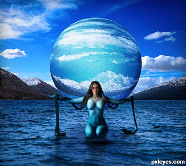
Nammu, Primeval Goddess of the Sea - created by musicj19


Nammu, Primeval Goddess of the Sea
Favs: 1SBS: n/aHi-resRank: 2/8Score: 67.8% (33)27030 views

In Sumerian mythology, Nammu was the primeval sea that gave birth to An (heaven) and Ki (earth) and the first gods, representing the Apsu, the fresh water ocean that the Sumerians believed lay beneath the earth, the source of life-giving water and fertility. (5 years and 2530 days ago)

4 Sources:

avatar CMYK46
CMYK46 says:

Good idea. Mountains need shadows, the figure could use more defined shadows, if not a reflection. Edges of the figure & globe could use some subtle blurring. I'm not sure about the texture on the model, but if you like it, that's your call.
PS: Good find on the mythology theme.

author says:

Thanks for the compliments and the suggestions. I added some shadowing for the mountains and also slightly softened the edges of the sphere and model. I don't believe that you would find more defined shadows on such turbulent waters as these. It was a specific choice I made not to have them defined so they looked more natural. At least that's how I see it. The choice of texture was to make her look like she was made partly of water and also so it just wasn't a nude woman on water. Nammu was part of the sea and that's what I wanted to portray.

(5 years and 2529 days ago)


CMYK46 says:

I still don't see shadows of the mountains on the water. The rest is better.

(5 years and 2529 days ago)


author says:

Hopefully they are a bit more defined now.

(5 years and 2529 days ago)


avatar lchappell
lchappell says:

Excellent concept!

author says:

Thanks!

(5 years and 2528 days ago)


Howdie stranger!
If you want to rate this picture or participate in this contest, just:

LOGIN HERE or REGISTER FOR FREE


Primeval Conflict - created by spaceranger


Primeval Conflict
Favs: 8SBS: 4Hi-resRank: 1/8Score: 73.6% (44)13630 views

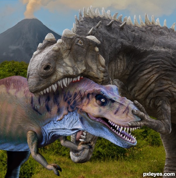
It seems there's always a bigger tough guy... (5 years and 2543 days ago)

4 Sources:

avatar kyricom
kyricom says:

Really nice one (although the bottom jaw looks a bit large)

author says:

It's exactly the same as the source image(3) which you can see in Step one in the SBS.

(5 years and 2543 days ago)


avatar dustfinger

Great scene. I like the positioning of the claw on the nose. it would be nice if you could apply some color to the bigger T-rex.

author says:

Thanks! The big guy isn't a T-rex he's a (take a deep breath) Acrocanthosaurus Atokensis, one of the largest theropods ever. Dinosaur colors are pure conjecture but I tend to go along with the camouflage scheme many experts favor and that's the coloring used on this Dinosaur Park exhibit seen in the source photo.

(5 years and 2543 days ago)


avatar CMYK46
CMYK46 says:

Good positioning of the claws both on head & jaw. Over all a great blend of sources to create a dramatic scene. GL author!

avatar rusvelt2000

Great job author

avatar eyecmore
eyecmore says:

One of the bests I've seen so far. Good job.

avatar Glockman
Glockman says:

Good work nice blending of the Dino's
PS this is also about 3 points better than what I mistakingly gave it. Sorry.

avatar George55
George55 says:

You are good for finding these nice sources to go with the source image. It shows that the fight for survival was intense. I can hear the neck bones cracking under that strong jaw. Ouch! Very good and sharp image again. Good job.

avatar nicehotcupoftea

Congrats Rein!

avatar CMYK46
CMYK46 says:

Congrats again, great job!

avatar George55
George55 says:

Congratulations my friend.... good job!

avatar lolu
lolu says:

Congratulations !

author says:

Thanks to all for the kind comments and congrats!! Special thanks to kyricom for providing the source image!

Howdie stranger!
If you want to rate this picture or participate in this contest, just:

LOGIN HERE or REGISTER FOR FREE