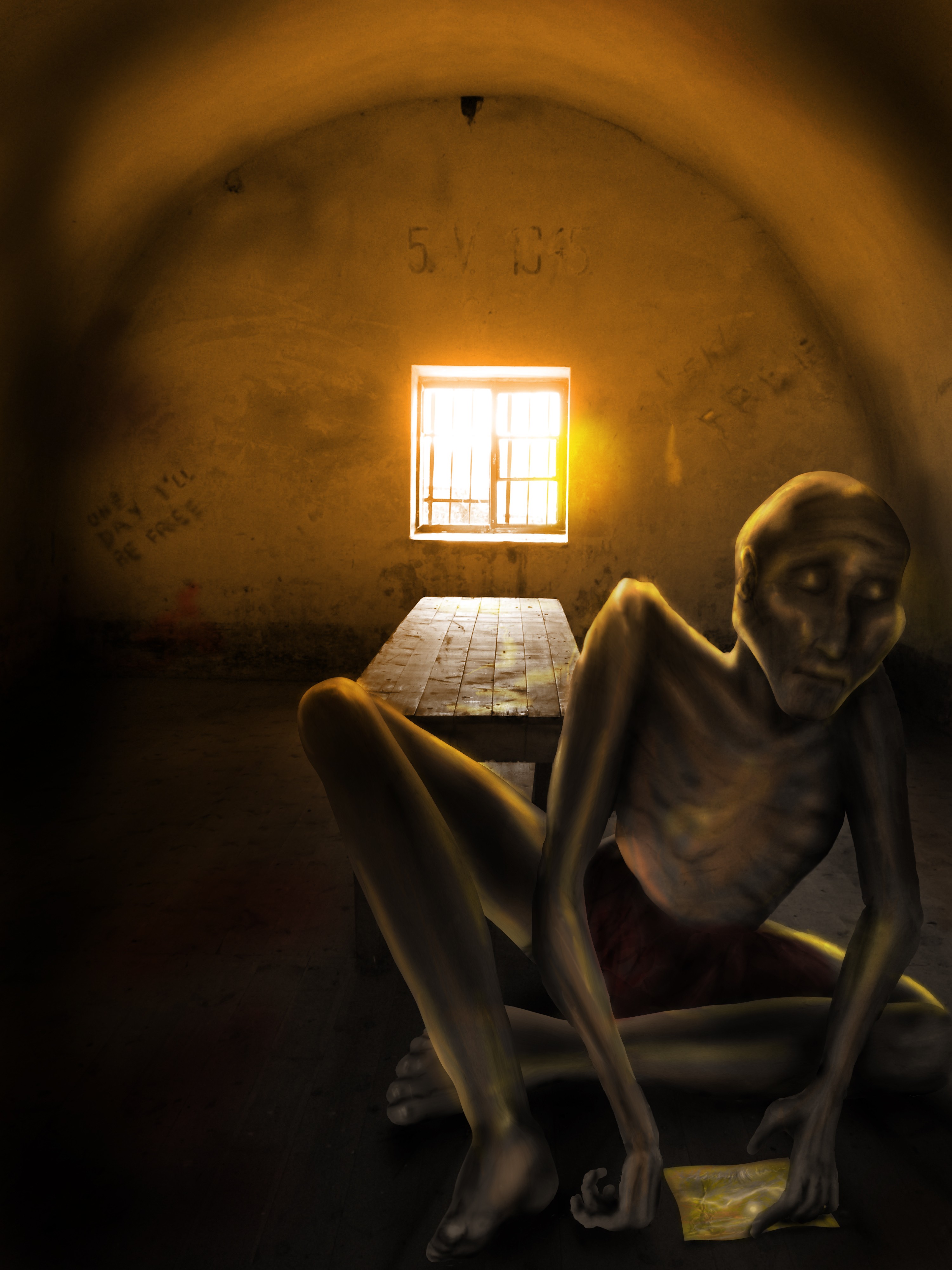
He's been held prisoner for so long he doesn't remember the reason any more, or his name.
He just holds on to this post-card, hoping to be free soon.
No other sources used. (5 years and 3854 days ago)
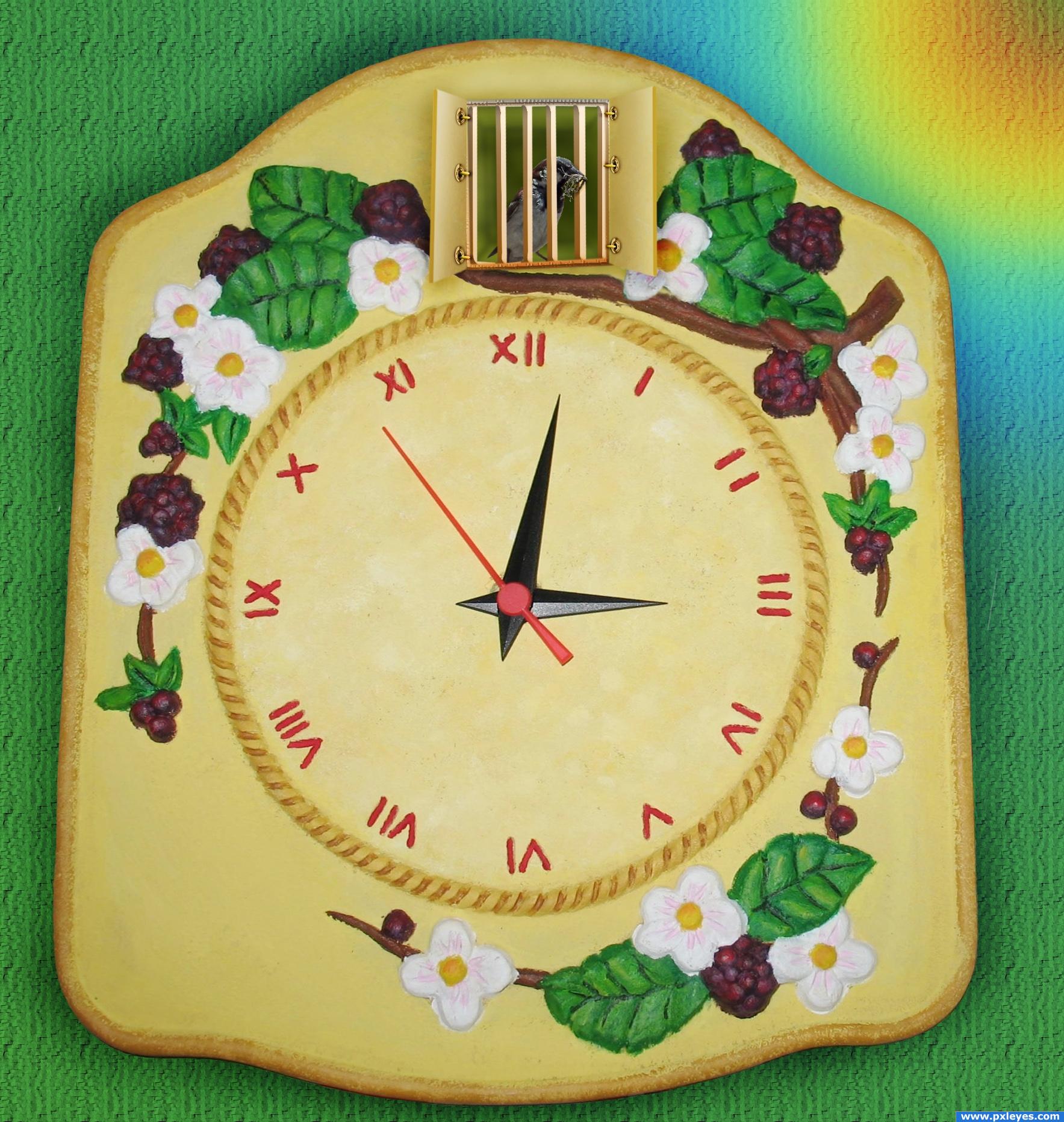
Sparrow, who wishes to live his normal life has to work instead of coo-coo bird. :-(
The only source is picture of the sparrow, taken by me. (5 years and 4001 days ago)
This looks very nice, a very creative idea. Great work with the hinges. Good luck!
This is simple and very creative
ryi like this image i think the idea is very cool and creative ..... a fav indeed! i wish i coul have a clock like that ... 
Thank you guys for nice comments.  Any technical advise?
i like the image a lot...
great!!
Good idea. Bars and hinches look good. Only the perspective of the doors doesn't match that of the clock. If you would take the doors as reference for determining the vanishing point, the clock could never appear as a normal circle.
Howdie stranger!
If you want to rate this picture or participate in this contest, just:
LOGIN HERE or REGISTER FOR FREE
Photography and photoshop contests
We are a community of people with
a passion for photography, graphics and art in general.
Every day new photoshop
and photography contests are posted to compete in. We also have one weekly drawing contest
and one weekly 3D contest!
Participation is 100% free!
Just
register and get
started!
Good luck!
© 2015 Pxleyes.com. All rights reserved.


Is he being held prisoner by dwarfs? He looks a little big. Suggestion: remove the table entirely and make him a little smaller and more center to the room but keep the window in the image. His edges are a little jagged when viewed in high res. Easy fix: liquefy/push tool to push them smooth, and hey, why not put some bars on the window? Just my opinion on that suggstion and optional but it might help match your description better. Kudos to originality
Thanks for the comment! He is big as I wanted to make him appear close to the ''lens''. Maybe I should blurr the background a bit to make it look it is far? I did put some bars on the window but maybe I should try to make them more distinguishable.
Scale is off, figure is too large...
Proportions are off (with the legs), but the mood is great. I don't agree that he's too large, but painting on the ground is much too light. It doesn't QUITE fit.
expression on the face has come out well author... well tried with lighting... but looking at the lighting on man, there is'nt a light source to cast tht bright light on the wall abv the arch.. also i wud hv lessened the brightness of light on the wall around the window and match it with the light on the floor imediate to the window, where there should logically be more light...(as light travels from window to floor, instead of spreading around the wall..) hope my explaination made any sense to you...
The bars are great! But it would still look better to just remove the table, put the focus on the prisoner and make the cell appear more like a cell.
Thank you all for your comments! They were really helpful, although with the holidays season I didn't have much time to work on my entry.
Howdie stranger!
If you want to rate this picture or participate in this contest, just:
LOGIN HERE or REGISTER FOR FREE