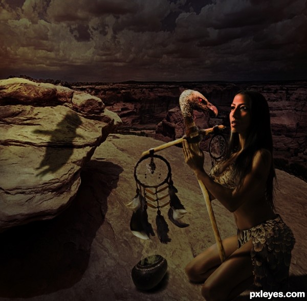
The priestess divined their future on that moonlit night. (5 years and 2588 days ago)
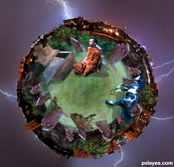
The Book of Nostradamus, Century VII, v.14:
He will come to expose the false topography,
the urns of the tombs will be opened.
Sect and holy philosophy to thrive,
black for white and the new for the old.
Small planet using polar coordinates of Photoshop. (5 years and 2957 days ago)
Howdie stranger!
If you want to rate this picture or participate in this contest, just:
LOGIN HERE or REGISTER FOR FREE
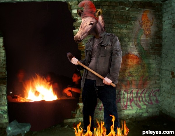
Artist's impression of an illustration in Vaticinia Nostradami:
A monstruous king above a sea of flames. He wears the phrygian cap (1) and the ears of an ass. According to the interpretation of the prophecies: when the sanculottes(2) took power during the french revolution, Pius VI was taken prisoner.
(1)the Phrygian cap is sometimes called a liberty cap; in artistic representations it signifies freedom and the pursuit of liberty.
(http://en.wikipedia.org/wiki/Phrygian_cap)
(2)In the French Revolution, the sans-culottes were the radical partisans of the lower classes; (http://en.wikipedia.org/wiki/Sans-culottes)
In this weird entry I simply mix the images and use burn and dodge (5 years and 2959 days ago)
A very good blend of the human and animal.. But a little more work required in other places.... Keep up the good work author...
Very original entry! in addition to this, you have been searching for the meaning of the items, which gives points to your interpretation. Good artwork!
Congrats, my friend! 
Howdie stranger!
If you want to rate this picture or participate in this contest, just:
LOGIN HERE or REGISTER FOR FREE
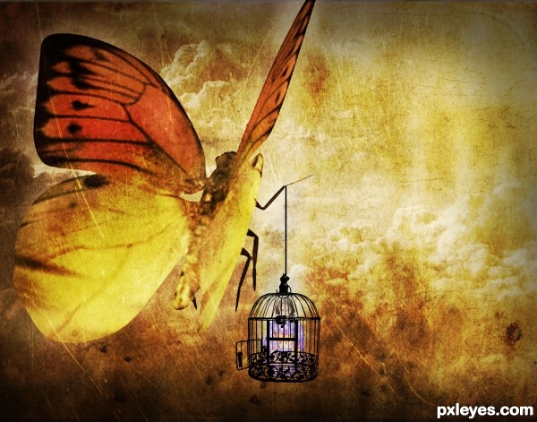
Texture 4 : http://night-fate-stock.deviantart.com/art/texture-10-135664434?q=boost:popular+in:resources+grungy+texture&qo=30
Credits to *Shoofly-Stock , ~ChainBound , ~xXxPaleGFXxXx , ~TW3DSTOCK , =Falln-Stock , ~Lord-Retsudo , ~WCat-stock , high_resolution and =night-fate-stock and *tsb-stock.
Updated. (5 years and 3439 days ago)
Great mood. But the cage could use a bit of transparency for better blend.
You have GOT TO email me that texture. I love it and this is so great! 
I absolutely love the texture too. I love this style of art.
Beautifully subtle, yet you added some color to it, keeping it from being *another* boring monochrome. VERY nice work!
cool...
Howdie stranger!
If you want to rate this picture or participate in this contest, just:
LOGIN HERE or REGISTER FOR FREE
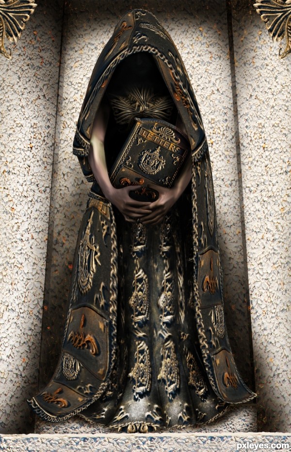
This was created for the contest:
http://www.pxleyes.com/photoshop-contest/13229/letters.html
but I uploaded it when the time had run out and couldn't participate ;(
All source with reference... (5 years and 3645 days ago)
very nice work done , best of luck 
gorgeous gorgeous gorgeous gorgeous
Good job! 
Slushy is completelly right: it's gorgeous!... 

Very nice work here...Great shapes...good luck author
wow nice work
nice costume design...gud luck....... 
Do you think this arms and hands are bigger than normal, author  ? Just 3/4 this size, but keep the length should be more reasonable
  . Without seeing your SBS, I though the arms are the 3D product
  , you drew them so nice. Best luck to you, author
Nice entry. Good luck.
Very nicely done.good luck author.
real good
Well done!! GL
nice entry! gl 
nice
Howdie stranger!
If you want to rate this picture or participate in this contest, just:
LOGIN HERE or REGISTER FOR FREE
waaaaaaaaw.....
??? not really sure what that means ..but will take it as " GL " lol
it means wow... i just liked the facial expressions the bird looking at the lady and lady looking at the bird "lovely eye contact"
thank you ..had to change her eyeballs ( see her pic and she is looking at camera)
I like the overall concept but the added light on her and the vulture's face, and the low-res background ruin this for me. Could do with some more masking too.
not sure whether it was the low res or the dof that bothered you ..and the glow if you look closer id from the radiant red eyes ... guess I should have made them even brighter
it was definitely the resolution, or at least the overall quality, of the background.
Regarding the light, yep I figured that's where the light was coming from but as you say the eyes should've been quite a bit brighter brighter, to throw that much light on her face.
Howdie stranger!
If you want to rate this picture or participate in this contest, just:
LOGIN HERE or REGISTER FOR FREE