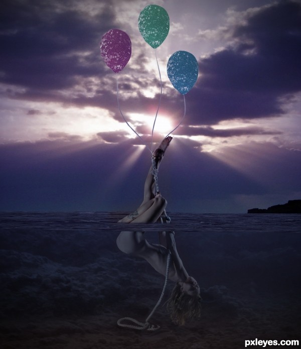
made balloon strings with brush (5 years and 2596 days ago)
- 1: source1
- 2: thx to mjranum
- 3: source3
- 4: source4
(5 years and 2747 days ago)
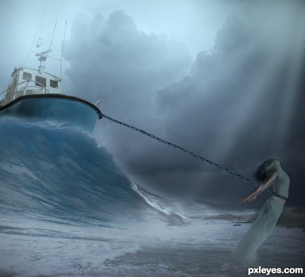
I think you did a beautiful job! I do not know why you have not gotten any comments or suggestions. Your image is just inspiring. Love the colors. Good luck!
thx george, dunno either why no one comment lol
Howdie stranger!
If you want to rate this picture or participate in this contest, just:
LOGIN HERE or REGISTER FOR FREE
(5 years and 3035 days ago)
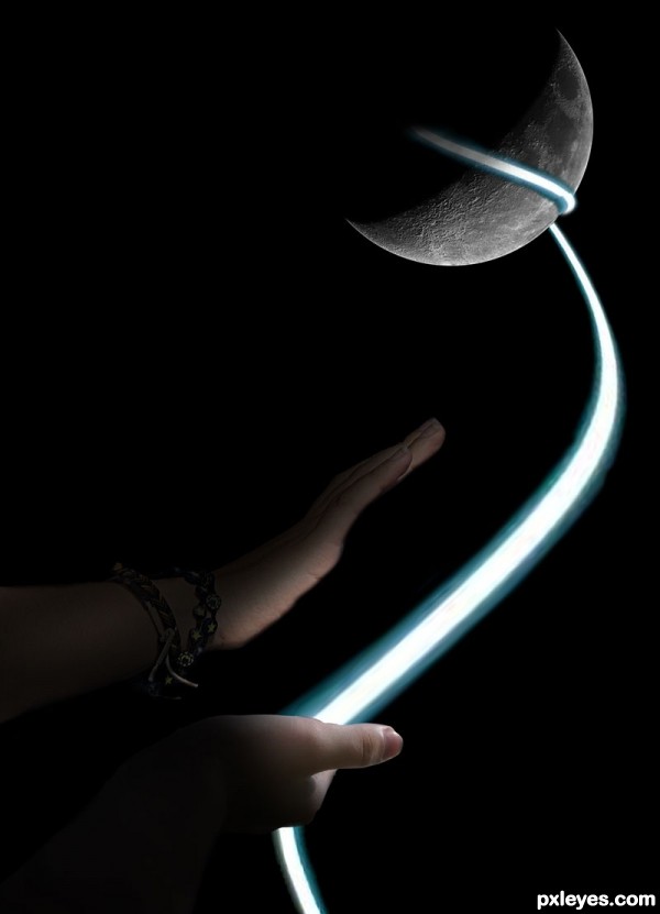
Good blending. Nice work.
Howdie stranger!
If you want to rate this picture or participate in this contest, just:
LOGIN HERE or REGISTER FOR FREE
(5 years and 3776 days ago)
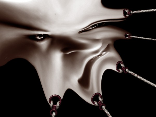
A bit too much like this: http://www.pxleyes.com/photoshop-picture/4b291d516367a/Cone-head.html
yes first time i see it,this art man is a movement,if i was the owner of the world...
but completely different way of thought in images,nevermind,i will tell u thanks for the pressure that u make here on people,if u are an optimist,bla bla bla,:
This reminds me of the movie Hellraiser, the first one. Good (and twisted) use of the source. 
this does look like cone head. at least you tried to add your own twist to it.
http://creattica.com/photoshop/splash/19406
congrats 
Congrats!
Congrats,
Congrats!
Howdie stranger!
If you want to rate this picture or participate in this contest, just:
LOGIN HERE or REGISTER FOR FREE
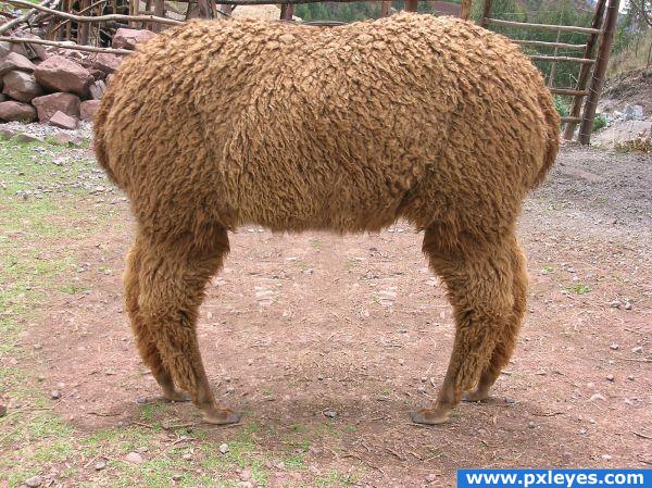
The opposite of a 'Push Me Pull You'...
I'm practicing with masks and cloning at the moment, so this was a good exercise. (5 years and 3875 days ago)
Good job! There's just a bit too much symmetry on the ground between the legs...
Yeah! Dr. Doolittle!
Oooooo, mercy! Really cleverly done! 
great imagination
Nice result. In fact I wanted to say the same as CMYK about the ground between the legs. If you can make it less symmetrical (just add some other ground parts), would be very nice. Good luck!
You can see where the top layer overlaps the bottom layer near the left legs. Also the shadows of the legs go in opposite directions, which makes no sense.
very nice one!
Thanks for the comments. I can see what you mean with the symmetry, I forgot about that area. But I also forgot about the shadows... lesson learned *hopefully  )
)
Howdie stranger!
If you want to rate this picture or participate in this contest, just:
LOGIN HERE or REGISTER FOR FREE
Awesome
Copied from PSHoudini at least give credit
http://pshoudini.deviantart.com/art/Fly-Away-PSD-and-Tutorial-345624941
Well actually it wasnt sunny, i made an earlier image with the same waterpart(second place)and i found this woman and decided to use her in my earlier photoshop imaged, btw i got imagination enough to create my own pic and not using another ones to win
its not missing, its under water and not big enough to let it show under water
good but if she is hanging on the balloon the rope should be straight right? but its curve
Howdie stranger!
If you want to rate this picture or participate in this contest, just:
LOGIN HERE or REGISTER FOR FREE