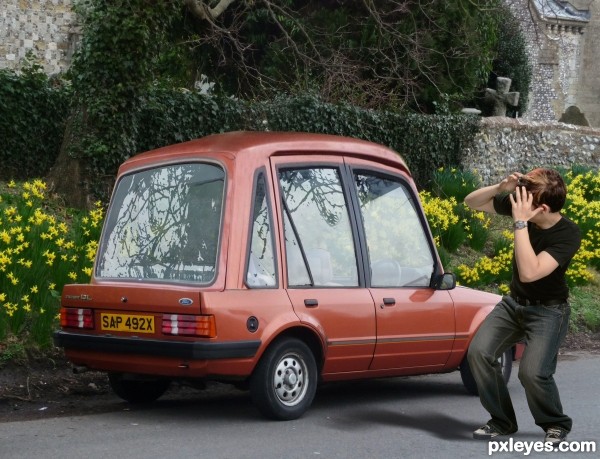
Not always changes the car look good (5 years and 2941 days ago)
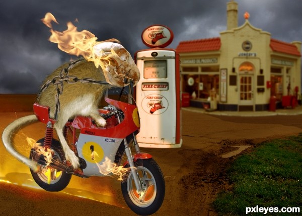
Good luck for all!! (5 years and 2941 days ago)
just a suggestion..give this a lighgt source coming from the top left..filter/render light source..just an opinion
I do not know why, when I use this effect the image has multiple horizontal streaks.
Author, you forgot to mention the link for the flames.
update done, erikuri, thanks
Howdie stranger!
If you want to rate this picture or participate in this contest, just:
LOGIN HERE or REGISTER FOR FREE

THX to Jelle80nl, Hotblack, Effennel, AndyGrayso, Cyrill
, Yochim, Therysma, MBeltman, Urban Don, Jerry Jones and Redjar for the lovely stock pictures ;-)
I was late for the actual contest, so i desided to put it here. I hope you like it. All comments are welcome ;-)
(5 years and 3087 days ago)
awesome man..
very nice build and idea -- think some texture on the edges of the parts of the head would improve this -- also maybe some shadows being cast from the face parts to the inner parts would give this more depth
Thx for comment 
@ Alan, i will try to fix this 
By the way, i got my inspiration from here:
http://psd.tutsplus.com/tutorials/photo-effects-tutorials/cybernetic-woman-photoshop/
This is pretty awesome!!..fav for me
@ Nator & Jordyponce: THX 
Party!
 Very well done, author!!
Unique, looks great in high res 
Congrats Clinge  wonderfully creepy
Congratulations! 
Thx to all for the nice comments 
Howdie stranger!
If you want to rate this picture or participate in this contest, just:
LOGIN HERE or REGISTER FOR FREE
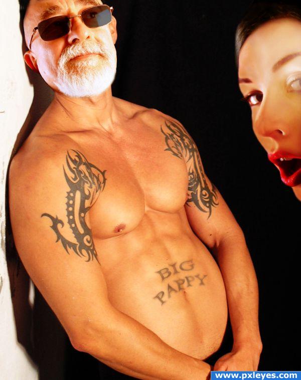
Big Pappy always gets the ladies! (5 years and 3821 days ago)
Very nice blending with the granpa's skin i think you should give her face the same color to match more the picture, good luck.
i think you should flip his head and maybe position it a bit lower
Hahaha.. great job xD Try matching the skin tone a bit better and it'll help sell the effect. Good luck!
Looks better now 
Superb use of the source image and excellent chop - nice work author!
Hahah!Nice one!
good idea Author nice blending 
Try to fix the making on the girl's hair. Lighting on girl is opposite lighting on man....
wow! nice job
LOLOLOL!
haha this is the best idea, ever
fantastic use of source author.fun image ,great chop. As highlighted there are a few lighting issues with the lady but i am sure you can fix them.. GL . 
Oohh La La! well done! GL !!
Give pappy's body a similar contrast as his face...this will help the blend more. Nice job!
Thanks all for the comments and advice it's truly inspirational! I've tried to impliment most of the changes and fix the coloring and lighting... don't know if I'm messing it up or making it better.. haha I'm such a hack  Thanks again!
jajajajajajajajajajajajaja
good job, that big pappy tattoo is so funny.!!!!!
LOVE THIS ENRY.....IT'S SO DIFFERENT FROM ALL THE OTHERS AND SHOWS GREAT IMAGINATION!
Nice idea but the background looks incomplete...a;so her left eye seems a touch faded.
Awesome!
Howdie stranger!
If you want to rate this picture or participate in this contest, just:
LOGIN HERE or REGISTER FOR FREE
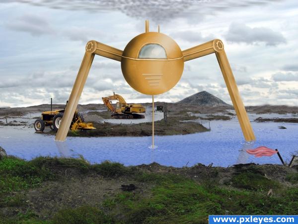
Pumping water to construct. (5 years and 3882 days ago)
ACK... invader invader.. hehehe..good luck!!!
Very nice, i'd like to see it look a bit grittier.. if you wanted to you could overlay some kind of metal scratches texture on the pump, just to make it feel more mechanic and more sterile, but really good job on the whole image! I'll leave my vote in case you change it, buit even if you don't.. i'll give you high marks!
thanks you for the comments. I'll try going grittier. I was having a hard time thinking of what to put as the main focus. Didn't want to copy other ppl's entries.
Hmmm. The perspective on the legs is wrong? Or at least you need a third at the back or something? GL
Yes i need to put the two legs behind the sphere. then perhaps create more legs.
The waters edge is in serious need of blending. Maybe use the 'blur tool'.
A reflection on water would help this greatly. Nice job.
cool idea
Howdie stranger!
If you want to rate this picture or participate in this contest, just:
LOGIN HERE or REGISTER FOR FREE
A car for very tall people! It's nice for my cousin, he is 2m tall...
or for very smart people ....
Howdie stranger!
If you want to rate this picture or participate in this contest, just:
LOGIN HERE or REGISTER FOR FREE