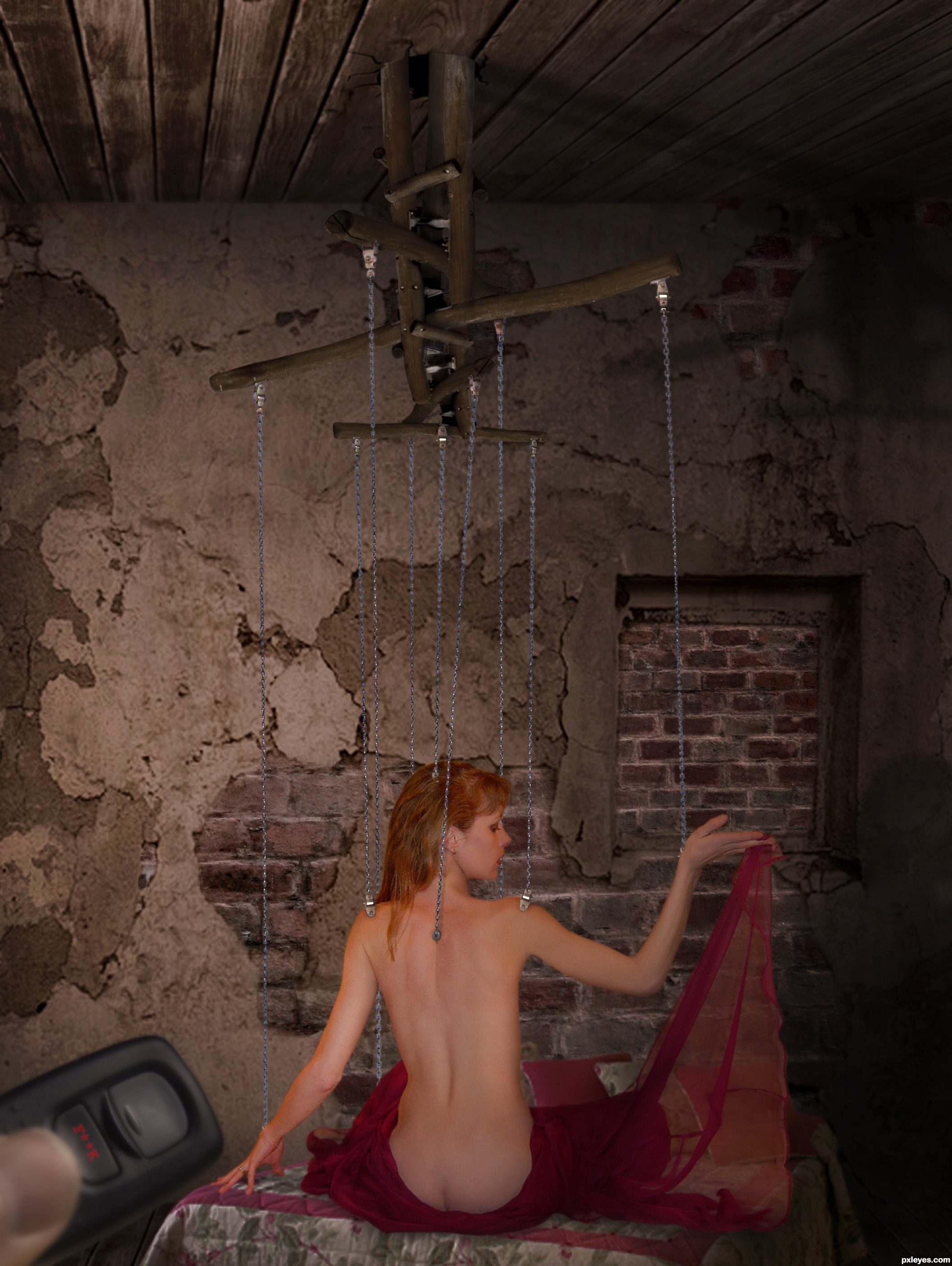
she's very kind, obedient, sweet and yummy!
PLEASE SEE HI-RES (5 years and 3257 days ago)
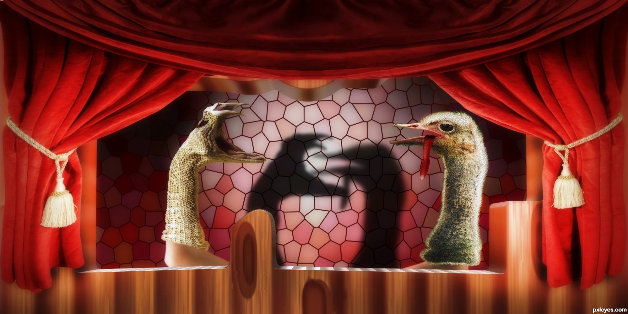
an epic battle between the powerful snake and not so weak ostrich :)) (5 years and 3322 days ago)
The snake is a bit hard to read, visually. Perhaps adding a forked tongue?
The wooden post with the Pxleyes logo, and the text title at the bottom are distracting to the image, I would suggest removing them.
You might want to also increase the lighting on the ostrich just a wee bit, it is too dark presently.
Very imaginative concept!
I accepted the criticis and corrected some things, logo and text is deleted, lighting Improved on ostrich, I did an experiment and you were right 
but for now the snake will not touch 
is it better now ?
and two light sources are, one for snake and one for ostrich !
I like the dueling spot lights... good image all around IMO
nice job...very creative
hahahahahahaha...super unique idea and nice execution...well done author
Howdie stranger!
If you want to rate this picture or participate in this contest, just:
LOGIN HERE or REGISTER FOR FREE
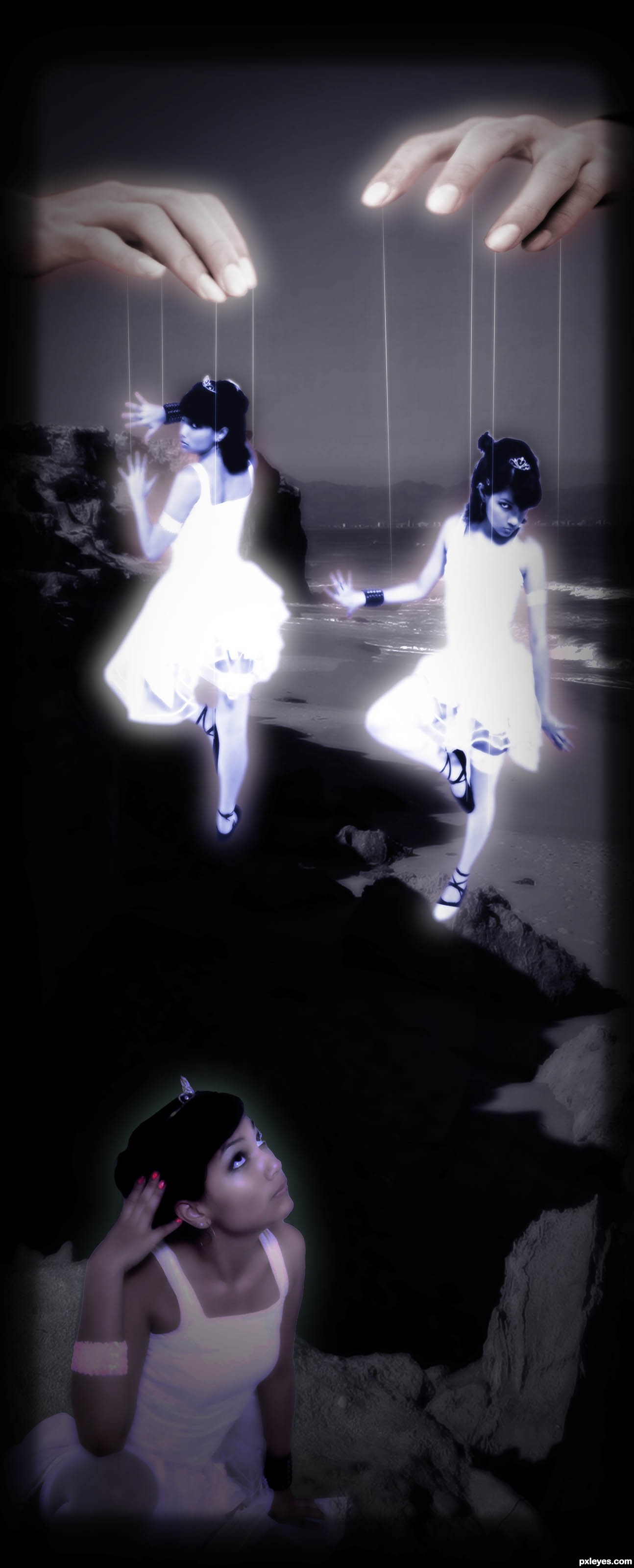
Metallica's well known classic- Master of Puppets, is the inspiration of the image that i have created. Hope you like!!!
thanks to naraosqa on sxc.hu for the models and arinas74 on sxc.hu for the hands!!! (5 years and 3331 days ago)
Here my opinion :
The main symbol of the puppeteer is that wood cross on which the strings are attached:
http://www.istockphoto.com/file_closeup/?id=14803377&refnum=1647260&source=sxchu04&source=sxchu04
but i don't know where you could find a stock with that. If you do, it would improve the mood for sure.
You have 3 girls, all in white & all brunettes, which lowers the impact, cause of the same element repetition ( and not cause they're brunettes  ) .
) .
You could:
- either keep just one, controlled by two hands = more of a "being controlled" feeling.
-or have them all in different colors, neutral color on the foreground girl, & opposing colors on the other two.
- or one evil one good, one sad one happy, etc.
That would give a "playing with your mind feeling"
....master of puppets is pulling your strings
twisting your mind, smashing your dreams .... as the song i think it should have a darker feel, but that's just me
I have to agree with gornats, when I listed to this song i don't get a mental image of pretty ballerina girls.
Gornats: The song is about drug addiction. Hence I can see why people couldn't get the ballerinas, as opposed to drug addicts.
That's what I see when I'm on drugs; just wish I could see the strings maybe go around the fingers... Still like it!
Howdie stranger!
If you want to rate this picture or participate in this contest, just:
LOGIN HERE or REGISTER FOR FREE
(5 years and 3408 days ago)
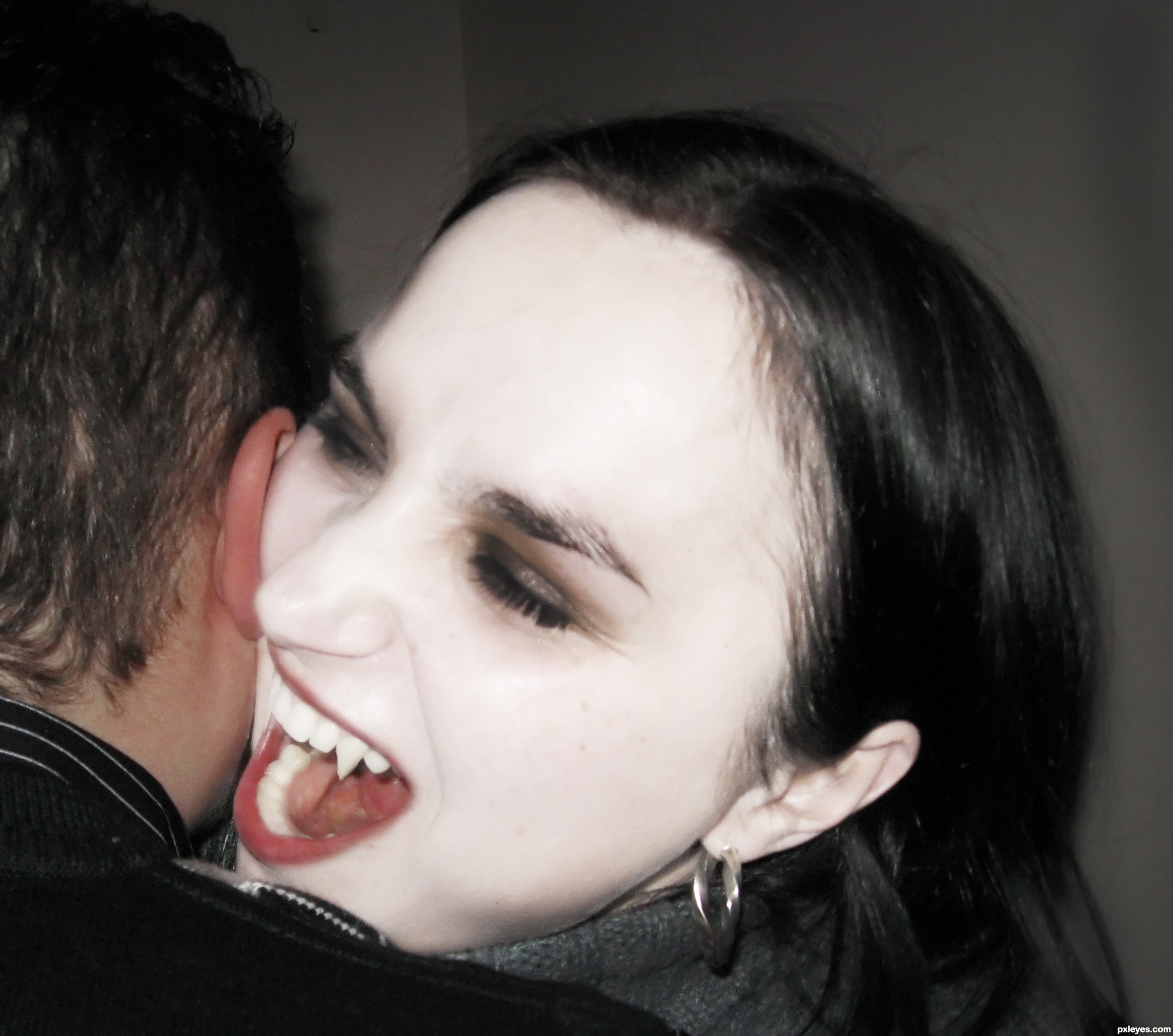
I think that the lower fangs are missing... but it's a cool image.
i really like how you made the skin so pale like a real vampire! right on target!
Howdie stranger!
If you want to rate this picture or participate in this contest, just:
LOGIN HERE or REGISTER FOR FREE
(5 years and 3517 days ago)
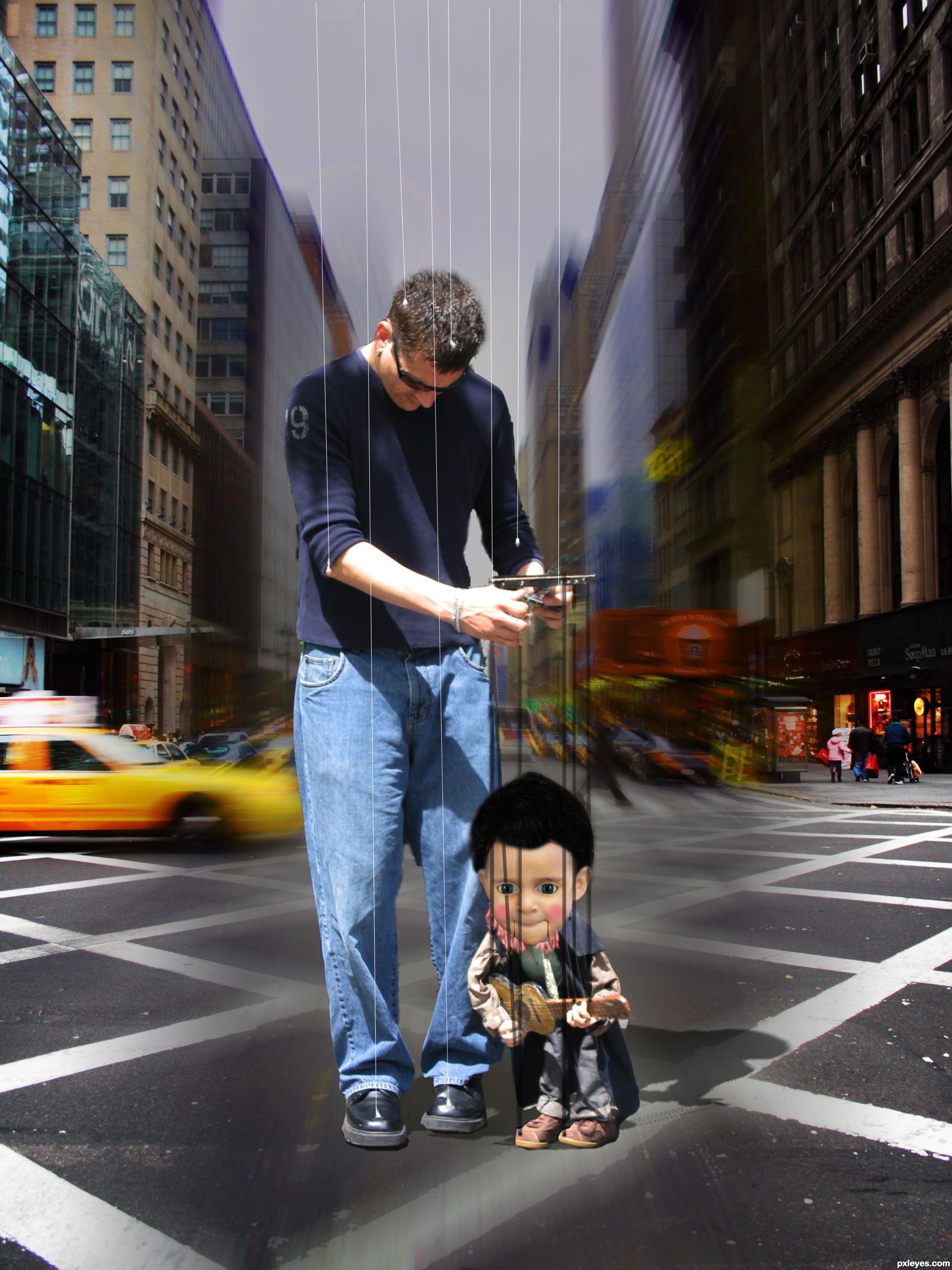
Why the blur?
i find it 2 simple thats why i put some effect in it
It's pretty nice. But shadow is wrong (if you look at the original image of the puppeteer, you'll see the right position of the shadow).
thanks erikuri i have make a new shadow cuz this is a difrent environment and i wantit to make a defrent image butt thanks for the comment
its nice entry,but i am with Erica about this... Environment its self don't demand shadow like this...if u look at the puppeteer u will see where from light coming,so according with this your shadow should be,now shadow make some kind of distraction...and shadow should be a bit softer,apply gaussian blur there a bit...entry is well made and will be better if u fix that...best of luck author
ok im gone fix it thanks
nice idea
Howdie stranger!
If you want to rate this picture or participate in this contest, just:
LOGIN HERE or REGISTER FOR FREE
Photography and photoshop contests
We are a community of people with
a passion for photography, graphics and art in general.
Every day new photoshop
and photography contests are posted to compete in. We also have one weekly drawing contest
and one weekly 3D contest!
Participation is 100% free!
Just
register and get
started!
Good luck!
© 2015 Pxleyes.com. All rights reserved.


good use of source..nicely done..good luck
Nice image...good blend of the swing. Girl is to much bright IMHO,and light source is a bit wrong. Her right side should be a bit darker cause she is in dark corner. Work a bit more at this author cause this image have nice potential...Best of luck
FIXED!
thanks a lot itsdesign and erathion for your comments,
any way erathion, what is IMHO stand for?
In My Honest Opinion - IMHO
IMHO stands for in my humble opinion....and yes, nice fix author...
Congrats for your second place!
Congratulations
Congratulations for 2nd
Congrats!!
congrats!
Howdie stranger!
If you want to rate this picture or participate in this contest, just:
LOGIN HERE or REGISTER FOR FREE