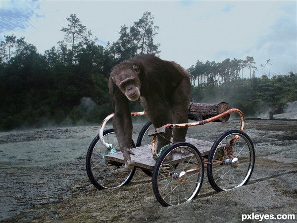
Ruts made w/ Dodge & Burn, chimp's color changed w/ Curves. (5 years and 2681 days ago)

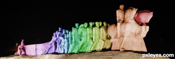
This is a photo of "Monumento as Bandeiras" (São Paulo - Brazil) = Memorial Flags.
In Brazil it is also known as "let me push". (5 years and 3373 days ago)
Howdie stranger!
If you want to rate this picture or participate in this contest, just:
LOGIN HERE or REGISTER FOR FREE

(5 years and 3567 days ago)
OMG I LOVE THIS~! Great work and idea! 
Pretty cool! Nice idea and execution. 
Very believable...GL. 
very good concept ! Clever and well done. Good luck author 
i hate to be a geek here, but author, your image has wrong physics.. the water will flow downwards in the absence of gravity.. (Newtons first law).. So to me this is unbelievable... But as far as your execution is concerned, i find it impressive 
 .. good luck ..
EDIT: I reread the contest theme.. Although the title suggests no gravity, the description suggests differently. I take back my geeky words and good luck again, author 
good thinking and execution
Many great works here but this is technicality top notch-- super job with the water looks great
nice one author gl 
very clever.., perfect and realistic
very nice...gl
Simple, clever and very believable for this theme.
Congrats to you too! 
Congrats! for 3rd place. Great chopping 

Congrats!!
Congrats! Congrats! Congrats!... 
Howdie stranger!
If you want to rate this picture or participate in this contest, just:
LOGIN HERE or REGISTER FOR FREE
This icon was mad single without any tutorial :D (5 years and 3730 days ago)
click click click click... NOTHINGS HAPPENING...hehehehe.. couldn't resist..Nice Idea!!!
Hey, Slushy! You did 4 clicks; one more and something can happen... hehehe... boom? 
KABOOM!
quirky.... welldone
uugh, what does this button do? 
Howdie stranger!
If you want to rate this picture or participate in this contest, just:
LOGIN HERE or REGISTER FOR FREE

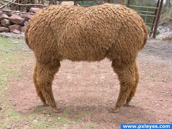
The opposite of a 'Push Me Pull You'...
I'm practicing with masks and cloning at the moment, so this was a good exercise. (5 years and 3949 days ago)
Good job! There's just a bit too much symmetry on the ground between the legs...
Yeah! Dr. Doolittle!
Oooooo, mercy! Really cleverly done! 
great imagination
Nice result. In fact I wanted to say the same as CMYK about the ground between the legs. If you can make it less symmetrical (just add some other ground parts), would be very nice. Good luck!
You can see where the top layer overlaps the bottom layer near the left legs. Also the shadows of the legs go in opposite directions, which makes no sense.
very nice one!
Thanks for the comments. I can see what you mean with the symmetry, I forgot about that area. But I also forgot about the shadows... lesson learned *hopefully  )
)
Howdie stranger!
If you want to rate this picture or participate in this contest, just:
LOGIN HERE or REGISTER FOR FREE
chimp needs to be a bit darker to blend in
Sorry, but the chimp was purposely lightened to stand out from the dark background. It's called creating color contrast.
Congrats!!!!!!
Howdie stranger!
If you want to rate this picture or participate in this contest, just:
LOGIN HERE or REGISTER FOR FREE