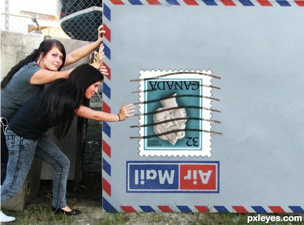
Thanks to LucasWard (Girls notified by PM) alitaylor (Envelope) Sarej (Stamp)
This is a rework of an old entry with some different sources
(CS3 & tablet) (5 years and 3697 days ago)

I miss you sweet friend
and I'm pushing their buttons for you.
I'm always here if you need translations and hope you return soon.
Til we meet again :)
Always remember... MEAN PEOPLE SUCK!
all source (5 years and 3706 days ago)


nice work
all the best ......... 
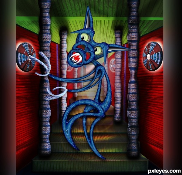
Poor blue creature  Looks anorexic
Fantastic job...gl
Unique entry and well done 
Wow now this is pretty awesome. Good job, this one's a winner for sure!
Trippy!!! 


Howdie stranger!
If you want to rate this picture or participate in this contest, just:
LOGIN HERE or REGISTER FOR FREE

While my work seems poor compared to the others I hope to get some helpfull feedback as to where i went wrong This is my first attept after only useing ps for a week All parts of this image come from the original (Techniques= This is just a lot of copy past and free Transform also used the gradiant tool to blend the clouds i believe the only filter i used was a gos blur on the shadow comeing off back of grader inside the picture ) (5 years and 3995 days ago)
Author.... NEVER PUT YOUR SELF DOWN.... that is an ENORMOUS NO NO.. (still giving you high marks, but never admonish yourself.. it makes your work drop in power immediately and makes people look at it in the wrong light).. now that you have been properly berated.. SUPER HIGH MARKS FROM ME.. you have to start somewhere..and this is quite excellent.. I'm sure others will be along to give you advice.. (you should up load a HIGH RES, it's the only way peeps can really see your work).. good luck
Thanks for the compliments and High res is there now sorry i missed the little check box first time
I..Love..Out of bounds... You...Genius...High...Marks
i love oob images however.... there is some cloud on the left there up the top. The tractor is looking a bit distorted and a bit flat. Goodluck anyway, we all started in the same place 
this is just great... well done...
cool 
good luck
wow i love this imge and yes, dont put yourself down, its rfeal cool
Try to soften the edges of the foreground clouds and fix the distortion on the tractor...good luck! 
Good idea. It's a very good start. Some hints: use a gaussian blur on the masks, it makes the parts generally blend better together. The tractor looks a little strange because the perspective is different from the clouds.
very interesting visually
the tractor seems a bit distorted, but otherwise I love the image and colors
Howdie stranger!
If you want to rate this picture or participate in this contest, just:
LOGIN HERE or REGISTER FOR FREE
good effort, but the hand near the stamp looks like it is pushing thin air, although it looks like it was pushing something else in another shot.
Author, if you move the stamp a bit under the girl's hand and add some slight shadows, maybe the impression of "pushing thin air" of the girl disappears...
The cancel marks on the stamp should continue onto the envelope. That's also an odd place for a stamp. You could turn the Air Mail logo upside down and then place the stamp upside down in the lower corner to make it seem like the entire envelope is upside down.
Made some adjustments -- thanks Danlundberg
good luck
Howdie stranger!
If you want to rate this picture or participate in this contest, just:
LOGIN HERE or REGISTER FOR FREE