(5 years and 3341 days ago)
- 1: source1
(5 years and 3511 days ago)
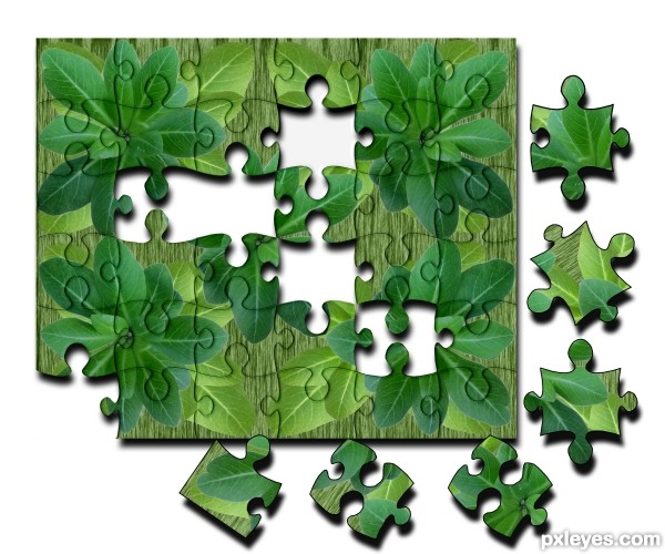
main puzzle is very well made,but the pieces have unrealistic edges ,and if u had the idea that the puzzle laying on some surface,then the shadow is to big and to strong for that...with shadow like this,puzzle looks like levitating few cm from the ground...
creative work ..
Howdie stranger!
If you want to rate this picture or participate in this contest, just:
LOGIN HERE or REGISTER FOR FREE
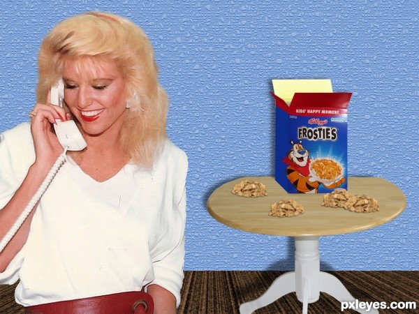
The woman calls her husband on the phone:
- Darling, I'm trying to solve a puzzle but I can't!...
- Didn't I say to start by the corners?
- Yep, you did, but I couldn't find the corners...
- Which puzzle?
- The tiger's one!...
- Tiger? I'm coming home, get waiting.
Some minutes ago her husband gets home and says:
- Let me see the puzzle.
So the woman takes him by hand and drives him to the kitchen. He looks at the table, and almost getting nuts counts until 10, slowly, and says:
- My dear... RETURN THE FROSTIES TO THE BOX RIGHT NOW!!!
Thanks to:
- roberthuffstutter, AlineGomes, ilmungo and kfergos @ Flickr. (5 years and 3572 days ago)
It's a BIG packet of frosties there - and the 80's woman is quite amazon-giant quality as well. You should work with the perspective a little and a bit more opaque shadow will do just one. Extra points for shamelessly chauvinist joke, which I of course like .. err.. I mean.. condemn strongly!
(Dunno if you chose that terrific 90's webpage design colour of the wall intentionally, but.. surely blinds my eyes)
Gonna check out later before voting.
I appreciate your comments, Widiar. Woman looks big because she's far from the little table. And if I put a small pack of Frosties, nobody can see it. And wallpaper was made by me, it's on my sbs. Maybe I can change the color... 
great joke...blond woman is just coincidence...LOL
Gotta love a blond joke... 
With no offenses to blondies! 
It was that way I knew the joke... 

Howdie stranger!
If you want to rate this picture or participate in this contest, just:
LOGIN HERE or REGISTER FOR FREE
Ps and source, an old entry (5 years and 3821 days ago)
very good.
solve that one easy.... nice.
looks good
Like It. very good
Unique take on the theme.
great 
Howdie stranger!
If you want to rate this picture or participate in this contest, just:
LOGIN HERE or REGISTER FOR FREE
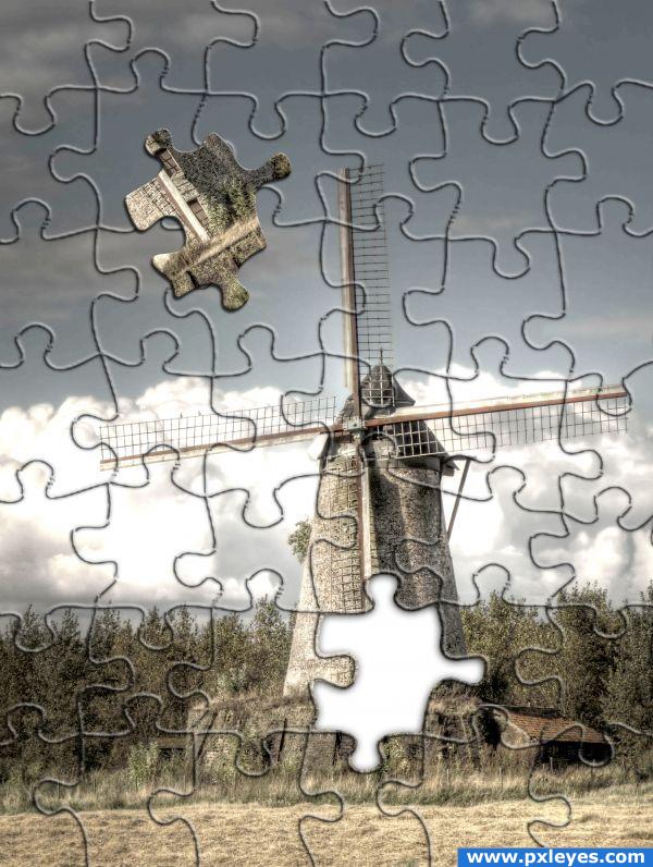
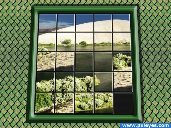
I took the source image and lightened using levels i then copied in the puzzle texture included within photoshop and free transformed it scale up to the correct size.
I then added a bevel and emboss style effect to the puzzle texture deleted the white background and reduced the fill level of this layer. (5 years and 3839 days ago)
Simple, but well done and creative. I like it.
Nice effect and look, however it seems like just an applied plug in for Photoshop...
Couldn't use the texturizer for this effect as photoshop wwould create puzzle pieces to small and not cover the whole image although the idea is the same but with the effect applied manually
cute
simple generic look but effective for the purpose... of just starting out... keeep on chopping and g/l
nice final outcome .. 
Would like to know what version of PS you have. I don't have this puzzle texture on mine. Nice entry.
Howdie stranger!
If you want to rate this picture or participate in this contest, just:
LOGIN HERE or REGISTER FOR FREE
Creative!
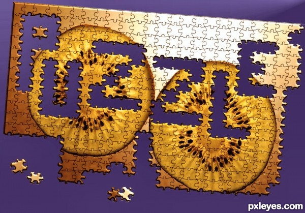
Objects have formed letters here, not vice-versa. IMO not on theme.
Congrats on an amazing interpretation of the theme. The unfinished parts of the puzzle is very much part of the actual object in this case, therefore I think it's brilliantly on theme. Though I do do wish that you'd used something more interesting than a kiwi but that's just me. Well-done!
.. perhaps you like better to use the word door, or house, or teacups and have a bunch of teacups in letter shapes... plenty of things to come up with..- like it is sad in the rules.
so it's on theme .
i think cmyk meant that the pieces should form the word puzzle itself instead of having the empty space as the word, it would be even more on theme, creaive concept though!
great
CMYK is correct. Look at the link in the intro section. That being said, it is a very nice image.
Howdie stranger!
If you want to rate this picture or participate in this contest, just:
LOGIN HERE or REGISTER FOR FREE