Logo Nr.5!
Hehe okay now... this is the last logo! :)
_________________________________________________________
Check this out! (5 years and 3950 days ago)
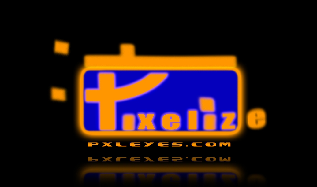
My logo design for PST's new website... i re-uploaded it with a smaller logo as i was suggested. does it really look like an ear? i was going for something like a letter P crossed with an abstract eye... and the right side of the P is meant to have a pixelated effect as Pxleyes also sounds like pixelize (5 years and 3950 days ago)
i really like the font you used, try to reduce the size of the emblem though, it's quite big compared to the logotype... nice idea  good luck
What Mike said and try to warp the big P a bit more.. it looks like an Ear.. though It could be the fact I've been looking at so many EYES in this contest that my mind immediately leaped to EAR when I saw your piece...very cool Idea.. good Luck
it's cool
Get glasses.
it looks kinda pixely, got a better version? Sure hope so because this is one of the better logo's in the contest
great ! GL
I agree with robvdn
Good Luck
yes it´s good idea the p with eye but u still hve to work on that try 2 take the blurr out of the p. g.l
I really like the simplicity of this but it's either too big, or not in the right place. Maybe try it in another colour than blue?
gl
I like the typo for pxleyes. I'd center the word with the cicrcle though (so a bit lower). And yes, I hope the P shape is not supposed to be pixeled, imo a smooth shape would work better. Good luck!
the blurry "P" takes the fun...  Good Luck!!
Funny P ! 
Howdie stranger!
If you want to rate this picture or participate in this contest, just:
LOGIN HERE or REGISTER FOR FREE
simple pxl logo (5 years and 3950 days ago)
Nice floating effect.. very different
cool type
Nice idea good luck!
I cannot read the smaller logo.
I think this is trying too hard...font isn't working
gl
looks like an arrow not a y ??
Not bad, but the smaller version (in high res) is hard to read, guess it's a combination of font type and size. The black pixel is a bit too big imo and asks too much attention. Good luck!
lolz "E"s look like Pacman...but nice use of colors.... Good Luck!!
Nice!
Howdie stranger!
If you want to rate this picture or participate in this contest, just:
LOGIN HERE or REGISTER FOR FREE
(5 years and 3950 days ago)
Nice concept..need some work on the eye though.. it's kinda not round.. you know what I mean.. the letters are AWESOME
Nice idea good luck!
Good Luck
I guess this is the same author as above. Same comments.
gl
the Eyes is masked out in a random fashion..fix this n it would be great.. Good Luck!!
Nice!
Howdie stranger!
If you want to rate this picture or participate in this contest, just:
LOGIN HERE or REGISTER FOR FREE
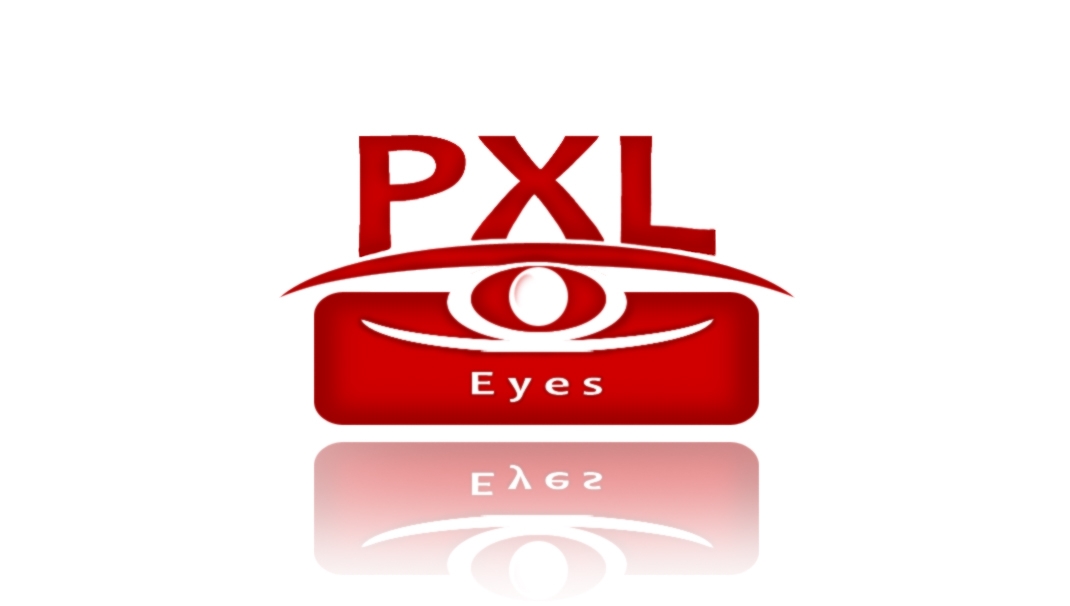
Logo Nr.3!
Next logo and not the last ;)
_________________________________________________________
Check this out! (5 years and 3951 days ago)
I think that, of the logos you have submitted, this is the best one by a long way.
very nice and professional
very nice.. a tad bit CBS.. but still cool
Good work author!!!!
This looks like a logo nice job. I dont like the red though.
This looks like a logo nice job. I dont like the red though.
I like it
gl
Looks pretty good!I think the red colour would look gerat in the site!
Good Luck
love the idea, but a different colour maybe
very creative
Nice idea good luck!
Not bad, not bad...but I'd say not in red. Does do weird things with screens and such. Watch out that you dont get some link to an optician when seeing this logo. "Eyes" could be a bit bigger maybe. Good luck!
Eye looks a bit compressed...Too much red...Good Luck!!
Good job!
Interesting...
Howdie stranger!
If you want to rate this picture or participate in this contest, just:
LOGIN HERE or REGISTER FOR FREE
Photography and photoshop contests
We are a community of people with
a passion for photography, graphics and art in general.
Every day new photoshop
and photography contests are posted to compete in. We also have one weekly drawing contest
and one weekly 3D contest!
Participation is 100% free!
Just
register and get
started!
Good luck!
© 2015 Pxleyes.com. All rights reserved.


Nice idea, good luck
Mmm...it's a bit hard to read. Also, it's up to the viewer how to interpret PXLEyes, so I wouldnt write it there like "pixelize" already. Good luck!
Looks very low res...and almost as if trying too hard...
Looks very low res...and almost as if trying too hard...
Looks very low res...and almost as if trying too hard...
gl
gonna be very hard to read once squished to size
Can't read P clearly...and E seems left out... lol... Good Luck!!
GL!
Howdie stranger!
If you want to rate this picture or participate in this contest, just:
LOGIN HERE or REGISTER FOR FREE