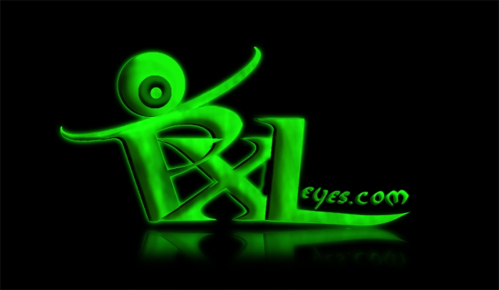
Logo Nr.2!
I try on and on...but they are not perfect ;/
The next will be better i hope ;)
_________________________________________________________
Check this out! (5 years and 3951 days ago)
Vray render
Please view SBS for smaller and integrated versions (5 years and 3951 days ago)
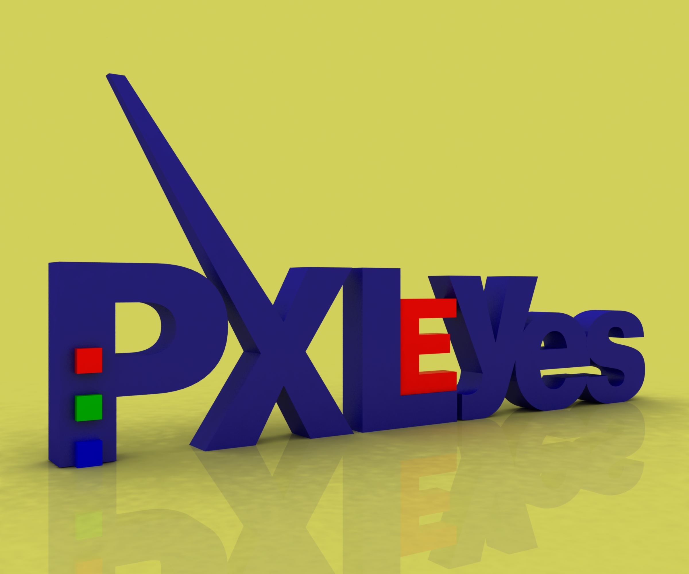
yes E is too very important! cool! good luck!
Cool 
I actualy like this one structure wise, just not crazy about the colors.
I agree with Anna. How it should looks with the layout? And in original size? Update your sbs this one is nice try to play with colors
love the idea
Nice idea good luck!
I like this one
good job i like it 3d ones
I feel like the word yes is meant to stand out and not eyes???? goodluck
only photoshop?....anyway you have my vote.....
oooooo this is just AMAZING.. this gets my high vote
Interesting, but the colors dont help to convince me. In the small version it's harder to read while the x takes up a lot of space. Perhaps a spotlight to show the front of the letters more and get more contrast in 3D would help. Good luck!
GL!
Not keen on the PXLeYES thing...
Howdie stranger!
If you want to rate this picture or participate in this contest, just:
LOGIN HERE or REGISTER FOR FREE

used a lot of rounded rectangle tool, elliptical tool, smudge, soft brushes and layer style work
All ps, my Bamboo and pen reference
sbs will be added later, have to go out. (5 years and 3951 days ago)
Its alright
oh!
stroke on the text is spoiling the luks....
Nice idea good luck!
big big
gl
GL!
Howdie stranger!
If you want to rate this picture or participate in this contest, just:
LOGIN HERE or REGISTER FOR FREE

(5 years and 3952 days ago)
Good Luck
you might want to fix the x. It doesnt look like part of text. You dont want people think peyesl or pleyes
Nice idea good luck!
change the font maybe it looks better but nice creation
gl
Quite hard to read this, there's not that much connection between all the elements. Tried to reduce to a small version and checked what remains from the drawing? Good luck!
GL!
Howdie stranger!
If you want to rate this picture or participate in this contest, just:
LOGIN HERE or REGISTER FOR FREE
(5 years and 3952 days ago)
Good Luck
very good
Nice idea good luck!
good job i like it
nice
like the idea but looks a little outdated
gl
Nice one.. Good Luck!!
Nice!
Howdie stranger!
If you want to rate this picture or participate in this contest, just:
LOGIN HERE or REGISTER FOR FREE
Photography and photoshop contests
We are a community of people with
a passion for photography, graphics and art in general.
Every day new photoshop
and photography contests are posted to compete in. We also have one weekly drawing contest
and one weekly 3D contest!
Participation is 100% free!
Just
register and get
started!
Good luck!
© 2015 Pxleyes.com. All rights reserved.


I dont think you would be able to read it when it was slimmed down
Nice idea good luck!
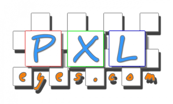
nice idea, but i don't think the bright colour will work goodluck.
gl
Creative, but hard to read. I'm afraid that wont get better if you bring back the logo in the final used size. Good luck!
a bit too much for me.. Good Luck!!
Nice!
Howdie stranger!
If you want to rate this picture or participate in this contest, just:
LOGIN HERE or REGISTER FOR FREE