Hope you like em :D (5 years and 3271 days ago)
if u dont like a thing then please say i ll try to change it> media :photoshop
special thanx \credits
1.Falln-Stock
2.Adorama (5 years and 3275 days ago)
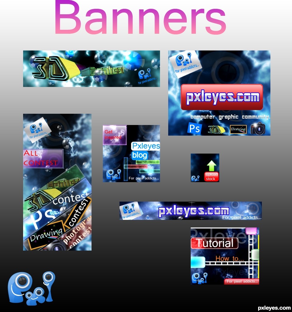
The paint in the last banner should end at the tip of the brush, imo. (That part behind the brush should be erased.
You have some nice banners, but I'm not a fan of the first one: when you say addicted you don't associate with gray, maybe with red instead, or a more vibrant color.
The photography banner has a painted camera, i think you're allowed to use stock for this contest, if so, maybe a real camera would fit better - if not, make some Polaroid pictures in photoshop.. or a photographic film.
Good luck!
thanx 
Love the colors you've used! They would catch my eye and make me want to click to check out the site for sure!
As said above, nice use of colors. They're bright without being overdone, looks professional. As a serie the banners are not bad, eventhough you used different solutions for each of the banners, the colors and use of texture brings them together. What you could do is put the logo always on the same place and perhaps use a same way to show what contest you want to advertise (i.e. the way you put the PS contest can also be done for the others). I like it that you put that photoshop window in a same direction as the text, I kinda miss that in the other banners. The whole setup from the PS banner (logo left, texture as background, diagonal text for the contest in the middle and in the right an image) could work for all, and you kind of did it but with some of them it works better than the others (example, for the 3D banner you illustrated the 3D part in the text itself instead of an extra image, is a different solution than the rest). Not that I dont like each of them, it certainly has potentional. It's more up to you what you'd like as serie. Ow, and I certainly agree with greymval about the camera, a real image would increase the power of the banner a lot. Good luck!
well did some changes thanx
& also i hv changed the first banner which was on red .
Fantastic piece author...One of the best in the contest for now...Best of luck
thanx erathion
This is what we called, GREATNESS! You have a good taste and wild imagination author and the result is perfect. GL!
thanx man
good 1 
thanx
wow i can see a winner here great job 
thanx for ur wonderful comment
Great work here = )
thanx Emik
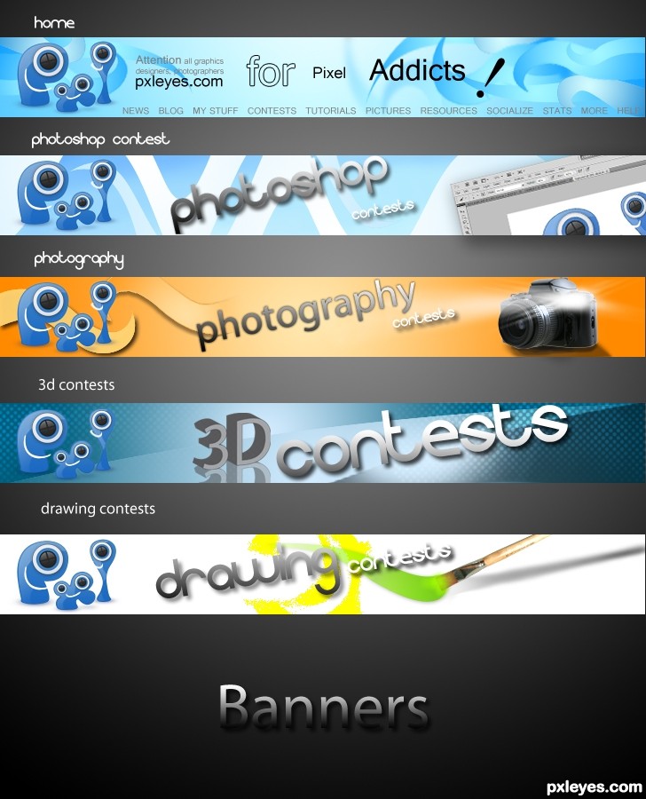
Very cool banners, especially the 3D Contests one
Congrats!! Good designs!
Congrats, well done
congratulation!!!
hey u won wow! congrats!!!!!!!!!!!!!!!!
Howdie stranger!
If you want to rate this picture or participate in this contest, just:
LOGIN HERE or REGISTER FOR FREE
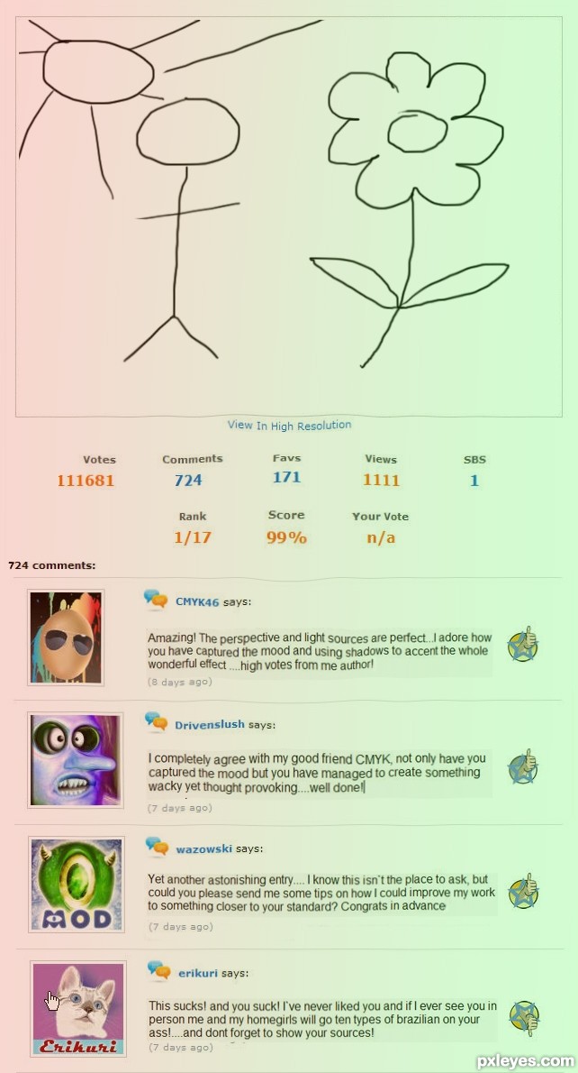
all comments are fake, image made of various screenshots of the site. image being commented on was hand drawn with brush tool (will be happy to provide detailed sbs for the flower/stickman)
(5 years and 3553 days ago)
Haha good one
Somehow I knew it was you, author. You always manage to make me smile with your entries, they are always too funny I really love this , I like how you turned CMYK46 and Drivenslush from greatest enemies to "good friends" and how you turned the lovely Erica to a demon Good luck with this funny entry ! 
You're not hallucinating... you are delusional.. BWHAA HAAA HAA
hahahahahahah....lol ahhahaha ... oh, my stomach hurts...awesome1 1 author
ROTFLMAO.... Damn thats a lot of votes..
maybe this hallucination was generated by more then lack of sleep 
baahahahahaaaa good one Author. But poor Erica  the monster
excellent
Good job author. hahahahahahaha LOL 
Author I think detail tutorial for flower and stick-man will be nice contribution. 
This was the only way I could ever see our sweet sweet Erica being mean....I`m sure she`ll see the funny side either that or she`ll kick my butt
SBS on its way Nas buddy 
Best humor for a very long time......U have perfect touch for the social relations author...well done...
LOL, too funny! Truly a hallucination. You chose 4 perfect members to showcase. Now where's that sbs, dammit?!
OMG, the sbs is classic!! great copywriting and idea for that author. LOL @ the wing leaves.
hahaha... this is the best design.. and congrats in advance author...
very well done....
awesome
wouldn´t like to meet erikuri and her homegirls. hahahaaa...
Good one!
Good one! Except you forgot to include the "one word" or "one emoticon" geniuses.
i have 2100 credits in my account, and i will give them all to MM if he will let us have that  comment option!
LOL and LOL..... and ....LOL,.......oh I am dying laughing......LOL......again......


Hey... are you trying to destroy my reputation???? I'll process you for moral injury!!!
Kidding! You know I'd never say such things to anyone even the work was very bad. And you... you are in my heart, my friend...
But prepare the cushion, I'll kick your butt!!!
Yeah.. a bad chop but a good fun. Very accurate commenting especially ,-) Thx for the humor moment of the day.
Amazing! The perspective and light sources are perfect...I adore how you have captured the mood and using shadows to accent the whole wonderful effect ....high votes from me author!
ha ha ha, I would love to have that dodge& burn knowledge you have. I also like your thump down repu. hilarius entry. lmao. In fact, artists who have made the greatest images someday step back to childdrawings at least. You captured all, sun, people flowers. Only critic, ... your should work on your shadows
Absolutely the funniest thing I've seen here. Thanks so much!
this was funny...i think u will win ......the humour contained inside your work will encouraged people to vote 4 u..
SO funny.Great entry.
Thank you all for the wonderful comments, to add slightly to the humor I have been asked by the mods to actually provide an sbs for this...rules are rules lol... so enjoy .. and happy drawing
hahaha love the sbs too
You made me laugh, thank you, this is very well done and creative.
Rofl this is 100% on the humor part... had a nice laugh seeing it!
i did a stick drawing for the anorexia theme and got like a million votes but was removed by the mods....... hope yours doesnt get pulled
i find it very funny and well done good luck!!!!!!!!!!!
FUnn time....... great job
Funny image
The stickman image is so skillfully done xD
My high score will really be for the SBS!!! Such humor is good for us to share.

Congrats
Congrats for 3rd place
Congratulations!
Knew you had a winner here! Congrats!
Congrats! Don't forget me...
Congrats!. Great humour
Congrats!
Sorry for saying this mate, but I don't think this work deserved the 3rd place. All praise to your wicked humour (loved the SBS too), but I find this kind of voting to be very unfair for the ppl who did a lot of work on this contest too. I hope you don't take bad feelings for me, I truly like your other chops... just wanted everyone to know how I feel, just to be honest. I never leave comments after vote results usually.
sometimes the idea goes over skills. I think it´s fair. congrats Geexman
I raised this issue on the forum, hopefully people will discuss it further there. I know some people will agree and many will attack me or disagree. In no way I wish to attack Geexman nor discredit his very good skills, as the voters are here to 'blame' .. if there is something to blame. I'm very much ok, if Geexman wishes to remove my comments as being insulting, which I hope it is not..
Howdie stranger!
If you want to rate this picture or participate in this contest, just:
LOGIN HERE or REGISTER FOR FREE
(5 years and 3566 days ago)
Cool idea. =)
Howdie stranger!
If you want to rate this picture or participate in this contest, just:
LOGIN HERE or REGISTER FOR FREE
Just for fun (5 years and 3566 days ago)
Howdie stranger!
If you want to rate this picture or participate in this contest, just:
LOGIN HERE or REGISTER FOR FREE
Photography and photoshop contests
We are a community of people with
a passion for photography, graphics and art in general.
Every day new photoshop
and photography contests are posted to compete in. We also have one weekly drawing contest
and one weekly 3D contest!
Participation is 100% free!
Just
register and get
started!
Good luck!
© 2015 Pxleyes.com. All rights reserved.


Some nice work. They seem a little busy and the pxleyes logo is a little lost on some especially against the background.
A banner is advertising, for example your 3d banner shows the pxleyes logo as the smallest object that is there the 3d stands out more than anything. I would make the 3d logo smaller and the pxleyes a little larger and also easier to see. I would prob also put the logo at the other side.
I do like the concept but feel it needs a little more work
A lot of interesting ideas. But I don't think the banners would ever be displayed against a cranberry background, so it's hard to evaluate their true impact in a real-world application.
very nice piece author...best of luck
Check in Hi-res
Howdie stranger!
If you want to rate this picture or participate in this contest, just:
LOGIN HERE or REGISTER FOR FREE