(5 years and 3949 days ago)
(5 years and 3949 days ago)
Nice idea good luck!
Good Luck 
nice one......
good job i like it
i like't.....
IMHO one of the few that don't suck...good luck! (Would be better if you added the "dot com" as per contest requirements).
thanks CMYK46! I added the .com" . I also added the version with the lens flare but I wasn't sure whether to leave it under this entry or upload it to a new one because it's basically the same, so I left it here. Hope that's ok.. 
looking good! gl
Nice!
Never use the lens flare!!!!!!
Howdie stranger!
If you want to rate this picture or participate in this contest, just:
LOGIN HERE or REGISTER FOR FREE
This logo is made from scratch using photoshop CS4.
I choosed this colors to match PXLs and PXLe colors.
In the corner the 100% verision is. (5 years and 3949 days ago)
sharp and crisp
nice 3d is like it good luck!
nice very nice
Good Luck 
good job i like it
gl
GL!
Like the lighting effect - wonder if it is too angled?
Howdie stranger!
If you want to rate this picture or participate in this contest, just:
LOGIN HERE or REGISTER FOR FREE
(5 years and 3949 days ago)
vohh!!! briliant! max points from me.  good luck!
Amazing! great work!
maybe try doing this in a colour nice concept!!!!!! 
good luck
Nice idea good luck!
Nice work 
awesome idea.....this one rocks.....
OK ReapRevenge! I made a colored verison! Here it is: http://www.pxleyes.com/photoshop-picture/4a3159ffcc4aa/PXLeyes-Flourish-Logo--Color-.html
good job i like it well done my favourite again
b/w just isnt a good colour for a logo 
gl
Great! I like it very much!
pretty
 Good!
Good!
More suited to a vector site...
Howdie stranger!
If you want to rate this picture or participate in this contest, just:
LOGIN HERE or REGISTER FOR FREE
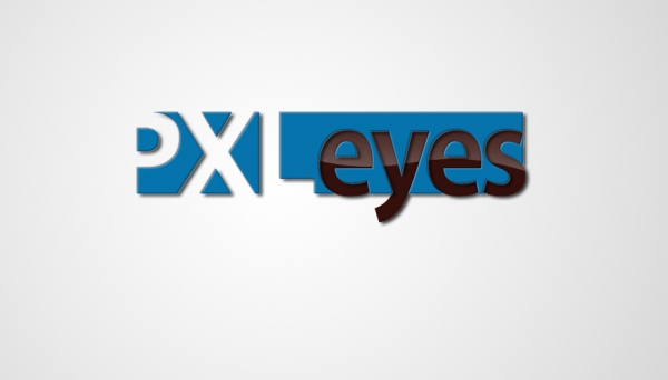
Tahoma type for "PXL"
Kozuka gothic pro type for "eyes"
Cut "PXL" in a blue box.
Layer effects: Drop shadow and bevel and emboss.
Gradient over "eyes" for brightness effect. (5 years and 3949 days ago)
clean and simple: GOOD! maybe for a contrast you can put the "eyes" part above it all?
This is very strong entry !!! I do like it very much 

nice idea good luck!
qute..nice one
very nice 
good
i like it
good idea 
Good Luck 
yes i really like this logo!
cool, best one so far 
different  goodluck.
we all force the eye to read the first "P" because we all know this is for PXL Eyes, but ask other people who doesn't know the site what does they see, i really like the cutout style... use it a lot for my own job, but readability always has to come at first  good luck... if you fid out there're readability issues, try to put a blue bar on the left and that's it
I like the use of rest space to create PXL, but also agree with Mike about the P. A small bar ìs needed to make the p really visible. Not completely sure about the eyes, they're falling a bit out of the frame (I know it's because of the curves) and the s looks a bit stuffed there. Not completely sure about what to do with that...Maybe one last thing and that's removing the glossy from eyes and put it in the blue background (starting with the p). Good luck!
Very, very good!
Not a new idea, but works okay.
i like this one.
Howdie stranger!
If you want to rate this picture or participate in this contest, just:
LOGIN HERE or REGISTER FOR FREE
nice idea..but the edges need cleaning so the logo shows up clean and sharp.. good lcuk
Good Luck
text eyes doesnt fit there. it destroy the text balance. you should move it. good
Nice idea good luck!
good job i like it
good job though
gl
GL!
Howdie stranger!
If you want to rate this picture or participate in this contest, just:
LOGIN HERE or REGISTER FOR FREE