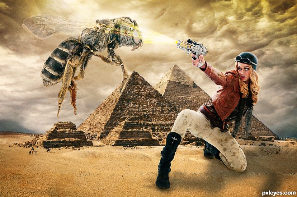
Beware of dangerous giant bees. (5 years and 981 days ago)
- 1: Pyramids
- 2: Clouds
- 3: Model by faestock
- 4: Bee by Skeeze
- 5: Dirt Brushes

Beware of dangerous giant bees. (5 years and 981 days ago)

(5 years and 3010 days ago)
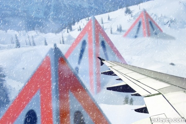
good idea...only one suggestion - if the plane is flying, the snow should have opposite direction of the planes trajectory . good luck 
@gornats you're right, wrong angle. Now I've changed the snow, thank you!
Nice mood on the background..
great image..GL author.
good job author  well done
Successful well work, luck
One of the better ones in my opinion.
The contrast of the plane wing is too sharp and high contrast relative to the rest of the image, which is very well done. It looks somewhat "tacked on at the last minute," rather than an integral part of it.
Thank you for your comment @MossyB. The sharp wing is because is very near to the subject; the rest of the picture is not so clear, this increases the feeling of an atmosphere of snow.
Howdie stranger!
If you want to rate this picture or participate in this contest, just:
LOGIN HERE or REGISTER FOR FREE

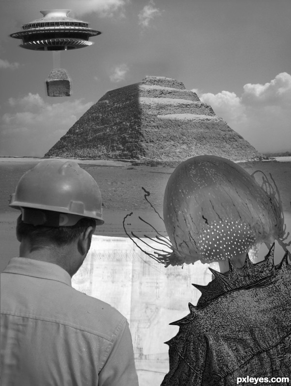
Alot of myth surrounding the construction of the Pyramids. figured i'd use this classic take on it..
thanks to:
zoomar for the space needle,
girolame, for the great pyramid,
Ed Yourdon for the other pyramid,
mikecogh for the stone block,
Remko Tanis for the construction crew,
CARLOS62 for the plans,
Michael Gwyther-Jones for the desert, rosswebsdale and marj k fir the jellyfish,
and Old Shoe Woman for the luxor (5 years and 3580 days ago)
He he, not bad. The pyramid could use a sharper edge where they are adding additional parts to it and IMO, it might look more of a reference to alien construction if you converted the human construction workers into alien looking construction workers, like a couple of grays. But keep the hard hats and plans. It's a nice touch. GL!
lol.. thanks Jawsh.. figured it'd be different..
please hold voting until the duplicates are removed.. thank you
I never vote if I make a suggestion for improvement. It wouldn't be very fair if I did. I'll just wait until you can't edit anymore. (Friday) 
seems nobody has any alien heads i can use... not giving up though.. i like that suggestion.. the quest continues.. just hope i can have it done by friday
Just find something that looks like an alien head. A gourd might work. 
Author idea is great,but demands a bit more work...First of all selection and masking of last pyramid block is not good,have to be way sharper then looks now,second thing are people that sit on benches near,it would be better to remove them.Another thing is blending problem,try to make edges of the constructor's a bit softer,and yes u could add some blue/gray layer,blend mode set to color with low opacity.This will help u with blending...Any how,idea is great and i wish u best of luck...
I agree with all that's written above. If you cant find a good alien picture, you make the aliens yourself, of course!  There's already a great base with these weird helmets. Just copy-paste them a couple of times and create something spacey with them. Remove the men's ears, put antennas on top of the heads, etc. I'm pretty sure you can do that. And dont forget to make the top of the pyramid look less erased. Good luck!
you all are correct... i was sleepy and not thinking last night... lol.. was stuck in chop mode.. my brain didn't switch over to paint...... thank you all for gettin my hea out of the box.
Ok, that's interesting. I would still do something to the guy on the left and Erathion made some good points too.
a hard hat on the alien would be a nice touch
There were no hard hats in 4,000 BC or whenever the pyramids were made. Good idea, but not well thought out.
the theory that i was trying to portray was that ancient astronauts from the future visited civilizations from the past and lent them a helping hand... i agre CMYK that it looks out of place.. and it prolly wasn't the best rendition on my part.. but hey.. its all in good fun... right?
no hard hats!!....how you know, were you there.......... ...........who knows what these aliens had on board their ship..........
you can use 'wazowski's avatar and blend it as the alien engineer..  if wazowski gives u d permission..
Nice work. Looking at the number of sources you have spend quite some time on this already. Still some suggestions though: The contrast is not consistent through the image. I would suggest enhancing the contrast in the background and make the blueprint less bright, making the clouds the brightest part of the image.
This looks like a shot from a really bad 50'-60's b-movie! LOVE IT! Camp factor is great!
Best of luck to you on this spacey entry.

Howdie stranger!
If you want to rate this picture or participate in this contest, just:
LOGIN HERE or REGISTER FOR FREE
Author, the cloud source given does not appear to be the clouds used.
Sorry. It's fixed now.
Shadows are wrong. With that light source the bee wouldn't have a shadow in this image, and the shadows of the figures in background should give a better idea of the shadow the girl would cast.
Thanks. Fixed.
Well, to me this looks just fine, shadows and all. I like the tonal range that melds into each other....it doesn't look pasted on but real.
Thank you Still.
Howdie stranger!
If you want to rate this picture or participate in this contest, just:
LOGIN HERE or REGISTER FOR FREE