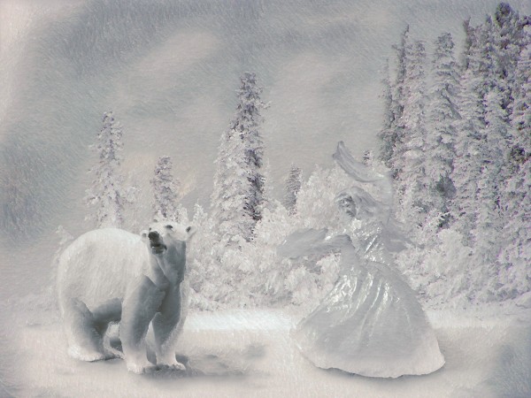
used paint engine PS plugin, for the final effect. It's freeware and can be found here:
http://fantasticmachines.com/store/index.php?cPath=24 (5 years and 3770 days ago)
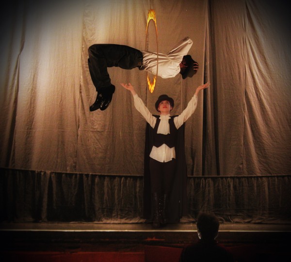
Thanks to stocked-n-loaded.deviantart.com and jademacalla.deviantart.com (5 years and 3773 days ago)
1st entry .. and a fantastic one at that.. truely on theme GL
Well done.
nice job --flaming hoop looks a bit flat however.
congrats! 
Congratulations for 3rd
Congrats for your third place, Nasir!
Congrats
Howdie stranger!
If you want to rate this picture or participate in this contest, just:
LOGIN HERE or REGISTER FOR FREE
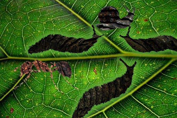
trail of insects parading miss queen of bump (5 years and 3779 days ago)
http://hortipm.tamu.edu/pestprofiles/other/garslug/slug.jpg the slug http://planterspk.com/Services%20pages/images/snail1.jpg the snail http://www.bobthebugman.com/images/Red_imported_fire_ant.gif the leaf http://www.firstscience.com/home/images/legacygallery/leaf.jpg
interesting image author. next time you may like to explore shadows. GL
Howdie stranger!
If you want to rate this picture or participate in this contest, just:
LOGIN HERE or REGISTER FOR FREE
(5 years and 3842 days ago)
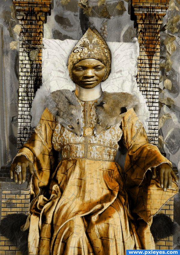
I really like your idea and the work you've put into it. Very good SBS by the way  The problem is, that you squished the face. In step 1 and 2 of your SBS it is normal, but something happened between step 2 and 3. Would be great, if you could fix that
  Good luck!
its hard to seperate each item in the image. The person looks really distorted, the background isn't straight but that may have been intentional.
Howdie stranger!
If you want to rate this picture or participate in this contest, just:
LOGIN HERE or REGISTER FOR FREE
(5 years and 3872 days ago)
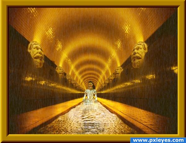
Nice overall image, but i think the blending on the ston head should be abit smoother, try not to remove as much of it when masking. Good luck!
I really like the feel of this one.
Nice work
This would be much better without the gold frame...imo. 
Howdie stranger!
If you want to rate this picture or participate in this contest, just:
LOGIN HERE or REGISTER FOR FREE
this is nice... a little goes a long way.
Lovely idea, but i think the paint filter creates too many hard edges and a lot of detail is lost, maybe it's just me (i'm not a great fan of filters) However great job.. it lookes very nice.
It's your image, and i will not question any artistic choices it's a great image.. good luck!
look forward to the SBS... I love toys for PS. -plugins..( dont have any at the moment)Although it has created some edges... I think you reached your goal of the OLD WORLD look... love it
Very nice work...ice queen is very very good and the bear perfectly fits in whole image...but i agree with ponti,photo filter create to many hard edges....Beside that this entry is one of the best,so high marks from me.
Looks like oil painting. Great image
It does look a lot like an oil painting.
it is very sweet
Howdie stranger!
If you want to rate this picture or participate in this contest, just:
LOGIN HERE or REGISTER FOR FREE