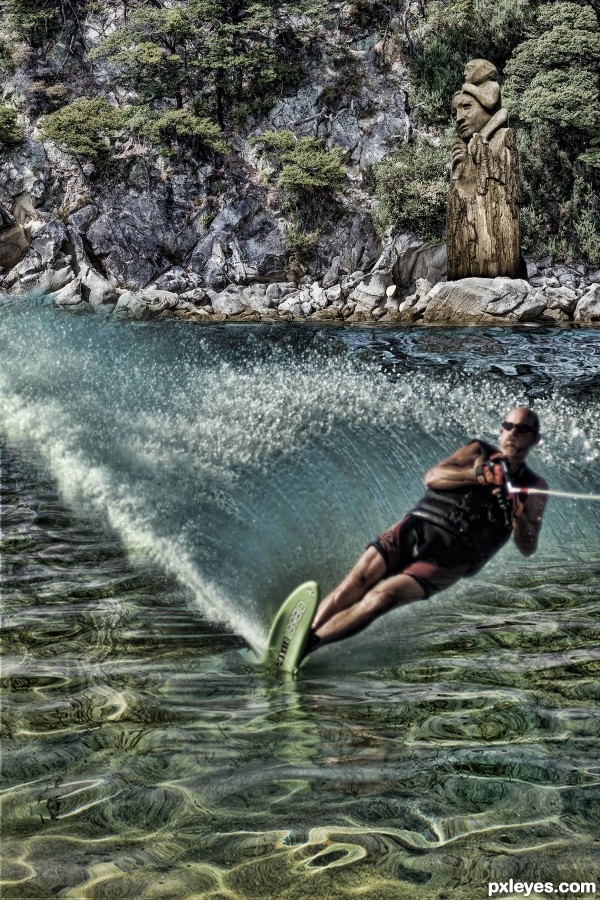
(5 years and 2862 days ago)
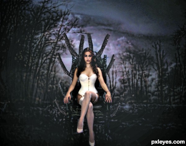
thanks to nightfatestock,ChainBound
wolfcstock visualgraffiti-stock (5 years and 2896 days ago)
I would add more contrast on the ground close to the throne.
Howdie stranger!
If you want to rate this picture or participate in this contest, just:
LOGIN HERE or REGISTER FOR FREE
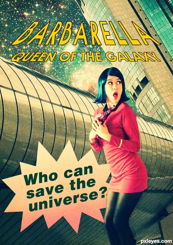
Star balloon is PS default shape. (5 years and 2930 days ago)
Love the retro texture feel, but she looks like she's falling over...and who knew Barbarella was in Star Fleet? 
PS: Don't you think all the type at the top should have the same perspective?
Thank you Bob! Applied perspective like the old posters of Barbarella  By the way, the universe became too big for her to try to save it all by herself... So she joined the Star Fleet crew
  I'm not sure whether changing her position made it better...
Now she's not falling over, which is a good thing. 
As for the type. of course the perspective is up to you, but now "queen of the galaxy" is the reverse of the larger type, not following the same perspective. Think STAR WARS titles.
Nice colors and good pick of sources. I'm less convinced about the choice of font for the tagline. It can have some more drama by using a bigger size, other font and perhaps (just as the text on top which looks better, maybe a bit thicker border) the use of some perspective (maybe you can use the perspective from the metal background to align with). Good luck!
Thank you @wazowski. I made some changes. Used bold century gothic for the tagline and applied a different perspective. I made the borders thicker too 
I agree with wazowski... I love this but the bottom is missing that drama. I think the tag line in side something like this would complete an excellent piece.
http://www.powerpoint-2010.com/wp-content/uploads/2011/12/star-bubble-02.jpg
Thank you @oziipop! I got it! 
Howdie stranger!
If you want to rate this picture or participate in this contest, just:
LOGIN HERE or REGISTER FOR FREE
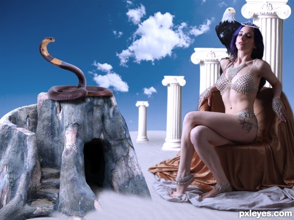
Thanks to mjranum, erisabesu-kuro-gosai, meihua-stock, prints-of-stock, night-fate-stock and AbsurdWordPreferred for the stock photos.
(5 years and 2944 days ago)
IMO...would make the sky look more realistic...clean chop tho..good luck
Thanks, look much better now.
Oh yes, I do like this, would love to see the tutorial for it
Howdie stranger!
If you want to rate this picture or participate in this contest, just:
LOGIN HERE or REGISTER FOR FREE
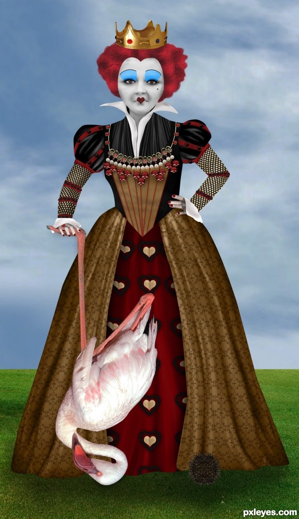
A photomanipulation I did using photos of Helena Bonham Carter as a reference and a lot of source images, I hope you like it!
Credits:
Dominic Morel for the flamingo
LilyStox for the Jewelry Set (5 years and 2954 days ago)
Great work 
thats amazing, i just finished watching the dvd then this image appeared  lol
lol
Good work, i love Helena Bonham Carter, especially in this movie with the big head.
Thank you very much for your comments!!
Curious as to what the black ball is, but otherwise nice painting and use of source 
Thanks for the comment! the "black ball" is a hedgehog! but promised it was not harmed!
this is really good, i love it, indeed.
Thank you so much!!!
Congrats!!
Howdie stranger!
If you want to rate this picture or participate in this contest, just:
LOGIN HERE or REGISTER FOR FREE
Well done, my favorite in this contest =)
everything perfect, but I think the trail behind must be broader. I live in a seaside town. just my opinion
Howdie stranger!
If you want to rate this picture or participate in this contest, just:
LOGIN HERE or REGISTER FOR FREE