(5 years and 507 days ago)
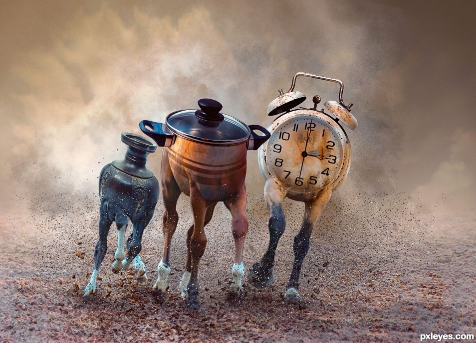
- 1: horses
- 2: clock
- 3: vase
- 4: cooking pot
- 5: stone brushes
- 6: powder brushes
- 7: sand dust brushes.
- 8: cloud brushes.

(5 years and 507 days ago)
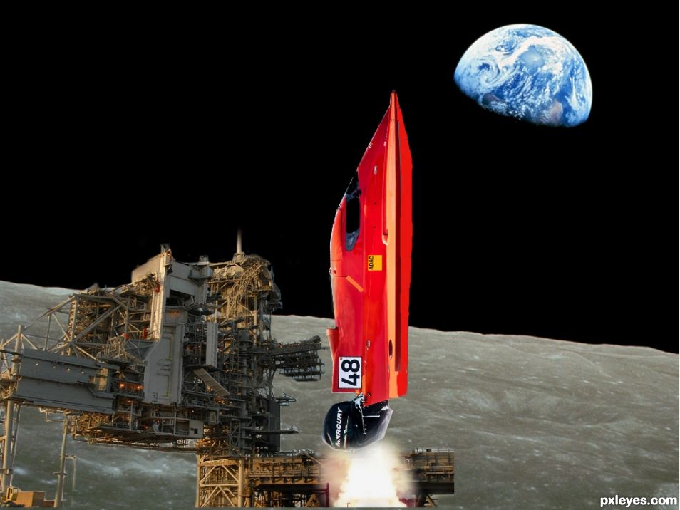
Fastest Nasa shuttle in the galaxy. Wanted t take the race boat image and change up to a space scene, tell me what you think?. (5 years and 865 days ago)
Please fix links 2 and 3. They don't lead to images. The background looks like an illustration and wouldn't be useable in any case.
Ok fixed the 2 links, should be able to see all sources now.
As I thought, source 3 is a render, and not useable. When using DA for source material, always use this link, which will take you to the stock section. http://www.deviantart.com/browse/all/resources/stockart/ Even then, some images will be renders or premade backgrounds, which are not valid sources. You have plenty of time to find a useable background and revise your entry.
Ok thanks
Author, please link all sources to the page that shows the copyright and usage information, not the download pages.
All right changed it, let me know if anything else needs changed?
Thank you for fixing this 
No problem.
Maybe have the exhaust shooting out from an external sourced rocket engine or even an engine from a fighter jet. Perhaps you could mask off the boat's engine to resemble one. Also the windows of the cockpit are blue and the sky is black in your Chop. That's an easy fix. Just "mask out" the blue parts of the windows. Then in your "Mask Properties", lower the "Density" a bit to allow some of the winnow to show through. You may or may not have to mess with a Hue/Sat adjustment to darken the Blue color of the windows. This way it will look like there is some glass in the cockpit, but it will be see-through and you will see the black sky behind it. The bottom of the boat is white. You may want to color it orange so the rocket color looks more consistent.
Hi BWR, thank you for your helpful pointers on the adjustments, let me test out and see what i can do about those things.
I changed the cockpit window to have the space background and added colour orange to the bottom of the boat, but still wanted to keep the engine the same from the boat to give that parody of the difference from a boat scene to a space scene. Hope you like it.
Howdie stranger!
If you want to rate this picture or participate in this contest, just:
LOGIN HERE or REGISTER FOR FREE
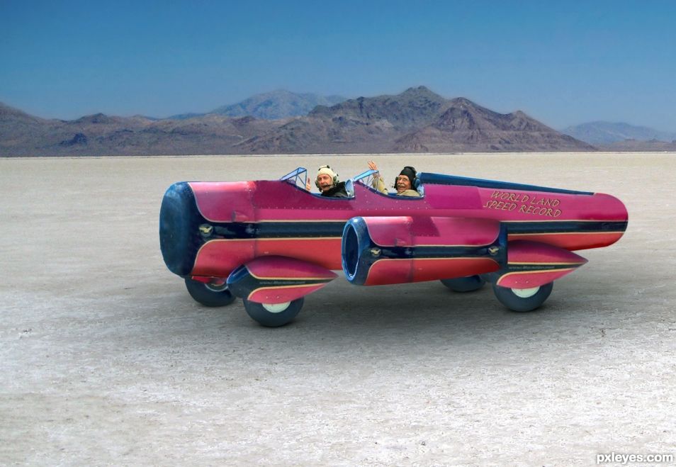
Posing for a victory picture, these two men just broke the world`s land speed record in their jet powered vehicle. In case you don`t know, the Bonneville Salt Flats is a densely packed salt pan in Tooele County in northwestern Utah, USA. It is totally flat and smooth for miles. Most of the land speed world records are done here. (5 years and 919 days ago)
Very cool vehicle. I would have added a tail fin, but that's just my preference. It looks like there's a bit of red stuff to clean up under the rear of the fuselage.
TY CM. Originally it had a tail fin, but I removed it because it made the vehicle look way too much like a plane. As per your suggestion I re-added the tail, and in my opinion it does make it look less like a "land vehicle" and more like a plane. Thoughts? https://i.imgur.com/AbJdpgv.jpg
I saw that yucky stuff under the tail you pointed out, and took care of it. Surprised that got passed me, so TY for your eagle eye. If anyone wants to know a trick for finding stray stuff that should have been masked or cut out, just use a temporary "Stroke" and it will reveal the bad stuff.
As I said, it's your preference. I thought a long low fin would look cool. Lots of the land speed record cars had fins. https://www.google.com/search?q=world+speed+record+cars&source=lnms&tbm=isch&sa=X&ved=0ahUKEwikhNrvw_3WAhUB5IMKHY56Ag4Q_AUICigB&biw=1724&bih=924
PS: I like the goofy guy in the back seat. 
Thanks again for your help. I tried quite a few tails. Tall ones. Short ones. Long ones etc and really thought it made it look too much like a plane. Here is what I think was the best one with a tail. https://image.ibb.co/gLdvwR/rebuilding_car.jpg
I did however raise the wheels (or lower the body) and I like it a bit better.
Definitely an improvement.  (I do like the one with the tail, though).
Congrats again BWR 
Thanks MM. 
Congrats BW!
Mahalo sister Z. 
Congratulations BWR. I like the one you did with the tail fin better though.
Haha. Such a hard decision sometimes when making these Chops. Probably should have listened to CMYK46.
You won anyway so it would have made no difference except you might have got an even higher score than you did. 60% always looks so much better than 59.9. 
Howdie stranger!
If you want to rate this picture or participate in this contest, just:
LOGIN HERE or REGISTER FOR FREE
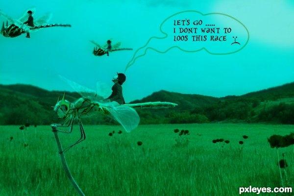
i am thankful to this guys for their wonderful stock
images and fonts...
* Marco T.L.(for font),RobMan170,gbsngrhm,tanakawho,last hero,
aussiegal7,shi-stock,night-fate-stock(for stock images)
(5 years and 2903 days ago)
"lose" is spelled wrong
ooop's !!!
Interesting concept. I wish you had an SBS as I'm too lazy to figure out what you've done otherwise. The text adds nothing IMO and the intense bluishness seems odd. With all the interesting elements positioned in the left side of the image, I would be tempted to crop out the right-hand third.
thanks for Opinion i'll keep improving and the thing you mention abt text now i am agreed on that.
wow nice n cute concept , IMO you don't need to add that text as it already convey the message !!
and i like this mask you put on dragonfly's head...if i guess created those with blending mods right ?
ok keep it up n good luck !!
thanks for interest i am glad that you like my work that keep me inspiring thanks a lot and abt that text thing i just wont to convey the message more effectively but unfortunately i made a spelling mistake there ...
Howdie stranger!
If you want to rate this picture or participate in this contest, just:
LOGIN HERE or REGISTER FOR FREE
(5 years and 2922 days ago)
Howdie stranger!
If you want to rate this picture or participate in this contest, just:
LOGIN HERE or REGISTER FOR FREE
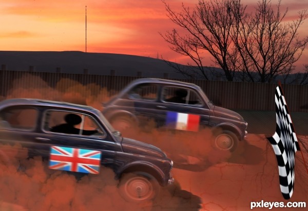
How fun! zoom zoom zoom.. photo finish
Thanks Ernest and thanks for the fav too.
Super ! well done ! good luck author
Thank you very much Lolu and thanks for the fav.
Congrats Skyangel
Thanks Sylvie
Howdie stranger!
If you want to rate this picture or participate in this contest, just:
LOGIN HERE or REGISTER FOR FREE