(5 years and 3259 days ago)

You don't remember
You don't remember
Why don't you remember my name?
Off with his head, man
Off with his head, man
Why don't you remember my name?
I guess he does.... (5 years and 3536 days ago)
Baby your mind is a radio
Got a reciever inside my head
Baby I’m tuned to your wavelength
Lemme tell you what it said
grrrrrrrrrrrrrrrrrrrrrrrRRRRRRRRRRRRREEAAAAAAAAAAAAAAAAAAAAAAAAT!!!
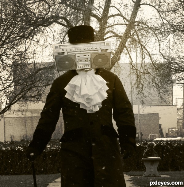
Good idea, but it does look more like a boombox head than a mere radio head IMO. An old-fashioned radio would work really well with the old-fashioned costume that evokes a radio-only era. I also think cropping off the guy's legs diminishes the retro charm.
ohh thanks dirvenslush ...@Danlundberg...thanks for your suggestion but...whenever i think of radiohead...a man with this kind of booombox head came in my mind :P...
I'm guessing you're a lot younger than me. 
yeah,..may b thats the reason lol
now where did I put my dentures and where is my walker with the yellow tennis ball feet? (creek creek creek)
lol
And this kind of radio is already obsolete... Nobody uses cassette tape anymore!  Nice compo, author!
Cool...great idea author...best of luck
thanks guys
Everything is generally well made...but there's something about the difference of image quality between the radio and the man. The radio is too sharp and stands out too much. Maybe try a very very slight blur and some white snow flecks to make the radio blend in with the texture of the photo.
nice work.., gl
nice job ....... but i am sorry ,my marks goes to drivenslush for the great poem .......... 
hahaha nice!
thanks guys  ..my inspiration
Howdie stranger!
If you want to rate this picture or participate in this contest, just:
LOGIN HERE or REGISTER FOR FREE
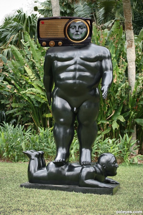
I'm not sure using a sculpture's head instead of a real human head really captures the band name, especially when the sculpture has a lot of distracting elements. That said, I would note that the radio casts a much weaker shadow than his pecs and that the radio is parallel to the image's plane even though the sculpture is angled away.
The shadow of the right foot is closer to the a$$ of the base character thus a darker shadow, the radio is farther away from the neck of the sculpture thus a lighter shadow (the pecs aren't really casting any viable shadow)
It's okay Dan, maybe if you actually entered some contests I'd actually know what you are talking about, but without any type of portfolio to cross reference I really have no idea what you are getting at. (you have a tendency to wonder and you lose focus quite quickly)
HEY! I know, why don't you enter some contests and show us how it's done, I mean, that would be a big help!!!
(Talking Heads)
Baby your mind is a radio
Got a receiver inside my head
Baby I'm tuned to your wavelength
Lemme tell you what it says:
Now you and I have no secrets
Now baby, lemme read your mind
I hear ev'rything you're thinking
You can't help the way you sound
I guessed the band as soon as I saw the image. Dan you said "I'm not sure using a sculpture's head instead of a real human head really captures the band name..." Maybe you should mention that to the author of this Radiohead album cover http://www.shutterphoto.net/article/100-best-photo-album-covers/ strange that it's actually listed as one of the top 100 album covers. "Distracting elements"? I'd say interesting elements. The pecs don't cast a shadow that's the reflection of the surrounding landscape. The radio appears to be canted forward a bit on the statues head, nothing wrong about that. I think this work shows most interesting creativity, nicely done author.
good work gl
radiohead has a smaaal weeeneee ha - ha - ha - ha - haaa - ha .
good chop
Do you remember when the only radio was AM...not stereo either. I was a "Radio Head" still am as a matter of fact. Shadows are fine.
Howdie stranger!
If you want to rate this picture or participate in this contest, just:
LOGIN HERE or REGISTER FOR FREE